Drawing sharp boundaries in a fuzzy world

A post by Chris RowanHumans are natural splitters. We have an innate tendency to look at the world and mentally sort everything into different categories, and grades, and entities: this is one thing, that is another; it was this, now it’s that. Our perception of colour is a good example of how our brains automatically split a continuum into discrete boxes.

We’ve incorporated our love of classification deep into science, trying to formalise and quantify the dividing lines we want to draw on everything: it’s this when conditions A and B are met, it’s that when we see Y and Z. But nature doesn’t often make it easy for us to draw our sharp dividing lines. We can exactly define state A and state B, but when something is gradually changing from one state to the other, when does it stop being A and start being B? We end up drawing our dividing line in the middle of the transition, even though there are signs of change before this line, and change continues on after it. In other words, the boundaries that we draw are almost always a little arbitrary, leading to uncertainty – and often disagreement – about where they should fall. The eternal debate over the best way to define a species is a prominent example of the problems that can arise when we try to draw sharp boundaries across fuzzy transitions that have depth, or width, or duration. In geology, the geological timescale is an entirely human contrivance, with the boundaries of periods and epochs delineating shifts in the state of the planet that might have taken hundreds of thousands or even millions of years.

A more topical boundary problem is provided by Voyager 1’s imminent entry into true interstellar space – the first manmade object to do so. I love that scientists are excitedly poring over data sent by a 35 year-old space probe, working far beyond its imagined operating lifetime. But it’s also clear from those data that the heliopause – the boundary between the sphere of the sun’s influence and the stuff outside – is one of those fuzzy boundaries writ large. One indicator being tracked by Voyager’s detectors, low energy cosmic ray particles that are generally unable to penetrate the heliopause, is spiking, possibly indicating the boundary is near. But two other important parameters – the level of lower energy particles produced by the sun (which can’t escape the other way across the heliopause), and magnetic field strength – are not yet changing as we’d expect. It seems that as we speak, Voyager 1 is now located somewhere between ‘definitely in the solar system’ and ‘definitely in interstellar space’.
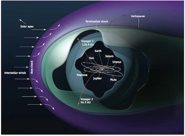
Voyager at the heliopause

Voyager's location at the boundary between solar and interstellar space. Source: NASA/JPL

One of the issues is that because this is the first time we’ve crossed this particular boundary, we don’t know exactly what a transition looks like (we don’t know exactly what it looks like on the other side, either, which is why this is so exciting). It is often the case that until a boundary is crossed at least once, you can only tell when you actually crossed it in hindsight; then you can see the whole sequence of events and measurements that accompanied the transition, and define a boundary amidst them.

But what if you’re trying to define a boundary that you dont want to cross? Such is the case for the ‘Planetary Boundaries’ that attempt to attempt to define exactly how far we can push the planet’s ecosystems, atmosphere and hydrosphere without triggering irreversible changes.
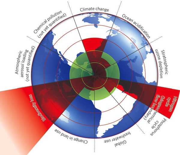
Planetary Boundaries

The 'planetary boundary' concept attempts to quantify the resilience of the Earth's natural systems to human-driven change. Source: Rockstrom et al., 2009.

It seems that some people think the planetary boundary lines above have been drawn in the wrong place, or can’t be drawn at all. Nonetheless, given that our civilisation is rather finely tuned to the fairly narrow climatic range that we have enjoyed for the past 10,000 years or so, identifying any such critical thresholds is important – especially since we seem as hell bent on pushing beyond these boundaries as Voyager is on crossing the heliopause. Unfortunately, in the case of our complex, feedback-infested planet, not only are we unsure what exactly lies on the other side of any approaching boundaries, but monitoring our passage is also a much more difficult venture.

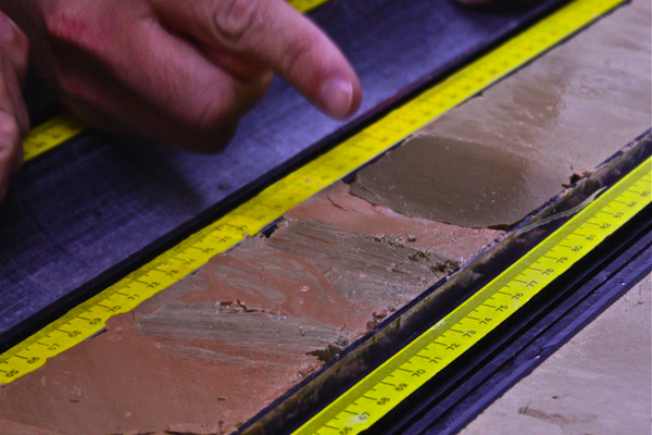
In theory, we geologists can provide a lot of help with identifying planetary thresholds: studying the progression of past, naturally driven climatic changes can give us valuable clues as to where the point of no return might be for the present, human driven one. An event of particular interest is the Paleocene-Eocene Thermal Maximum (PETM), an abrupt 5-6° C warming of the planet around 55 million years ago, which appears to have been caused by a massive fluctuation in the planetary carbon cycle. Last week we got treated to core drilled right through the PETM, pulled up from beneath the seafloor off of Newfoundland by the research drilling ship the Joides Resolution.
PETM core photo

An oceanic sediment core containing the PETM boundary (the transition from red and grey to brown sediments, as pointed out by a helpful IOPD finger). Source: Joides Resolution Blog.

Here, at least, is a boundary that is easy to point at – an abrupt darkening in the colour of the sediment that marks where the warming killed off phytoplankton in the surface oceans, and shut off the steady rain of biologically produced carbonate onto the ocean floor. But ironically, in this case we might be faced with a boundary that is too sharp for its own good. The warming at the PETM took of the order of 10 to 20 thousand years, but Deep Time has taken this originally fuzzy boundary and squashed it into a few centimetres of core. Whilst this has made it easy to locate, it also means that information about how the transition actually occurred has been highly compressed, or even lost entirely. This is a recurring problem when you mix (relatively) rapid events with the geological record: in my own field of paleomagnetism, we have a similar problem when trying to find good records of magnetic field reversals.

So that’s the problem with drawing boundaries in science: more often than not, they’re either informative, and tricky to define; or easy to spot, and difficult to understand.

Categories: general science, geology

What do you mean, the Gulf Stream doesn’t keep Europe warmer than North America? How even scientists are afflicted by urban myths

A post by Chris RowanIn science, you discover that you’re wrong at least as often as you’re proven right – and the things that you end up being wrong about can be quite surprising. Prior to last week, if asked I would have confidently confirmed that the reason the UK does not have a polar bear problem, despite being located at the same latitude as Hudson Bay, is the heat supplied by warm water transported into the northwest Atlantic from the Gulf of Mexico by the Gulf Stream. But then, courtesy of Kevin Anchukaitis, known on Twitter as thirstygecko (and someone you really should follow if you’re interested in things paleoclimatic), I found out that this is not the case at all.

[blackbirdpie url=”http://twitter.com/thirstygecko/status/211195868248940544″]

If you follow the link,

=”” The Gulf Stream is part of the global ocean conveyor, but it doesn’t convey much extra warmth to Europe. Source: Marika Holland.

The oceans do still play an important role in keeping Europe’s winters mild, but it is nothing to do with the Gulf Stream. The winds that blow northeast onto Europe from the Atlantic carry with them air that is relatively warm even in the winter; the large heat capacity of water means that the sea cools off more slowly in the winter, and this also moderates the temperature of the air above the sea surface. This contrasts with the eastern US, where the prevailing southeast winds are cold, having lost their heat to the thousands of kilometres of land surface they’ve already passed over.

So the oceans are still involved, but it is the atmosphere that is the true key to explaining Europe’s mild winters; and in a pleasing geological twist, it is apparently the presence of the Rocky Mountains that causes the large scale waviness of atmospheric circulation that magnifies the temperature contrasts on either side of The Pond (Richard Seager explains this in more detail in this more comprehensive piece at the American Scientist).

How the Rockies cause the westerlies to wiggle, magnifying the trans-Atlantic temperature difference. Source: The American Scientist

According to Seager, the notion that the Gulf Stream was warming Europe can be traced back to a book first published in 1855, and is “the climatological equivalent of an urban legend”. It is certainly persistent enough, although given that this particular “fact” has been promulgated not by a friend’s sibling’s cousin’s friend over a pint on a Friday evening, but by scientists and educators in newspapers, televison programmes and lectures, it’s arguably even more pernicious. But how did this happen? Isn’t science meant to be self-correcting?

Here’s how it can happen. In the introduction to your average paper, you’ll often see sentences along the lines of:

The link between [phenomenon] and [process] has long been known (Bloggs, 1996).

The implication is that everyone knows and accepts this, so it’s not worth wasting time going through the evidence in painstaking detail; but if you’re interested, you can look up the given reference for the gory details. Most of the time, this is exactly what you get when you track the given reference down; but sometimes, you find that it is nothing more than the oldest reference to this fact that the original paper’s author was willing or able to look up, and all it says is:

There is strong evidence that [phenomenon] and [process] are linked (Obscuro, 1982).

If you persist further, you may find yourself going through the process of looking up a reference, only to be directed to an even earlier one, several more times before you finally reach the canonical document, the one that contains actual data and discussion. And this is what you find:

Based on [invalid data] collected using [method known to be inaccurate] and assuming [long disproven assertion], we conclude [process] causes [phenomenon].

This is how a scientific urban myth is born: by the time you reach a citation 3 times removed from the supporting observations, a conclusion becomes something ‘everyone knows’ despite very few people ever being exposed to the evidence it was based on. “I’m telling you, this paper told that paper that this other paper has compelling evidence for this! Compelling! Well no, I haven’t actually read it myself…”

I don’t believe this is a hugely common phenomenon. But science nowadays is such a vast body of knowledge that there are bound to be a few zombie ideas traipsing around in it, managing to survive because no-one has really properly examined them for a while. It is only when a scientist is inspired to chase one of these ideas back to its origin that they are brought into the light.

Categories: academic life, climate science

A mountain (meta)geologist

A post by Chris RowanAs you might have noticed, my blogging has been a little thin on the ground recently, which means I have been remiss in pointing you to some sterling posts from fellow All-geo blogger Simon Wellings, who is writing a whole series exploring the geology of mountains, with a focus on the Himalayas and the Tibetan plateau. As he explains, plate tectonics is often not a good model for deformation on continents, and of the many models that have been suggested and processes that have been proposed to explain how it all works, perhaps the most mind-bending is “channel flow“, where the middle regions of the crust are warmed and weakened as a plate thickens during an orogeny, then squeezed out sideways into neighbouring regions like toothpaste. As Simon’s most recent post explains, this process appears to have occurred beneath the Tibetan Plateau: driven by rapid erosion at the surface, channel flow has transported deeply buried rocks 200 km sideways and 20 km upwards to be exposed in the Himalayas. The peak of Everest may be stupendously uplifted marine carbonates, but the rocks that make up the slopes beneath have been on an even more extreme tectonic adventure. The Geology of Mount Everest comes complete with many fabulous photos taken by the author himself; the fact that Simon was in a position to do so makes me swoon with jealousy. Check it out.

Ooh. Click image for more pretty mountains, courtesy of Simon Wellings.

Categories: geology, links, structures, tectonics

Scenic Saturday: a pilgrimage back to the grand granitic tors of Dartmoor

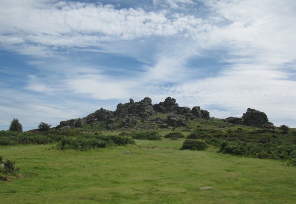
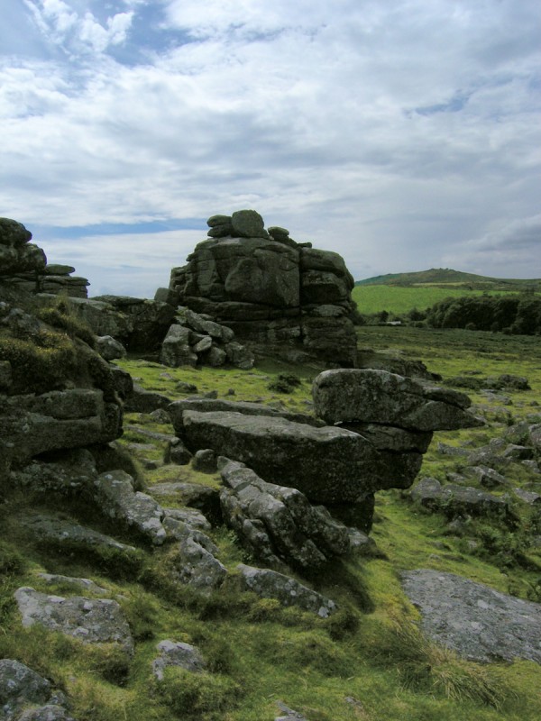
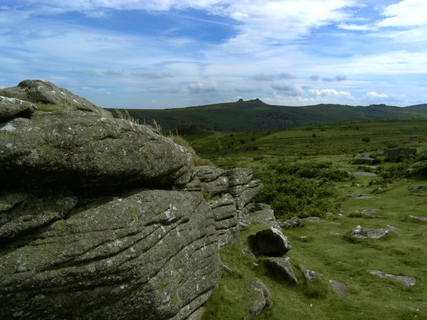
A post by Chris RowanThe high and rugged scenery of Dartmoor is as wild and untamed a landscape as you’re likely to find in the United Kingdom, and would seem to have more in common with the Scottish Highlands than the prim and proper south of England. Yet not an hour’s drive from the crowded beaches of the ‘English Riviera’*, you can find yourself in a stark, windswept landscape dominated by the tors: granite-topped hills that could easily be mistaken for ruined castles, but are instead the product of millions of years of weathering.

Hound Tor, Dartmoor. Click to enlarge. Photo: Chris Rowan, 2011.

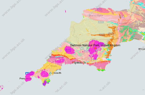
Around 300 million years ago, the Variscan orogeny, the collision between Gondwana (Africa and South America) and Laurussia (North America, Northwest Europe and the UK) that marked the final assembly of the supercontinent Pangea, produced the wickedly folded and metamorphosed rocks that can be found on the coasts of Cornwall, Devon, and South Wales, and thickened the crust enough to cause the lower reaches to melt. This produced a large granite intrusion – a batholith – that runs down the buried spine of Devon and Cornwall all the way down to Lands End. In various places, it pokes above the surface, the largest of these outcrops being Dartmoor.

Geological Map of SW England

Geological Map of SW England. Granites are garish pink. Source: BGS (click image to go to their online map viewer).

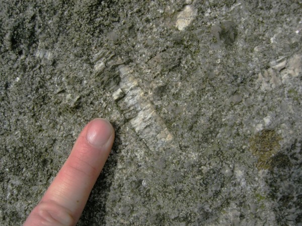
I first visited Dartmoor when I was around 6 or 7, and I remember being fascinated by the tors, which were looming and mysterious and great for causing my mother minor heart attacks as I clambered around them in a death-defying manner. As someone who grew up on the flat coastal plains of East Anglia, this was probably one of the first times that I realised that landscapes could be interesting. Thus was born a life-long love affair with pointy places and the interesting rocks you find there. Last summer, 25 years or so later, it was great fun to revisit the tors and look at them as the geologist that they helped inspire me to eventually become. And find some rather impressively large feldspars whilst I was at it.

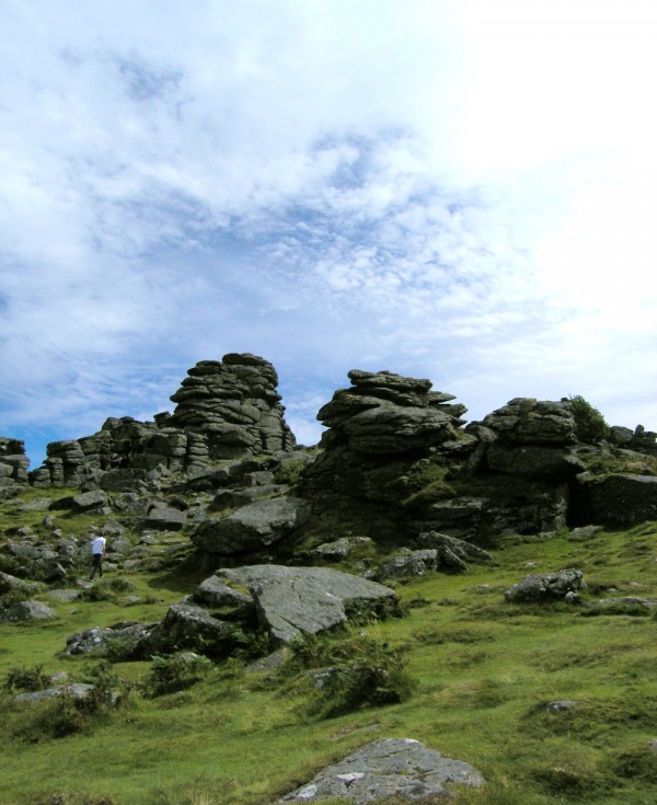
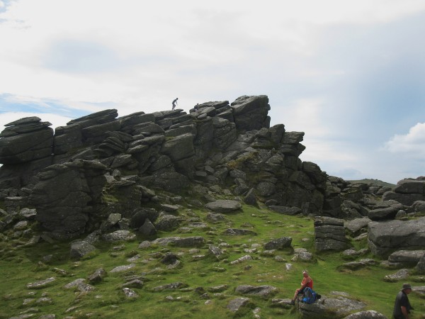
Larger versions of all these images can be seen by clicking on them.

Hound Tor, Dartmoor

Photo: Chris Rowan, 2011.

Hound Tor, Dartmoor

Photo: Chris Rowan, 2011.

Hound Tor, Dartmoor

Photo: Chris Rowan, 2011.

Hound Tor, Dartmoor

Photo: Chris Rowan, 2011.

Plagioclase in granite, Dartmoor

A large plagioclase phenocryst visible in the weathered and lichen encrusted granite of Dartmoor. Photo: Chris Rowan, 2011.

*Not an ironic designation, as far as I can tell. Because hey, it doesn’t rain all the time…

Categories: geomorphology, outcrops, Palaeozoic, photos, rocks & minerals

One Venus transit – but many kinds of scientific outreach

A post by Chris RowanOn Tuesday afternoon, I took the bus to downtown Chicago and walked out to the prime piece of lakeshore real estate that is occupied by the Adler Planetarium. This was hardly the epic journey that some of my British forebears undertook to see Venus transit across the Sun, but I was still keen to personally observe the event through a telescope. As it turned out, I wasn’t the only one to have this idea:

Queuing to observe the Venus Transit at the Adler Planetarium, 5 June 2012. Photo: Chris Rowan 2012.

Venus transit party, with Chicago as a backdrop. Photo: Chris Rowan 2012.

After a wander through the planetarium itself, I joined the queues outside and eventually got my 20 seconds of peering through an eyepiece at the sun, seeing both the black dot of Venus itself and an impressive constellation of sunspots. Mission accomplished, and not just for me: the Adler itself had done more than stick a few telescopes on its lawn, with lots of other scientific and historical information on display, and incorporated into their planetarium shows. One of the coolest things that I learnt was that observations being taken during this transit will help us to characterise the atmospheres of exoplanets as they transit their parent stars (which is how the likes of Kepler actually spot them in the first place); because we know the composition of Venus’ atmosphere very well, it provides a useful calibration point (as this article explains). All this was clearly a pretty successful exercise in scientific outreach: lots of people turned up to see the transit, and the atmosphere was one of excitement and fascination.

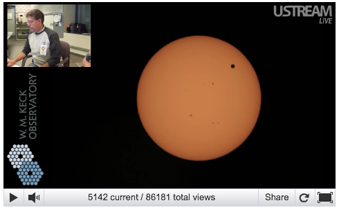
The sun set behind the skyscrapers of downtown Chicago long before the transit was over, so I headed back home, fired up my web browser and pointed it to NASA’s livestream from the Keck Observatory on Hawaii. As the screen capture below shows, I joined more than 86,000 people in doing so – possibly many more before the transit was over – and whilst it may have lacked the more visceral experience I got from actually peering through a telescope lens, it more than made up for this by there being no queue of people behind me waiting to take their turn and pressuring me to cut short my ogling. Clearly, with lots of viewers and lots of interaction the astronomers providing commentary on the livestream, who were having a great time answering a never-ending stream of questions, NASA’s online streaming was another outreach success.

The NASA livestream of the Venus transit from the Keck Observatory

But the transit experience didn’t end there: in the last couple of days, I’ve continued to be supplied with stunning imagery via blogs and Twitter. I think my favorite was this video of the first moments of the transit, where Venus’ atmosphere is clearly lit up by the sun’s glow before it fully entered the suns disc.

The penumbra of tweets, blogs and videos around this event clearly augmented the experience for many people. Before the transit, it told people it was happening and why it was important and rare, and told them where they could go to observe it; during and after the transit it was the means of sharing a constant stream of gorgeous pictures and videos (particularly from NASA’s various outlets). Not only was all this activity successful scientific outreach in itself, but by widely promoting the other events I’ve been talking about, it undoubtedly boosted their own success.

In a week when the question of why scientists in academia don’t do more outreach, and how hard it is to get professional credit if we try (see some excellent posts from SciCurious, Kate Clancy, and Cedar Riener), has once more reared its head, I think this last point is worth pondering. Of course, outreach is a much more prominent part of the remit of organisations like NASA and the Adler planetarium, which means that some of the pressures that inhibit scientists who work at research universities are less stifling. But this use of blogs and social media to augment more approved forms of outreach might help to convince our still-skeptical peers and superiors that all this internet stuff is not a complete waste of our time. This doesn’t always have to be the case, of course, but the prospect of adding value to forms of outreach that are more accepted – things like open days and public lectures – might be a helpful lever.

Categories: planets, public science