Happy Anniversary Grímsvötn

Yesterday was the first anniversary of the 2011 eruption of Grímsvötn.  Despite being the largest eruption in Iceland in 50 years, the day passed without much fanfare as the eruption had a relatively small impact compared to a certain other eruption the year before.  To understand why, read my post from the second anniversary of that one: An Icelandic eruption 100x more powerful than Eyjafjallajökull.

In this post, I want to point out the interesting effects that wind patterns had on the tephra dispersal from the Grímsvötn eruption, and to update you on the analysis of the samples.

Where to go: Greenland or Great Britain?

The US National Oceanic and Atmospheric Administration (NOAA) have a webpage where you can have a go at running their HYSPLIT atmospheric dispersion model.  This uses information on wind speeds and directions to predict where particles in the atmosphere will travel.  It works in forward or in reverse, so if you smell a bad smell, you can find where it came from and if you make a bad smell, you can see where it is going to go.  Except on a global scale.

The Grímsvötn 2011 eruption was interesting, because the final destination of the erupted material was controlled really strongly by the height that it reached in the plume.  Check out these two plots for comparison:

Material from 8ooo m goes north

HYSPLIT trajectory for particles released at 8000 m. These do not include particle settling, but give a good idea of wind direction. Material is carried north across Iceland, then across to Greenland.

Material from 4000 m goes south

HYSPLIT trajectory for particles released at 4000 m. These do not include particle settling, but give a good idea of wind direction. Material is carried south across Iceland, then across to Great Britain.

Where did the tephra go?

The plume from Grímsvötn reached 20 km in altitude, but it turns out that not all of this was tephra.  Much of it was steam and volcanic gas.  To see whether most of the tephra was in the upper or lower part of the plume, have a look at this photograph of the area south of the crater, taken on an monster-truck expedition to the crater last August.

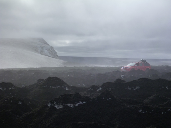
A black sandy desert

A black sandy desert. This is the tephra deposit from Grímsvötn 2011 on top of the Vatnajökull glacier. All this should be white ice and snow. Click the image to read my post about a trip to the crater last summer.

It is clear from the deposits on the ground that most of the tephra from the eruption was carried to the south by low-level winds and was deposited from the lower part of the plume.  There was very little tephra deposited to the north of the crater, but material from the upper plume was carried carried to the north and was detected over Greenland by satellites sensitive to the volcanic gas sulphur dioxide (SO2).

This complicated dispersal of volcanic material is another reason why mapping volcanic ash clouds is HARD.  The main lessons that were learned are:

  • Tephra may not be distributed evenly throughout the full height of an eruption column during a subglacial eruption.
  • It is important to get information from the ground and from satellites as quickly as possible to refine computer predictions made during an eruption.

What happened to the samples?

Some of you may remember that during the Grímsvötn eruption, there was a request from the British Geological Survey for samples of ash collected by the public.  I made a video and wrote a post at the time called An easy way to sample falling ash, and another post showing some of the ash that fell in the UK.  In the end, we received ~130 tape samples from the public and found ash in many of them, particularly ones from Scotland (which is in nice agreement with the particle trajectories above).  The results are being written up, but it will still take months for them to be published formally.  Such is the pace of science.

Thanks again to everyone that sent samples in.

Categories: Uncategorized

EGU2012 Open Source Software in Geosciences

A splinter session yesterday drew a larger-than-expected crowd to talk about the use of free and open source software (FOSS) in the geosciences.  Those in attendance spanned the range from developers to end-users and the main outcome is that there will probably be a dedicated FOSS in science session at EGU2013.

A list of FOSS for geoscientists

A lot of the discussion yesterday was about open source software used in computer models (e.g. Glimmer-CISM, a community-written model of ice sheet dynamics).  Examples of more general use of FOSS in geosciences are using GRASS and QGIS instead of ArcMap, Python instead of Matlab, Inkscape instead of Illustrator.  For a longer list and a discussion of the advantages of FOSS, see the post: All the software a geoscientist needs.  For free!

Showcase of FOSS in research presented at EGU2012

Have you used FOSS in research that you are presenting at EGU2012?  If so, add an advert for your work in the comments (even if it has already been presented).  The list will demonstrate the wide variety of applications for FOSS in the geosciences.  Abstracts for the presentations can be looked up on the conference planner website.

Topics discussed at the meeting

Much of the discussion was led by scientists who are also developers of the software that they used.  Some of the main themes were:

  • The need for reproducibility in science. If people cannot reproduce your results, how can they test if your hypothesis is correct?  This issue was highlighted in a recent editorial in Nature, and it is likely that it will be increasingly necessary to publish code alongside results.
  • Logistical issues with packaging code.  Many open source software projects are built different packages from many sources, each with their own schedule of updates.  Sometimes, using a different version of one of these can cause a model to give a different result.  The need was discussed to ensure that older versions of packages are always available so that results can be exactly reproduced.
  • Getting credit for your work.  If an open source model is used by the scientific community, it has, in effect, been peer reviewed.  Can a system be developed so that the software itself becomes a citable bit of science, e.g. with a Digital Object Identifier (DOI)? How would this system cope with different versions of the same program?
  • Ensuring good documentation.  Scientists often write code for their own use and give little thought to documenting it for others.  If an open-access journal could be created where documentation for a hydrological or climate model could be published, along with an example use case, this would make it easier for others to use the models as well as giving another way of citing the author(s).
Categories: Uncategorized

EGU2012 broken wifi workaround

There is a problem with the wifi in the conference centre at EGU2012.  Some people can log on, but others cannot.  They can connect to the wireless, but trying to browse the web results in ‘Page not found’ or DNS errors. DNS errors mean that the names of servers are not being correctly translated into the IP addresses they represent.

I was in the second group, until I just met some German dude who showed me a workaround:

  1. Connect to the EGU wifi as normal.
  2. Open a browser window.  It will try to connect to http://hotspot.egu2012.local/login, but it will fail.
  3. Change the server name to the IP address, 172.16.0.1, so that the address becomes:
    http://172.16.0.1/login?
  4. A webpage will open with a login button.  If you try the button, it will also fail.  Instead, save a local copy of the webpage.  (File, Save Page As…. in Firefox).
  5. Edit your local copy, changing all instances of hotspot.egu2012.local to the IP address.
  6. Save the changes to your local copy, then open it in your browser.
  7. Click the login button, then surf away…

This just worked for me, I can’t promise that it will work for you.  The German lad also said that you might need to redo it each time that you reconnect.  And of course these instructions are of no use to you if you can’t actually get online to read them.

Comments Off on EGU2012 broken wifi workaround
Categories: Uncategorized

Science conference posters with Scribus

When you have the right tools to do a job, it is a lot easier to do it well.

Consider making a poster for a science conference. Two software programs commonly used to make posters are Powerpoint and Adobe Illustrator (or Corel Draw). If making posters was shaving, then these would be the equivalent of a butter knife and a surgeon’s scalpel: they might take the hair off, but you will be left thinking that there must be a better way.

This article is a quick-start guide to a free/open source desktop publishing package called Scribus. It’s the poster-making equivalent of an electric razor.  The article contains an example of a simple poster and the original file that was used to make it.  By using these as a starting point, it is easy to make up a poster of your own.  If you need to make a poster for the European Geosciences Union conference next week, then this should give you a head start.

Advantages of using Scribus for poster making

  • It is a desktop publishing program, so it has very powerful features for handling text e.g. wrapping around images, linked text boxes, document-wide font styles, variable line spacings.  You can even control things like kerning.
  • It features simple-to-use tools (such as Align and Distribute) for precisely organising layouts.
  • Images are stored as links to files, so if you update your figure, the poster is updated automatically.
  • The output is a PDF file, which can be printed anywhere and is usually small enough to send by email (5-10 Mb), even for an A0 poster.
  • It’s open source, so you can install it on as many computers as you want, wherever you are.

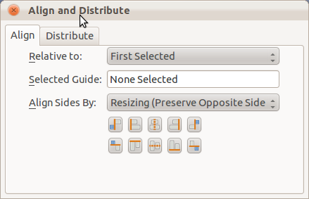
The 'Align and Distribute' dialog is your best friend. It makes it simple to ensure that your text boxes and images are perfectly aligned. Click an item as a reference, shift-click the one that you want to move or resize, and then change it as you please. Find it in the 'Windows' menu.

If bands went to conferences…

The following is a demonstration of what you might see if bands went to conferences.  Click it to see the full, A0-sized, PDF version.  It has been made according to the American Geophysical Union (AGU) poster presentation guidelines, which state that text should be at least 24 point in size to be readable at 2 m distance.

An example poster demonstrating titles, logos, text and image frames, figure captions, references and other features common to science conference posters. Click to see the full-quality PDF version (7Mb).

You can download the template file here:
Scribus_conference_template.sla (right click, Save Link As)

Prettier posters are possible, but this demonstrates what you can make fairly quickly and easily.  With this template, the hard work of setting up the page and defaults has already been done for you.  It has defined style settings for Title, Authors, Section Heading, Figure Caption etc. so it is just a case of replacing the text and images with your own.  It doesn’t take much more work to resize the boxes and personalise the layout, fonts and colours.

The text size used in the bullet points here is actually 36pt size, which is more than AGU require.  I think that most conference posters contain far too much text, so I would recommend keeping the large size.  If you run out of space, then you are writing too much.

Get Scribus

Get Scribus on Ubuntu Linux via the Software Centre or by running the following command:

sudo apt-get install scribus scribus-doc

Other Linux distributions should have it in their respective repositories.  Windows and Mac users can download installation files from here.

Learn More

There are some good tutorials for Scribus, including a Quick Start guide, and some video guides on YouTube, such as this one.  It is worth having a look at them, as the range of options when you start can be a bit overwhelming.

To find out more about useful free/open source software for scientists, read my post ‘All the software a geoscientist needs.  For free!

Happy poster making!

Scribus-specific tips

  • Use the Story Editor (ctrl-T) to input and edit your text.  Put all your headings and bullet points in the same text box and format them with the Style Manager.  Make sure that you highlight all the text in a paragraph before applying a new style to it as some formatting can be applied to individual characters.
  • Make images fit their frames by r-click, ‘Adjust Image to Frame‘ followed by r-click, ‘Adjust Frame to Image‘.  Resize by dragging corners, holding ctrl to preserve the shape.
  • Use the Shape tab (r-click, Properties) section to make text flow around your images. You can then position them on top of a box of text and Scribus will adjust everything for you.
  • A red cross by your frame means that your text is over-running.
  • Use ‘Columns and Text Distances’ in the ‘Text’ section of ‘Properties’ to control offset between text and frame margins.  You might need to enable this option by selecting ‘Show Text Frame Columns’ in the ‘View’ menu.
  • Use ctrl-shift-click to access items that are beneath others in the pile.
  • Use the Style Manager (dialog labelled ‘Styles‘ in ‘Edit‘ menu) to change fonts, sizes, colours across the whole document.  Local changes can be made in the Story Editor.
  • Use Layers (dialog in ‘Windows‘ menu) to separate any background image from the main poster content.
  • Align and Distribute is your friend.
  • Lock items in place once you are happy with them (r-click, ‘Is Locked‘).
  • I used Gimp to fade out the edges of the background image by following these instructions.  I also desaturated the image and increased the brightness to make it less distracting.
  • When you open the template file, you will get red crosses where the images should be.  I didn’t include them in the file, in order to save on file size and because they aren’t my images.  If you want to transfer your whole document and all the images to another machine, use the ‘Collect for Output‘ option in the ‘File‘ menu.

Prettier posters are possible, but this demonstrates what can be made quickly and easily.

Categories: Uncategorized

An Icelandic eruption 100 times more powerful than Eyjafjallajökull

Eyjafjallajökull was a relatively small eruption

This month marks the second anniversary of the eruption of Eyjafjallajökull that left millions stranded across Europe, and cost airlines an estimated €150 million a day for six days. But alarmingly, this eruption was relatively small by Icelandic standards. Much larger eruptions, perhaps 200x more powerful, are possible in Iceland and happen as frequently as a couple of times per century.
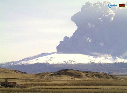
Eyjafjallajökull webcam

A webcam image of the plume from Eyjafjallajökull on 17 April 2010. If you think that this was bad, imagine an eruption 100 times more powerful. Source: EWA Blog

Such an eruption would dwarf that of Eyjafjallajökull, pumping out around 10,000 tonnes of tephra (broken up ash and pumice) per second, compared compared to Eyjafjallajökull’s 500 tonnes per second. The tephra-filled plume would speed upwards to over twice the height of Mount Everest and spread over areas the size of whole countries, high above trans-Atlantic air routes. Thunder would boom as powerful lightning flashed within it. In the surrounding country, day would be turned to night and hardy farmers with masks and torches would brave the choking air to round up their livestock. The fallen tephra would turn the landscape to a blacky, sandy desert.

Having seen the effects of Eyjafjallajökull in Europe, you can imagine what would happen with an eruption one hundred times more powerful: transport crippled as thousands of planes are confined to their hangers; airports turned to giant refugee camps; riots for tickets at ports and railway stations; panic buying of fuel; rotting mountains of undelivered food; masked youths swarming the gridlocked Champs Élysées as a weakened, blood-red, sun casts its last rays on the Arc de Triomphe. A lone survivor picking through the wreckage of the city to be reunited with his pregnant sweetheart and their quirky-but-lovable dog.

Grímsvötn

Hollywood and the newspapers have primed our imaginations for such carnage across the European continent, but the reality was not like that.

Yes, I said ‘was’.

We’ve already had an eruption much more powerful than Eyjafjallajökull: the Grímsvötn eruption of May 2011. Everything that I described in Iceland actually happened. Everything that I described in Europe was made up.  As a rule of thumb, ~100x increase in the power (discharge rate) of a volcanic eruption results in a plume ~3 times the size.  At its peak, the Grímsvötn plume reached 20 km, compared to 5-10 km for Eyjafjallajökull during much of the time that European airspace was closed.  The eruption produced about twice as much tephra (~0.7 cubic kilometres vs. ~0.3 cubic kilometres) in a much shorter time (4 days vs. 39 days), so the average discharge rate was around 20x that of Eyjafjallajökull.
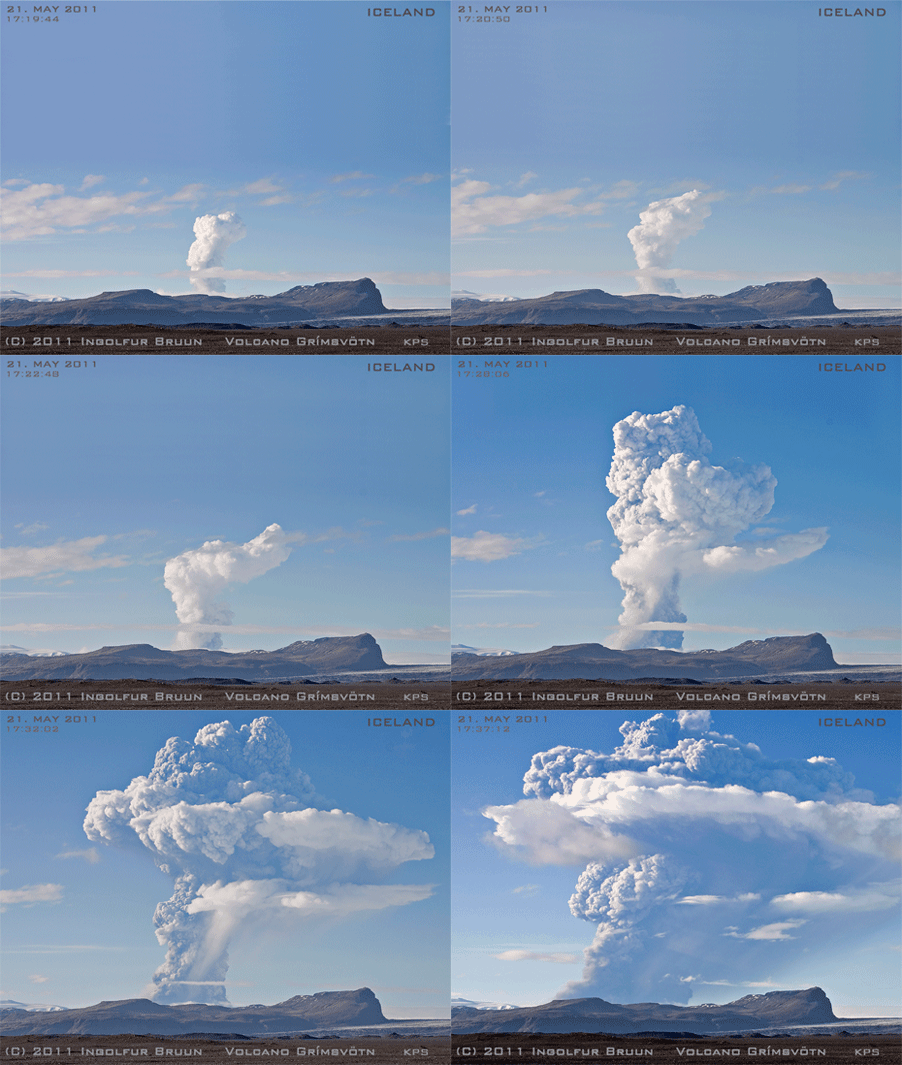
G2011 plume

Animated GIF of the beginning of the Grímsvötn 2011 eruption. This eruption was up to 100x more powerful than Eyjafjallajökull was when it was stopping planes all over Europe, but caused much less disruption to aviation. Source: Iceland in Pictures blog

The huge disruption caused by the Eyjafjallajökull 2010 eruption was a combination of bad luck (it coincided with an unusually-long period of northerly winds that blew the tephra to Europe) and bad planning (there wasn’t much information on how much ash an aeroplane could safely fly through, so the limits were set at a very low level). The rules were changed, and as a result, it was clear when the Grímsvötn eruption began that it was not going to be a repeat of Eyjafjallajökull. In fact, the disruption in Europe was relatively minor, with just 900 out of 90,000 scheduled flights cancelled. These were mainly in Scotland, Scandinavia and Germany.

The low impact is reflected in the cultural importance of the Grímsvötn eruption, as measured by the ultimate cultural barometer: Google rankings. It was the largest eruption in Europe in 50 years, but a Google search for ‘Grímsvötn 2011‘ brings back just 844,000 results. ‘Eyjafjallajökull 2010‘ gets 4.7 million. ‘iPhone 4‘ gets over 2 billion.
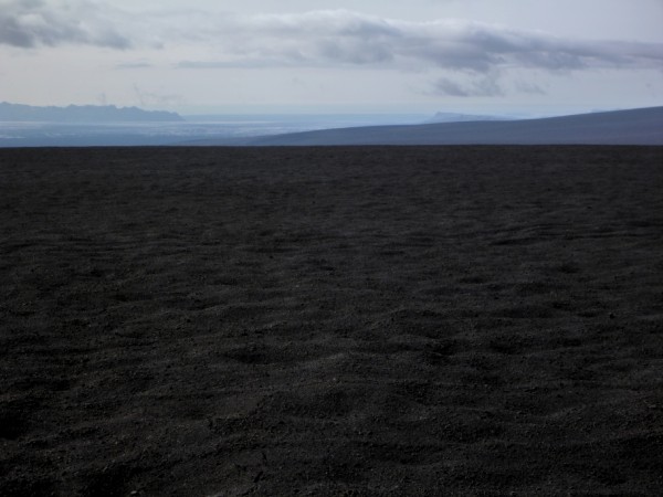
A black sandy desert

A black, sandy desert. This is the tephra deposit from Grímsvötn 2011 on top of the Vatnajökull glacier. All this should be white ice and snow. Click the image to read my post about a trip to the crater last summer.

In the eyes of the media, Eyjafjallajökull remains the default reference for an Icelandic eruption, but this view is out-of-date. The science and the organisational structures in the airline industry have improved and this is reflected in the lower impact of the Grímsvötn eruption. If the structures and technology that are in place now had been there exactly two years ago, there would have been far less disruption.

The rules are different now

The new rules for the ash concentrations through which an aircraft can fly make a huge difference to the possible effects of eruptions in Iceland.  The map shows predicted ash concentrations during the Grímsvötn eruption, on 25th May 2011. All aircraft can fly in the blue areas. If an airline makes a ‘safety case’ to the Civil Aviation Authority, they can enter the grey zones and sometimes even the red zones. Whether you can accurately map the difference between the two zones is another story.
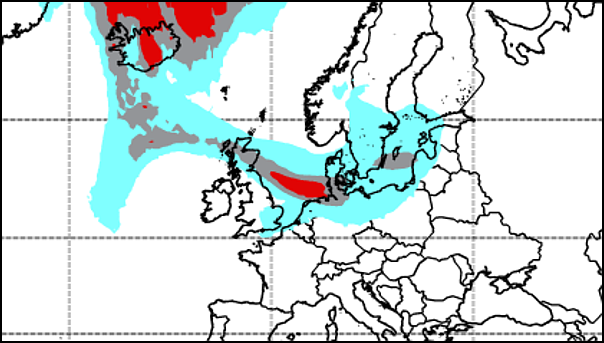
Predicted ash concentrations during G2011

Section of map of predicted ash concentrations during G2011. Under the old flight rules, all coloured areas would have been out of bounds. This would have resulted in closure of London airports. Source: Met Office, Crown Copyright 2011. Click image for full plot.

Under the old rules, all coloured areas were no-fly zones. As the cloud moved eastwards, this would have closed airports across the whole UK on the 24th May, and again on the 27th. The whole of the UK.

This means you, London!

To me, this significant point seems to be completely ignored in discussions of Icelandic volcanism. At the time, it was drowned out by claims that the ash cloud was a ‘myth’. That Heathrow airport remained open during Grímsvötn 2011 represents progress in our handling of Icelandic eruptions. Of course, there is room for further progress to be made, and much of this will come through closer linking of satellite data to computer models in order to combine the advantages of these two distinct methods of mapping ash clouds.

Reality is less dramatic than you imagine

The problem with these imagined apocalyptic scenarios is that they project events that occur in a small region around the volcano onto locations that are much further away. They forget that London is about 1700 km from Eyjafjallajökull. It is a very long way; more than 500 miles and 500 more. Even the Proclaimers would not walk that far. The effects of even the largest eruptions are much less severe at such great distances.

The worse case scenario for Europe is a large flood-basalt type eruption, which would last for months with repeated flight disruptions and the release of abundant toxic and weather-changing gases. The Laki eruption of 1783-4 produced 14 cubic kilometers of lava and was associated with tens of thousands of deaths in Europe caused mainly by heart and respiratory problems.

Fortunately, these eruptions are rare, with only two in the past thousand years, but if one did occur, I suspect that the reality of even this would be less apocalyptic than you might imagine. You would not see whole families cut down in their prime, spluttering and bloody-mouthed. The closest analogy is a heatwave in France in 2003. It killed nearly 15,000 people there, but, to quote The Day Today, most of them were old and would have died soon anyway. This group of people are also the most at risk from a Laki-type event, but unless you worked in a hospital or were unfortunate enough to know one of the victims, the extra deaths may pass unnoticed. Furthermore, this is also a scenario where good government planning could really reduce the impact.

And Katla rumbles on…

Meanwhile, the media obsession with Katla continues, particularly following increased seismicity over the past year. The truly awesome floods that can accompany Katla eruptions are a genuine concern for Icelanders, but as far as the Europe is concerned, 16 of the 20 Katla eruptions since 920 A.D. that have been measured were similar to, or smaller than, the 2011 Grímsvötn eruption. It is therefore probable that the next Katla eruption will have similar consequences: some flight disruption, mainly in Scotland and Scandinavia, probably for 1-2 days.
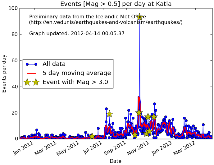
Earthquakes per day at Katla since Jan 2011

Earthquakes per day at Katla since Jan 2011, showing increased activity since last summer. What it actually means is unclear. Click the image for more information.

Erik Klemetti wrote a nice article on his Wired Eruptions blog about how news websites regularly peddle fear of an Icelandic eruption . He said that Katla was the media favourite because it is: “(a) near Eyjafjallajökull; (b) hasn’t erupted in a long time; and (c) easier to pronounce.” One of his readers, Carl le Strange, left a suggestion on how to address this. I think that it is an excellent idea, and a perfect antidote to the hype surrounding the 2nd anniversary of the Eyjafjallajökull eruption.

Sometimes I think they should rename Katla into Lítileldfjallsemmunaðeinstaugarnar, that should really take care of the problem…

[…]

Oh, and that odd name would be in english “Smallvolcanothatwillonlyirritate”

Edit April 2015 – Further reading:

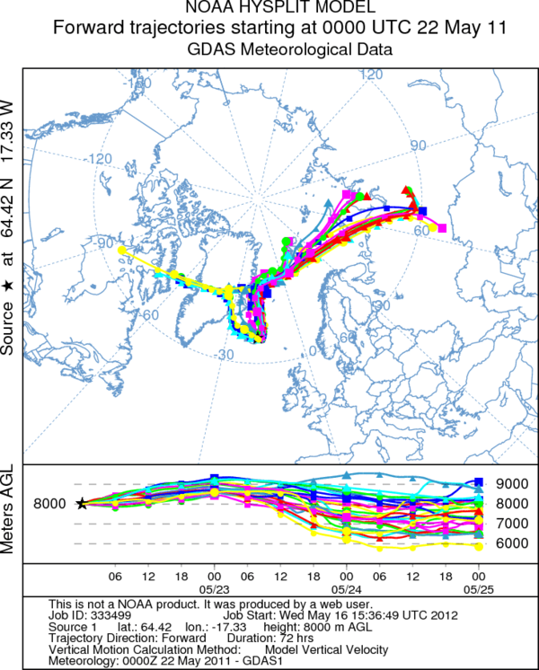
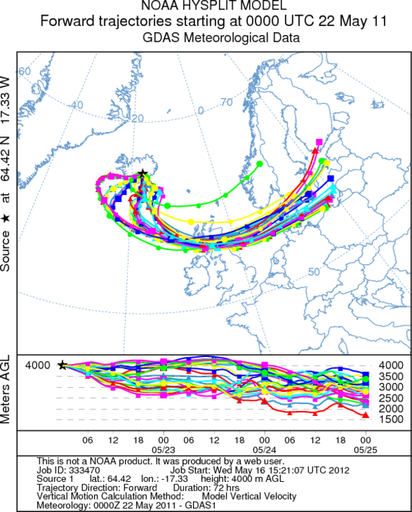
In the summer of 2013, we published a paper on the effects of the Grímsvötn eruption on the UK.  I wrote one blog post explaining our findings that samples of various types (including some collected by citizen scientists) can map the progress of an ash cloud, and another that explained why the timings and locations agreed with predictions from computer models but the concentrations were different.  Have a read to learn more.

You can also can watch the video of my 2014 Geographical Association lecture, Do Iceland’s volcanoes pose a threat to the UK?
Categories: Uncategorized

Sounds of the Underground

This is a post that I originally wrote in June 2007.  It contains sound files that let you hear the crashings and rumblings that go on beneath the ground near Volcán de Colima, Mexico.  I’m reposting it today because a) it deserves a wider audience, b) I’m off to map the deposits of the Hekla 4 eruption in Iceland soon and don’t have time to write a fresh post this month, and c) Mexican earthquakes are in the news today.

I hope that you enjoy it.


Earthquakes in Colima

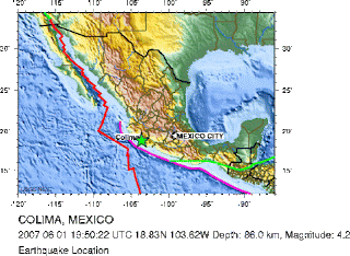
We had a couple of earthquakes last week. The first was magnitude 5.2 and took place at about 05.30hrs on Wednesday morning. It was the talk of the town the next day, but a healthy dose of tequila the night before had ensured that we slept straight through it. One of the aftershocks came at lunchtime the following day and was quite impressive as it rattled window panes and shook me in my chair. It was a magnitude 4.2, which isn’t huge but the epicentre was only 25 km away so it still felt strong.

Image from http://earthquake.usgs.gov

The people of Colima get rightly scared when the earth shakes. In 2003 there was a magnitude 7.8 that flattened buildings all across the town and killed a number of people. Considering that the extra energy released by each grade on the Richter scale is 10x larger than the previous and that the 2003 earthquake was therefore ~1000x more powerful than the one that we felt, it must have been pretty scary.

Seismicity as sound

On Friday I discovered how to convert the traces from the seismograms into sound files so that we can ‘listen’ to the earthquakes. Volcano seismologists have been doing this sort of thing as part of their analysis of the seismic signals for ages. They use it to detect changes within the plumbing of volcanoes that may one day be a method of predicting eruptions. I did it because the results sound cool. The sounds produced are not real – they are vibrations of the Earth that have been sped up 50x so that we can hear them with our ear. But you can clearly tell the difference between various types.

Click the images to hear the sounds.

**If you get a taste for seismicity as sound, check out this post on the Highly Allocthonous blog that demonstrates the power of last year’s Japan earthquake.**

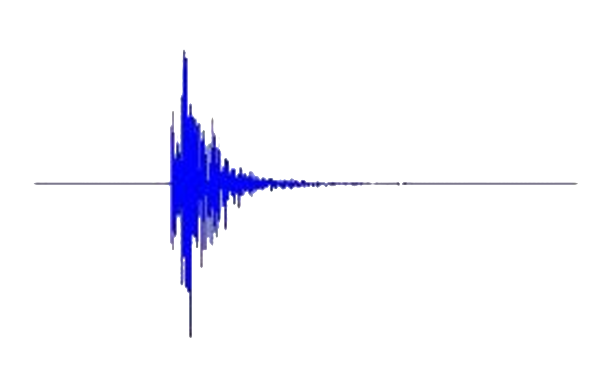
Earthquake

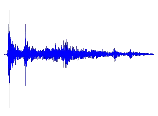
earthquakeThe trace above is from a tectonic earthquake.  It sounds like a cross between someone slamming a door and the rumble of distant thunder. This is the noise of big slabs of rock grinding past each other in a sudden jerk.

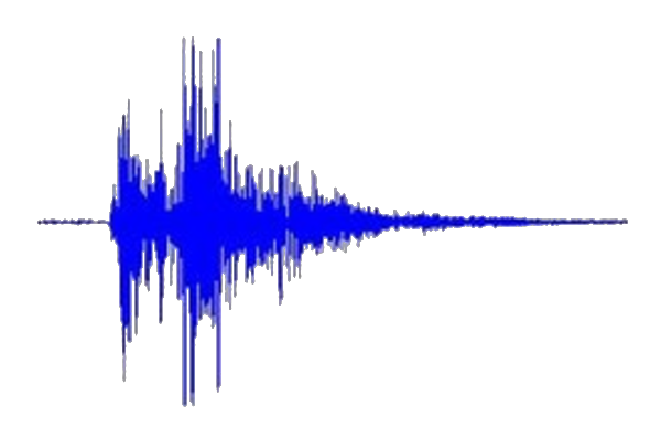
Explosion

explosionThis trace is from an explosion at the volcano. It is the sound of pressurised gases explosively bursting free from the crater, carrying ash and rock fragments with them. It is easy to hear the energy tail off as the pressure is released.

Harmonic tremor

tremorA third kind signal comes from harmonic tremor. It sounds a bit like whale-loving or a broken trumpet. This type of signal is a bit special, as it is thought to be caused by seismic waves travelling within a gas- or fluid-rich conduit beneath the volcano. Different frequencies are amplified or cancelled-out like sound waves in a music instrument. Volcano seismologists use the changing frequencies of the signals to estimate things like pressure beneath the ground.

Categories: Uncategorized

One year of volcan01010: Best of 2011 and coming up in 2012

This week is the first anniversary of the volcan01010 blog.  With this post, I want to pick out some highlights from 2011, and to whet your appetites for some things to come in 2012.

Top 3 posts:

The main aim of the blog is to be a source of reliable and easily-understood information on Icelandic and other volcanism.  I also want to showcase the use of open-source software in (geo)scientific research.  Most posts are ‘feature-length’ to allow a deeper discussion of each topic, and I hope that this means that they are worth returning to months after they are first written.

The following 3 posts were among the most popular and give a good summary of what the blog is about:

  • Grímsvötn eruption – frequently asked questions.  This post, written at the onset of the May 2011 eruption, explained why the eruption was unlikely to cause as much disruption as Eyjafjallajökull 2010, even though it was bigger.  The post got lots of hits because is was quoted by a number of news websites.  It is worth re-reading, because the same will most-likely apply to the next Katla eruption.
  • Grímsvötn 1 – Crossing the glacier.  In August, I was lucky to join an expedition to the crater of Grímsvötn to study the newly-erupted material.  It was an adventurous journey involving monster-trucks, crevasses and a crazy landscape of ice and tephra.  This post describes the journey and explains what we found.
  • All the software a geoscientist needs. For free! This post explains how you can replace packages such as Microsoft Office, ArcGIS, Matlab, Adobe Photoshop, CorelDraw with free and open source alternatives.  Not just because it is cheaper, but because it makes your workflows portable and easy to automate.

    Crossing the tephra-covered glacier on the way to the crater of Grímsvötn. Click the image to read more.

Volcanoes, software tricks and general musings

There were a number of other Grímsvötn posts, explaining how to collect samples of falling ash in the UK and why it is so difficult to map the ash plume from a volcano.  There were also posts about the deposits of the huge Hekla 4 eruption and the massive floods from Katla that make her eruptions so serious for Iceland.  Outside of Iceland, there were videos of lahars at Volcán de Colima and an animation of the globe-spanning plume from Puyehue Cordon-Caulle.

Need to chop/rotate/annotate/join some images in a hurry?  There was a post on ImageMagick to show you how.  There were also general musings on the striking similarity between piles of grain and the shape of mountains and wondering why people insist on using Imperial units to measure babies.

The site now has an archive page, Every post ever, which you can browse other posts that might grab your interest.

Coming in 2012

Van

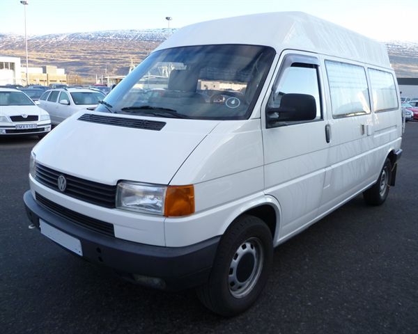
My home for the summer in Iceland: a VW Transporter T4 Syncro van.

From the end of March, I am off to live in a camper van in Iceland until the late autumn.  I will driving round the country digging holes and sampling prehistoric tephra (pumice + ash) layers.  I will be working with the Icelandic scientists responsible for monitoring their volcanoes, so if there is an eruption from Katla (who is still rumbling) or Hekla or anywhere else then I will be able explain things with the best information, direct from the scientists themselves.

On the computing side, it is a longer-term aim to post an introduction or quick-start guide to each of the programs described in the All The Software post.  The Image Magick post is an example of this.  Many of these will form part of a series called Quit wasting your life with Excel.  Watch this space.

Subscribe, then tell all your friends

The best way to follow volcan01010 is to subscribe to the RSS feed.  If you’ve never heard of RSS, read this guide.  It lets you keep track of posts that you have read and tells you when a new one is out.  You can also follow me on Twitter (@volcan01010).  This way you get updates with other news and links that I think are cool, but if you follow lots of people then it can be easy to miss announcements of new posts.

Volcan01010 now has 201 followers on Twitter, and in the last year the blog scored 21,679 page views from 10,049 unique visitors in 149 countries (with the vast majority in the UK and USA).  It has passed an important psychological barrier of at least 100 reads per new post, which means that the total time spent reading an article is now more than the time it takes to write!

If you find the blog interesting or useful, then please tell all your friends.  Then tell them to tell all their friends, too.  It’s going to be an interesting year.

Categories: Uncategorized

A Very Scottish Skyline

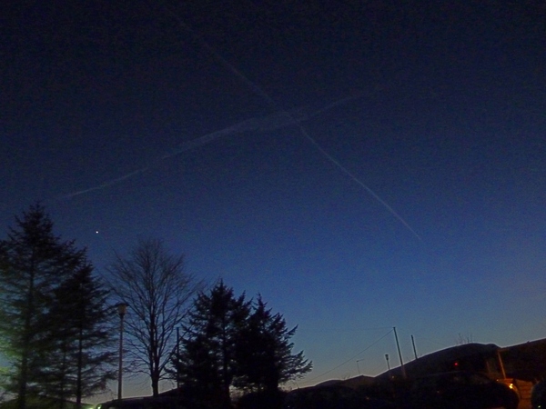
A Very Scottish Skyline

Crossed contrails in the sky above Edinburgh this evening, looking south toward the Pentland Hills. Click to enlarge.

In 2014, Scotland will have a referendum to ask the people if they want to become an independent country.  The Scottish National Party will be campaigning hard for a ‘Yes’ vote.  Does that extend to some kind of deal with air traffic control?

Or perhaps it is a good omen ahead of Scotland against England in the 6 Nations rugby this weekend?

The image is licensed under a Creative Commons Attribution-ShareAlike 3.0 Unported License. You can use it if you link back to this page.
Comments Off on A Very Scottish Skyline
Categories: Uncategorized

Iceland’s melting glaciers and other stories from the Nordic Geological Winter Meeting

This post describes my highlights from the 30th Nordic Geological Winter Meeting that took place in Iceland last week. The most interesting results include that Iceland’s glaciers may be gone in 200 years, that the May 2011 Grímsvötn eruption was supplied by a fresh input of magma, and that melt flows upwards into the columns that form when lavas are cooling.

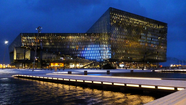
The meeting took place in Harpa, Reykjavík's newly-opened opera house and conference centre. It was attended by over 250 participants, mainly from Nordic countries. Sessions covered topics such as tephrochronology, glaciology, and igneous, metamorphic and resource geology.

Iceland’s shrinking glaciers

The alarming conclusion of Helgi Björnsson’s talk was that Iceland’s glaciers may have less than two centuries left. This seems incredible, given that they are so huge, but Björnsson demonstrated how their rapid demise results from a positive feedback loop or vicious circle: the smaller these ice caps get, the faster they will shrink. Understanding this depends on a concept known as the Equilibrium Line Altitude (ELA).

Above the ELA, more snow and ice accumulate on the glacier in the winter than are lost in the summer. The opposite is true beneath the ELA, which is known as the ablation zone. As long as the area above the ELA is large enough to collect enough snow to replace the ice lost beneath it, the glacier will be stable. With rising global temperatures, the ELA is rises, the glaciers lose more ice than can be replaced by annual snowfall, and they shrink. But this alone doesn’t explain the rapid shrinking.

Björnsson and colleagues have mapped the bedrock surface beneath Iceland’s glaciers using ground-penetrating radar. This is how we know, for example, that Katla’s glaciers are ~500 m thick. But this means that the surfaces of the glaciers are only above the ELA because of the ice itself. For example, 65% of the area of Vatnajökull is above the ELA, but only 20% of the bedrock is. As glacier shrinks, the surface altitude of the ice decreases, which reduces the area above the ELA, which makes the glacier shrink faster and so it continues.

There are equations that show how snow is compacted into ice. There are equations that show how glaciers flow under their own weight. There are equations that show how ice melts at lower, warmer, elevations. Combining these with the surface shapes of the glaciers, the radar maps of the bedrock and estimates of future climate (2°C increase by 2100), Björnsson and colleagues modelled the glaciers to see how they would change shape in the future. They concluded that they would be mostly gone in 150-200 years.

The disappearing ice was a theme in other glaciology talks and even in other sessions. Another glaciologist, Thorsteinn Thorsteinsson showed the results of 25 years of monitoring the Höfsjökull glacier, during which period it has lost 6.5% of its mass. The summers of 1991 and 2010 were particularly bad for the glacier, when a coating of fresh volcanic ash caused extra melting. Over in the geodynamics session, Thóra Árnadóttir presented results from GPS stations that are looking for tiny movements of the land surface caused by plate tectonics or volcanic activity. Every station that they put on the mountains poking through the glaciers (nunataks) shows a strong upward motion. This is caused by the land rising as the weight of the ice disappears, and is something to bear in mind when looking for signs of inflation at ice-covered volcanoes.

Reykjanes

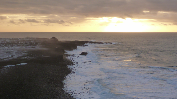
The Reykjanes peninsula basking in the midday January sun. This is where the mid-Atlantic ridge comes ashore. If you swam due south from here, the next land that you would hit would be Antarctica.

Fresh magma drove the Grímsvötn 2011 eruption

Olgeir Sigmarsson’s talk looked at the geochemistry of the magma from the Grímsvötn eruption in May, and concluded that the reason that the eruption was so powerful is that it was driven by a fresh batch of hot, gas-rich magma from deep beneath the volcano (see my post from August to see the deposits close up).

Geochemistry is a very important tool in understanding volcanoes. It relies on two facts, which will be familiar to any students of a Volcanology 101 class:

  1. Magma is a cocktail of many different chemical elements and their oxides e.g. SiO2, Al2O3, MgO, CaO, F, Cl.
  2. Magma doesn’t all melt or freeze at once or at a single temperature.

As magma solidifies, crystals grow, and the concentration of the ingredients of those crystals is reduced in the remaining liquid. For example, MgO is removed from the liquid when crystals of the mineral olivine ([Mg,Fe]2SiO4) form. This process is called fractional crystallisation.

A key piece of evidence in Sigmarsson’s talk was the concentration of the element thorium (Th) in samples of ash and pumice from each Grímsvötn eruption of the 20th century.  These show an increase in Th concentration over time.  This suggests that they all came from the same source beneath the volcano (the magma chamber), where growth of crystals of low-Th minerals results in an increase in concentration in the remaining melt. This melt was erupted in each of the events that produced the samples e.g. in 1998 or 2004, and was probably left over from the huge Laki eruption in 1783. The Grímsvötn 2011 samples contain much less Th than previous eruptions. This implies that it is a different magma: hotter, richer in gas, and closer to the composition of the original melt that formed in the mantle.

Melt migration into lava columns


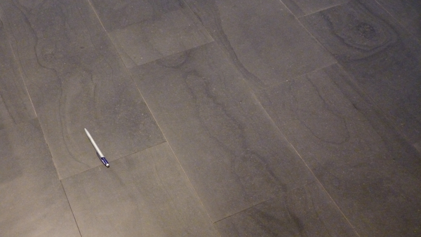
Hannes Mattsson gave a presentation suggesting a previously-undescribed process within cooling lavas that explains the patterns in polished lava tiles (see image) as part of a study into the formation of columnar joints in basalt.  This work has already been published in the journal Nature Communications.  Joints are a system of cracks in a rock, and columnar joints break the rock into columns. Famous examples of columnar jointed lavas are the Giant’s Causeway in the UK, the Devil’s Postpile in the USA and Svartifoss in Iceland.  Mattsson and colleagues found that melt flows into the columns as they form.

Floor tiles in Harpa

Basalt tiles on the conference centre floor. These were quarried from columnar-jointed lava, and each tile is a slice through a column like a plank of wood. The pattern, which resembles the grain in wood, results from melt movement within the columns as they cooled.

Columnar joints form because lava contracts as it cools. Usually, the top of the lava, exposed to the air, cools most quickly and the cracks grow downwards into the flow. Experiments show that basalt lava shrinks by 10-15% when it solidifies, but the volume of the gaps created between the columns is much less than this.  Mattsson’s group thought that this is because more material flows into the columns as they form.  Sometimes you can see where finger-like parcels of lava have done this, but they are not very common, so another mechanism is required.

This mechanism is also based on the fact that magma doesn’t freeze or melt all at once.  As the lava cools, the first crystals to form are tiny, white, matchbox-shaped grains of plagioclase feldspar.  The dark bands in the tiles are rich in a black-coloured mineral called titanomagnetite, which is the last mineral to start crystallising.  If lots of plagioclase crystallises, then the crystals can lock into each other and form a network with some strength.  By this point, the lava is effectively rigid, but the remaining melt is still free to move through the gaps between the crystals.  It is equivalent to sucking coffee through a sugar cube.

Titanomagnetite, as the name would suggest, is magnetic. To test their hypothesis, Mattsson and colleagues measured the magnetic field across the column. It showed that the titanomagnetite grains were all lined up parallel to the column’s edge, instead of begin randomly orientated, or lined up with surface of the ground.  This demonstrates that melt flows into the columns from the molten interior of the flow, and seems to confirm their idea.  The different colours of the individual bands could be explained by different pulses of melt moving in.

If you visit Iceland, you will surely see these patterns, as the same tiles are used in the floor of Keflavík airport. Now you know what they are.

Other highlights

Football on the city pond

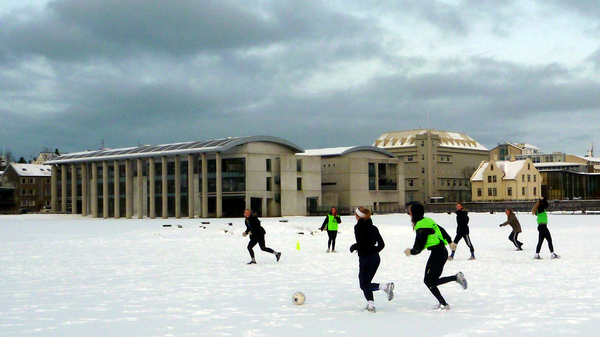
The conference was opened by the president of Iceland. He knew how to play to a room full of geoscientists. In his address, he said that seven-day creation myths are clearly false because Iceland was still being created. I imagine that he is equally unimpressed by stories about walking on water; in Reykjavík, people play football on the city pond.

  • Thor Thordarson explained that subglacial basalt eruptions may release less sulphur dioxide than their subaerial counterparts because quenching of the magma by meltwater can freeze the gas inside the pumice and ash.
  • Anja Schmidt looked at how tiny sulphate particles formed from volcanic sulphur dioxide would be dispersed across Europe by another Laki-sized eruption. Using equations linking air pollution and cardiopulmonary fatalities, she predicted that around 140,000 extra deaths could be caused in Europe (depending on weather conditions).  The full study was published in PNAS last year.
  • Guðrún Gísladóttir looked at sediment accumulation in western Iceland in lake and soil cores.  You can easily spot the time when Iceland was settled around 900 A.D. because there is a distinctive ash layer from an eruption at the time.   Before settlement, Iceland’s largest herbivore was the goose. The arrival of tree-chopping men and their vegetation-munching livestock coincides with a big increase in wind-blown sandy material in the cores as the plants that previously held it in place were stripped away.
  • Rikke Pedersen concluded that the best way to explain a donut-like ring of uplift around Hekla between 20 and 40 km from the crater is that material is being added to a magma chamber deep below the volcano, while the upper part is subsiding under its own weight.
  • Halldor Björnsson used webcam footage from Eyjafjallajökull and point-tracking computer software to study how the way that the plume rose above the volcano. These results will feed into improved understanding of how ash clouds form. This study is another great example of quality science being done using public data and a bit of programming skill.
  • Sean Pyne-O’Donnell reported on the identification of ash grains from Alaska and the Cascades in peat bogs in Newfoundland, showing that ash from very large eruptions can travel great distances. He suggested that some ash grains found in Europe, and which have no chemical match with known Icelandic eruptions, may have come all the way from the Americas.

Ash from Iceland fell in the UK

My own talk showed that the recent eruptions of Eyjafjallajökull and Grímsvötn both deposited ash in the UK. It included a map of where Grímsvötn ash was found in the UK based on the tape samples sent to the British Geological Survey after our call last May. Thanks again to everyone that sent them in. The talk made the front page of the local paper, which was exciting, even if all the quotes about other European locations that were attributed to me actually came from someone else.

Acknowledgements and caveats

I am grateful to Marie Curie Actions, who provided funding to allow me to attend this meeting. All of the information presented above is based on my understanding of the conference and is therefore only as accurate as my note-taking on the day.

Comments Off on Iceland’s melting glaciers and other stories from the Nordic Geological Winter Meeting
Categories: Uncategorized

Colima lahar videos

The Indonesian word, lahar, is the technical term used to describe volcanic mud flows. This post explains the difference between two types of lahars (hyperconcentrated flows and debris flows), using videos that I recorded at Volcán de Colima as examples.

I’d been meaning to post these for a while. This month, the Accretionary Wedge (a collection of geoblog posts linked by a common theme) gave me an excuse. The current theme is ‘Geological Events That You’ve Directly Experienced‘.

The ingredients for a lahar

The summer of 2005 was the most active period at Volcán de Colima in nearly 100 years. Hundreds of explosions blasted from the crater; the largest produced pyroclastic density currents that dumped millions of cubic metres of smashed-up volcanic rocks upon the upper slopes and within the ravines (barrancas) on the flanks. Uncemented by clays, the deposits are a loose, rubbly mixture of boulders, cobbles, gravels and sandy and dusty ash.

Fast-forward to summer 2007, and the middle of the rainy season. Sweaty, humid nights dawn into blazing sunlit mornings, but clouds soon form. By 12.00hrs the summit of the volcano is lost and thunder begins to rumble. Mid-afternoon, every day, the tropical rain hammers down. And I mean hammers; rainfall of 100 mm in 3 hours is not uncommon. By contrast, London gets 750 mm in an entire year.

The first video shows what this kind of rain looks like. I had gone with Flo, a volunteer at the Universidad de Colima, to maintain a radar monitoring station on the south flank of the volcano, about 3 km from the crater. (Click here for a Google Earth file that shows the monitoring station and the debris-covered flanks of the volcano). We had barely started our work when the rain arrived, so we had to sit it out in order to finish what we needed to do.

The three ingredients for a lahar, steep slopes, loose debris, and heavy rain, were in place.

Hyperconcentrated flow

Hearing a gradually increasing roar from the barranca to our west, we went over for a look. A lahar was flowing in the bottom of the channel, crashing boulders and splashing mud and roaring with the white noise of rocky collisions and hammering rain. The second video shows it in action.

The technical term for this type of lahar is a hyperconcentrated flow. It contains mainly water, but with 20-60 vol% sediment. The finer material is mixed turbulently into the muddy water, but the bigger rocks are moved by bouncing or rolling along the floor. Deposits from the flow contain mainly silt/sand and gravel and can be stratified, although they often have no obvious structure and the bigger rocks are isolated, supported by their finer surroundings.

About 30 seconds into the video, a big raft of boulders comes charging down the valley (Flo gets very excited). You can see clearly how they jostle each other as they rattle past us. These ‘inter-grain collisions’ are important in allowing fragments of solid materials to flow.

Debris flow

Once we’d seen enough, and had begun climbing back up to the radar station, we felt the ground begin to really shake. Something much bigger was coming, so we ran toward the barranca, and arrived just in time to see a wall of boulders about 2-3 m high sweep round the corner like an oncoming train. Retreating to a slightly higher perch, I recorded the third video.

This time, the flow has a different regime, known as a debris flow. Debris flows are mainly sediment (>60 vol%), and the water mixes with the finer material to form a wet-concrete-like slurry that lubricates the flow of the boulders. This one was moving at over 10 metres per second (36 km per hour).

Inter-grain collisions keep the heavy boulders moving, and a process called kinetic-sieving, where the smaller rocks fall down gaps between the larger ones, can concentrate the largest boulders at the top and at the front of the flow. You can see this at the very start of the video. Also, because the slurry is so heavy with sediment, boulders can become buoyant. At about 20 seconds into the video, a ~1 m wide rock floats by on the surface of the flow.

Debris flows can form from hyperconcentrated flows that bulk-up by eroding sediment from the channel walls, especially if a large part of the wall collapses. I think that was what happened here. Hyperconcentrated flows can turn into debris flows if they are diluted by water from tributary streams, or if they deposit a load of their sediment when they reach flatter ground. The latter was the most likely fate of this debris flow.

Learning from experience

Having the direct experience of lahars at Colima reinforced three things in my mind. These are things that should have been obvious, but are more sharply defined having seen them first hand.

  1. Lahars happen all the time. From the tectonically inactive shores of the UK, lahars sound exotic and exciting, but in Colima they are just weather. High on the volcano’s flanks, small lahars occur just about every time that it rains. Generally, they deposit most of their material harmlessly within 5 km of the crater, where the gradient of the channel gets less steep.
  2. Lahars are powerful and dangerous. The momentum of the fast-moving boulder mixture is incredible, and the potential for destruction is clear.  Bigger events can travel further from the volcano, reaching inhabited areas. Lahars from Volcán de Colima prompted evacuations in 2007, destroyed a house in 2000, and resulted in 20 fatalities in a town ~20 km from the crater in 1955. Elsewhere, Semeru, Mayon and Pinutubo have all produced fatal, rainfall-triggered lahars.  This video from Semeru makes the Colima lahars above look tame.
  3. A lahar is a wet pyroclastic density current. The inter-grain collisions and other processes in a lahar are broadly the same as those that allow pyroclastic density currents (PDCs; aka pyroclastic flows) to travel so far from their source volcanoes.  The difference is that PDCs are lubricated by hot gas, not water. This video from Mt Unzen, Japan is a good example.  If you could see through the billowing cloud of 200°C dusty ash, the blocks and larger rocks rattling along the river bed would look very similar to those in the videos above.

Volunteer scheme

I filmed these lahars while I was working as a postdoc at the Centro de Intercambio e Investigación en Volcanologia (CIIV) at the University of Colima.  The CIIV has a volunteer scheme that provides opportunities for people to gain experience working on an active volcano. Volunteers need only basic computer-literacy, an ability to spend days out hiking, plenty of enthusiasm and at least a couple of months to spare. For more information, visit http://www.ucol.mx/ciiv.

Categories: Uncategorized