Friday Focal Mechanism: Magnitude 7.2, Western Pakistan

A post by Chris RowanThe biggest earthquake this week occurred on Tuesday in Western Pakistan. The USGS pegs it at Magnitude 7.2, with a depth of 68 km.
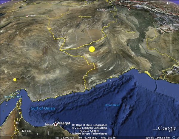
The rupture (big yellow dot) occurred at ~70 km depth beneath western Pakistan, close to Afghan and Iranian borders

The focal mechanism indicates that this rupture was due to extension in a northwest-southeast direction (for the puzzled, here’s a primer on earthquake beach balls).

This seems quite odd at first, since we are clearly in a region of plate convergence. The Himalayas and Tibetan plateau to the northeast are perhaps the most dramatic expression of the ongoing collision of India (and, to the west, Arabia) with Eurasia, but even in western Pakistan the topography is dominated by a prominent curved fold and thrust belt (which appears to be a substantial control of the course of the Indus river to the east).
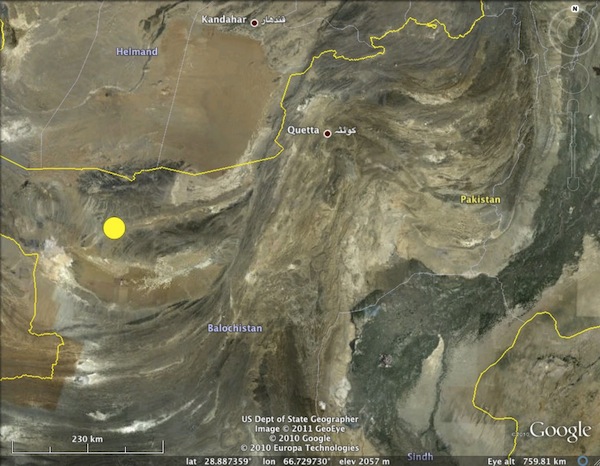
Close up of fold and thrust belts in Western Pakistan - the faulting that formed these is too shallow to be associated with the earthquake.

However, look again at the depth of the earthquake. Depending on the algorithm and the types of seismic waves used in the calculation, the estimated rupture depth varied between about 50 and 80 km. This was quite fortunate for the Pakistanis still trying to recover from last year’s devastating flooding: although the earthquake was released twice as much energy as the recent events in Haiti and Christchurch did, seismic energy spreads out and dissipates the longer it travels through the solid earth, so there was only mild (if widespread) shaking at the surface.

So this earthquake occurred a long way below the crust being deformed by thrust faulting in this area – in fact, it almost certainly occurred deeper in the Earth than the crust in this region is thick. However, the plate boundary in this particular region is rather interesting, because of the presence of the Makran trench just off coast to the south. This marks the position of a narrow subduction zone, hemmed in on either side by areas of colliding continental crust, where oceanic crust is being thrust down into the mantle.
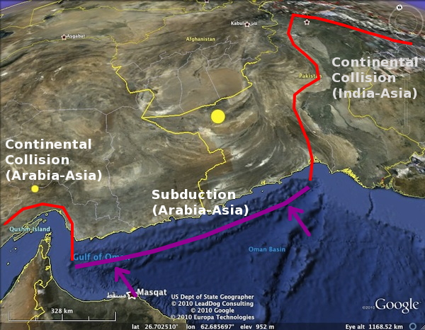
The Makran Subduction zone, sandwiched between two areas of continental collision.

This means that there is a subducted slab dipping beneath western Pakistan. Data on its shape and extent are rather sparse – the nexus of Iran, Pakistan and Afghanistan is not really a place you can just wander into and deploy a local seismometer network. However, I did manage to dig up a paper that plots the location of earthquakes large enough to be picked up by the global seismometer network. The deeper earthquakes in this dataset trace out a zone of seismic activity that gradually dips northwards beneath western Pakistan, which Tuesday’s earthquake also appears to fall within.
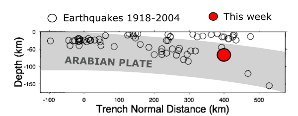
Rough shape of the subducting Arabian plate (shading added by me) based on the earthquake locations of Enghdal et al. (2006), compared to the location of this week's M7.2 quake.

It seems most likely then, that this earthquake was a rupture in the subducted Arabian plate. Extensional earthquakes are not uncommon in subducting slabs; the weight of already subducted material deeper in the mantle can exert a fairly substantial pulling force, causing the shallower parts of the slab to stretch. In this particular case, the direction of extension is not quite in the northerly, down-dip direction you would expect from ‘slab pull’, but the narrowness of the subduction zone, and its position sandwiched between two areas of colliding and thickening continental crust, may have complicated the forces at work.

Categories: earthquakes, focal mechanisms, geophysics, tectonics

Flooding on the flanks of Mt. Hood

Flooding on the East Fork Hood River, January 16, 2011. Photo by Sue Marsh and used with permission.

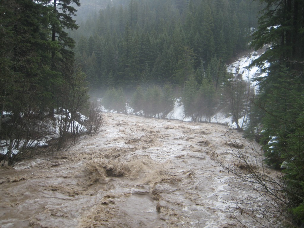
Flooding on the East Fork Hood River at the Tamanawas Falls trailhead, January 16, 2011. Photo by Sue Marsh and used with permission.

A post by Anne Jefferson It’s the middle of January. You’ve traveled to Oregon’s majestic Mount Hood for a weekend of skiing the snow- and glacier-covered slopes. On Saturday morning when you begin to head up the mountain from Portland, it’s warm and raining. “No problem,” you think, “it will be snowing at higher elevations.” (Thanks to generally decreasing temperature with increasing elevation, or the environmental lapse rate.) But it’s not. Instead, it is raining. Not just run-of-the-mill Oregon drizzle, either. It’s really raining hard.

That’s not just a made-up story. It happened last weekend. On January 15-16, 2011, Portland got ~40 mm (1.4″) of rain. Timberline Lodge, Mt. Hood’s most famous and highest elevation ski lodge, got 170 mm (6.76″). Of rain.

Rain on the mountain was thanks to warm, moist air being blown in from the Hawaiian Islands. This was a classic “Pineapple Express.” The extra-large helping of rain at higher elevations was the result of the orographic effect, in which mountains force air to move up in elevation, where it cools and can’t hold as much water vapor, so it produces more rain.

All that warm rain had to go someplace. And the first thing it hit on the mountainside was the snowpack. At the Mt. Hood SNOTEL site, 36 cm (14″) of snow depth were melted away by the warm rain between Friday and Monday. That contributed an additional 33 mm (1.3″) of liquid water to the festivities. So, something like 200 mm (8″) of water was loosed upon the the landscape over a two day period. (More at higher elevations, less at lower elevations.)

Some of that water probably soaked into the ground, but a lot of it ran off into the streams and rivers that drain the flanks of Mt. Hood. Below, I’ve reproduced the hydrographs of two of Mt. Hood’s Rivers to give the quantitative picture of what happens when that much water reaches a river in a short amount of time.

Hydrographs of Hood and Sandy Rivers for flood of January 15-16, 2011 (Data from USGS)

Hydrographs of Hood and Sandy Rivers for flood of January 15-16, 2011. The Sandy River (at the Marmot gage) drains Hood's west side, and the Hood River (at the Tucker Bridge gage) drains its northeast side. The gap in the Sandy River data represents an equipment failure or lack of an adequate rating curve at high water levels. (Data from USGS)

I could wax lyrical about what I see in those hydrographs, but I think the following two videos do a pretty good job of showing the amount of sediment (and large trees and roadway) that 350 m3/s can carry out of the mountains.

The Sandy River from alexandra erickson on Vimeo.

The thing about this past weekend’s flood, though, was it’s utter unremarkableness. A few ill-positioned streamside cabins and some roadways bit the dust, but most infrastructure was fine. Because floods like this happen quite frequently. In the graph below, I’ve reproduced the same hydrographs for this past weekend. But now I’ve added the most recent good-sized flood (November 2006, which I have blogged about before), and the rather larger 1996 and 1964 floods for comparison.

2011 flood hydrographs in comparison to 2006, 1996, and 1964 peak flows for the Hood and Sandy Rivers, Oregon (USGS data)

2011 flood hydrographs in comparison to 2006, 1996, and 1964 peak flows for the Hood and Sandy Rivers, Oregon (USGS data)

Oregon builds for flowing water much more powerful than last weekend’s flood. So while the wet weather created some localized problems, the videos above clearly show that this sort of event mostly just makes for something different to do on the weekend (flood-watching in lieu of skiing).

What would have changed that equation is if large or numerous landslides had been triggered by the rain and running water, like they were in a similar event in 2006. When flowing water becomes flowing car-sized boulders, the damage gets much more serious. Thankfully, Mt. Hood had a healthy snowpack that could sustain 36 cm of rapid melt without exposing the loose sediments that give rise to such boulder torrents. Plus, the places most likely to produce landslides had done so only four years earlier, so they may not have been as overloaded with sediment ready to move. Nonetheless, as warmer winter temperatures reduce snowpacks, bring more winter rain, and force glaciers to retreat (exposing more loose sediment), it’s likely that the mid-winter rain storms of the future will produce more landslides along with the floods. And, as one unfortunate Mt. Hood ski resort learned in 2006, landslides don’t just force skiiers into becoming flood watchers, but can ruin the whole season.

Categories: by Anne, geomorphology, hydrology

The elephants in the room at ScienceOnline 2011

A post by Chris RowanThe annual ScienceOnline conference can’t generally be considered as a stand-alone event. Because it brings together a few hundred people who are constantly interacting with each other online, it acts more of a snapshot of the current status of discussions that have been going on long before before the conference started, and will continue in the months to come. With that in mind, my summary of the 2011 conference, which occurred last weekend, attempts to highlight not just the things that were said, but the things that were not said; or, more broadly, the undercurrents and unresolved issues that I feel are going to be an important component of these conversations in the next 12 months.

  • Scientists can refine their message, but how effective is this when the media fixes the rules of the game?

    Chris Mooney told us that we need ‘Deadly Ninjas of Science Communication’, Tom Peterson of the National Climatic Data Center said that he had been told by a Congressman that the debate over climate change was a ‘knife fight’, and Josh Rosenau drew some compelling parallels between the tactics and rhetoric employed by denialists and the creationist playbook. And yet, there was still a rather odd focus on the communication skills – or the implied lack thereof – of scientists as the reason that so many seem to think that the basic fact of anthropogenic climate change is still up for discussion. Sure, we can refine our message. But how effective is this in a media landscape, particularly in the US, where manufactured controversy abounds, and people who knowingly distort and misrepresent the science are happily given a megaphone? Our ninjas are going to need more than better framing in their toolkit of rhetorical jujitsu moves.

    (this has all hit rather close to home in the aftermath of the session: it seems that, to my chagrin, one of my tweets from the session was seized upon by Anthony Watts and twisted into an attack on Tom Peterson. Beyond conveying my apologies to Dr. Peterson, I’m still not sure what to think about this, although the fact that we’re hand-wringing over the lack of context of Twitter when talking about someone who routinely repatriates quotes out of any context that they might be living in says…something.)

  • Blogs and social media enhance the MSM science narratives – but how do we drive them?

    The session on blog coverage of the Gulf of Mexico oil spill was extremely thought-provoking, and highlighted the sterling efforts of the likes of the Deep Sea News crew in enhancing and even correcting the media coverage of that disaster. But towards the end of the session, we discussed the thorny problem of covering the aftermath of events such as this, and earthquakes and floods and other natural disasters, which have continuing and significant impacts months and years after the media has moved on to the next big story. Science blogs are an ideal medium to provide continuous, low-level coverage, but keeping a broader audience in the loop requires at least some wider media engagement. Yet outside of the political world, what is written on blogs doesn’t currently end up exerting much control on what stories media outlets decide to cover. Can we change that?

  • Not all bloggers want to be journalists

    The endless debate over whether blogging counts as journalism does, thank goodness, seem to have finally faded into the background this year, but the dominance of professional science writers on panels about the interface between science and the media, such as ‘Keepers of the Bulls**t Filter’, has me wondering if there isn’t still a certain imbalance here. Whilst advice on clearer writing and reaching a wider audience can be valuable, underneath it all seems to be the almost unconscious assumption that everyone is in this game because they want to be a journalist or a popular science writer. But some of us are scientists first, and science writers second. There is a fundamental difference between writing for your day job and writing about your day job, and this uniquely guides and limits our choices about what we write about and how we write it. I think that perspective needs to be better articulated in these discussions, lest we lose sight of the fact that science blogging is most valuable when it spans the entire continuum between scientific journals and popular exposition. Good writing can sometimes be technical, and aimed at a narrow audience.

  • We can aggregate science blogs, but how do we curate them?

    Saturday morning saw the unveiling of ScienceSeeker, a new aggregator for the entire science blogosphere. This is a clear step forward from the first iteration, scienceblogging.org: rather than a page full of feeds, all the posts are filtered by subject, in a manner akin to the ResearchBlogging site (although without subcategories at the moment). Their geoscience category is rather sparsely populated at the time of writing, but should hopefully soon be populated by most of the blogs on the allgeo feed.

    Pulling in content from all corners of the blogosphere into one portal is nice idea, but the sheer number of science blogs nowadays means that the number of posts being aggregators is going to totally overwhelm anyone except perhaps Bora. I believe that the success of these aggregators is completely dependent on how we deal with this firehose effect. How to we make the best posts stand out on these aggregators? Who decides on what is ‘best’? Should we use like buttons? Can we tie these aggregators into the Twitter link recommendation ecosystem? I think hitting on an effective and fair system may take a lot of time and experimentation.

  • Defence and offence when blogging on the academic career track

    There were a couple of sessions that addressed the question of how scientist bloggers – particularly those on the tenure track – should sell their online activities to their senior colleagues within academia. Unsurprisingly, opinion and experience both indicated that your scientific output and ability to get your research funded will always be the most important considerations in hiring decisions. But it seems that we may – may – have got the stage that with the right emphasis, your online activities will not automatically count against you. This is definitely an improvement, but there is still a certain amount of defensiveness in these discussions. Of course, in a system where teaching is often not considered as a good use of an academic’s time (forgetting that universities exist to share knowledge as well as generate it), it is no surprise that we have to go out of our way to justify spending time explaining our science to the public that (mostly) pays for it. I’m not arguing that people about to submit their tenure folders should have a section entitled ‘I blog. Deal with it.’ But I do think there should be some strategic thinking about how we can shift attitudes to a place where blogging is considered akin to sitting on committees, peer review, even teaching: a duty that needs to be balanced with writing papers and grants.

These musings aside, my weekend held many more interesting discussions: the ‘Technology and the Wilderness’ session was a great exploration of the promise and pitfalls of using tools like the web and smartphones to report from and teach in the field . I also had a nice discussion with Dr. Holly Bik about the fuzzy area between being able to talk knowledgeably to the media about science in fields related to, but not specifically in, your area of research (for me, earthquakes; for her, oil spills), and being an ‘expert’ (as the media is fond of referring to you). I got the yearly chat in person with old internet friends, and met some for the first time outside of the web. Once again, this was one of the more fun, and intellectually stimulating, weekends I’m likely to have this year, full credit for which goes to the organisational energy of Bora Zivkovic and Anton Zuiker. Now all that remains is to see where all these conversations have progressed to next January.

Categories: antiscience, bloggery, conferences, public science, science education

Landslides and flooding in Brazil

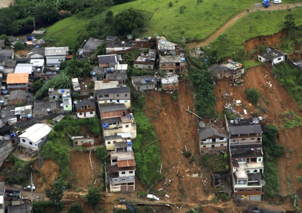
A post by Anne JeffersonWhile Australia continues to cope with widespread flooding in Queensland and elsewhere and the death toll continues to rise (at least 20 people), in Brazil landslides and flooding in the past week have claimed at least 700 lives. Yet international coverage of the Brazilian tragedy has been scant at best.

Four days of torrential rainfall (blamed on La Nina) triggered numerous landslides and flash floods in the Serrana region near Rio de Janeiro. A month’s worth of rain fell in just a few hours and flood waters rose quickly. Neighborhoods perched on steep hillslopes were destroyed by landslides, while low-lying areas were inundated by floods. Most of the casualties have come from four towns, but some isolated areas are still completely cut-off.

Landslide scars in Brazil, January 2011

Landslides in Nova Friburgo, Brazil, January 2011 (photo from Rio de Janeiro state government, via Sacramento Bee's The Frame Blog

Some blame is being placed on poor housing construction, but from the photos and videos I’ve seen, the problem seems to be dense populations in high risk areas. More problematically, it appears that response by the Brazilian government has been slow and there are concerns about clean water and the threat of a disease epidemic amongst survivors. While it is hoped that the worst rain is over, light but steady rainfall is predicted for the next few days, and with saturated soils there will likely be more slides and more deaths. Even without fresh slides, the death toll will likely rise substantially as recovery efforts continue.

But it’s not just Brazil, Australia, and Pakistan that have been suffering from devastating floods, but Sri Lanka, the Philippines, and South Africa have also been hard hit by floods in the last week.

Categories: by Anne, geohazards, hydrology

Earth’s magnetic field: still not reversing

A post by Chris RowanSome rather apocalyptically minded people – a couple of whom have actually contacted me – have seen a connection between two recent odd occurrences. First came all those birds falling from the sky over the Christmas period. Then, there was this rather odd report of runways in Florida having to be repainted due to ‘the shift in the location of the Earth’s magnetic north pole’. Perhaps fuelled by fuzzy memories of The Core, my worried correspondents – and others around the internet – are musing whether this is a sign of an imminent magnetic field reversal (or ‘pole flip’ as it is often called), with all of the nebulously dire consequences that would ensue.

Well…no.

In fact, neither the bird deaths, nor the runway realignment, are heralds of anything particularly unusual. On the avian mortality front, some digging by the Christian Science Monitor reveals that on average, mainland North America seems one mass wildlife die-off every two days. According to this report from the USGS, there were eight events that involved more than 1000 bird deaths in 2010, and if anything it was a quiet year. Furthermore, although birds do have the ability to sense magnetic fields, it seems unlikely that some disruption of that ability would cause them to fall from the sky. It might make them a little lost and confused, perhaps.

But crucially, there is no sign of any unusual disruption of the Earth’s magnetic field – the reported runway re-alignment is certainly not one. Here’s what the article from the Tampa Bay Online site linked to above says:

Scientists say the magnetic north pole is moving toward Russia and the fallout has reached — of all places — Tampa International Airport…

…The busiest runway will be re-designated 19R/1L on aviation charts. It’s been 18R/36L, indicating its alignment along the 180-degree approach from the north and the 360-degree approach from the south.

To check what is going on, I plugged the co-ordinates of Tampa Airport (around 28°N, 82.5°W) into NOAA’s handy online magnetic field calculator, which allows you not only to calculate the magnetic field direction and strength at any point on the Earth, but also track how it has changed over time. Below is the declination – the deviation of magnetic north from true, geographic north – at Tampa airport for the last 20 years.

January 1991: – 2° 37′
January 1992: – 2° 45′ (-8 minutes)
January 1993: – 2° 54′ (-9 minutes)
January 1994: – 3° 2′ (-8 minutes)
January 1995: – 3°11′ (- 9 minutes)
January 1996: – 3° 18′ (- 7 minutes)
January 1997: – 3° 25′ (- 7 minutes)
January 1998: – 3° 33′ (- 8 minutes)
January 1999: – 3° 40′ (- 7 minutes)
January 2000: – 3° 47′ (- 7 minutes)
January 2001: – 3° 53′ (- 6 minutes)
January 2002: – 3° 59′ (- 6 minutes)
January 2003: – 4° 5′ (- 6 minutes)
January 2004: – 4° 11′ (- 6 minutes)
January 2005: – 4° 17′ (- 6 minutes)
January 2006: – 4° 23′ (- 6 minutes)
January 2007: – 4° 29′ (- 6 minutes)
January 2008: – 4° 35′ (- 6 minutes)
January 2009: – 4° 42′ (- 7 minutes)
January 2010: – 4° 48′ (- 6 minutes)
January 2011: – 4° 54′ (- 6 minutes)

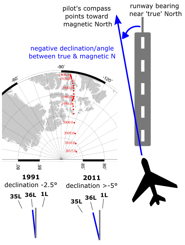
What this shows is that the ‘shift in the location of the pole’ that has necessitated the Tampa runway realignment is not a big, recent jerk – instead, it’s the result of the gradual – and entirely unremarkable – motion of the magnetic pole relative to the geographic pole over the past few decades (what people who study the Earth’s magnetic field call secular variation). In the figure below, I’ve included a British Geological Survey plot of the magnetic pole’s motion from a location in the northern reaches of Canada into the Arctic ocean in the past century. This motion has produced a steadily more negative declination in the vicinity of Tampa Airport over the past couple of decades. A look at Google Maps indicates that the main runways at Tampa have an absolute (geographic) orientation close to due north. Many aircraft (particularly smaller, non-commercial aircraft) still use a compass to direct their course, and pilots need to know what direction the runway is oriented, particularly at night or in bad weather, when visibility is limited. With a negative magnetic declination, you would have to fly at a magnetic bearing a few degrees east of north to parallel the runway.

Pilots must compensate for magnetic declination when lining up with a runway. In Florida, declination is now closer to -10° than 0° due to gradual drift of magnetic north.

The numbers on runway numbers are their bearing relative to magnetic north to the nearest 10 degrees, divided by 10 (e.g., 5=50°, 22=220°). For the past few decades the small declination at Tampa has effectively rounded to 0, and the runway numbers reflected this. Now however, the declination is on the verge of being more than -5 degrees*, which rounds to 10; this means that the runway markings must be updated to tell pilots that they should set their landing course to a bearing of 10° rather than 0, or 190° rather than 180 if you’re flying in the opposite direction.

So move along, nothing to see here. For those who are interested in what the real prospects for a future reversal of the Earth’s magnetic field are, I’ve already written an opus on this subject. Basically, the magnetic field will not be reversing any time soon, unless you are talking about ‘soon’ in the sense of ‘in the next few tens of thousands of years at the earliest’. When it does begin to reverse, it will take several thousand years – probably longer than currently recorded human history – to do so. And given that there is absolutely no correlation between extinction events and magnetic field reversals in the geological record – rather fortunate as there’s a reversal every half a million years on average – I don’t think we have much to worry about when it does happen. Except, perhaps, we might need to repaint our runways more often.

Still, I do have my own premonition. Somehow I can’t help thinking that, as we get closer to some arbitrary milestone in the Mayan’s cyclical calendar, I may have to revisit this subject again.

Update 24th January 2010: Apparently, Stanstead airport in the UK, close to where I grew up, is also having to repaint it’s runway markings for the same reason. Given that this has to be a semi-regular occurence in the aviation world, I wonder why such things are getting more play in the media world right now. Are they deliberately trolling people who are worried about 2012?

*given that the Tampa runways appear to run a little east of true north, their magnetic bearing may already be more than 5°. Also, the numbers above are from a global field model, so are probably not completely accurate at such a local scale. I’d suspect that Tampa airport has performed it’s own direct measurements before deciding to change their markings.

Categories: antiscience, palaeomagic