A Seismic Summary of 2017

Plenty of natural disasters hit the news in 2017, but most of the headlines were hogged by disasters linked to extreme weather, such as Hurricane Harvey. Nonetheless, in the background the Earth’s tectonic plates continued bumping and grinding against each other, producing 1,558 earthquakes of magnitude 5 or greater over the past 12 months. As well as a map of individual locations, I’ve also produced a global seismic ‘heat map’, scaled to represented the total energy release in each grid square.

Global map with earthquake locations marked as circles, scaled according to their size.

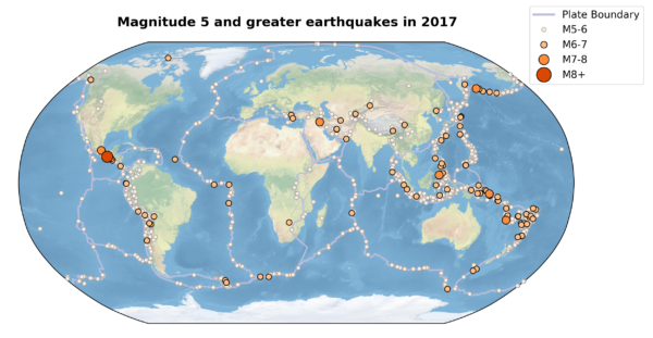
Global Map of 2016 earthquakes, according to the USGS database.

Gridded global map where intensity of colour in each 5 degree grid square represents the total energy released by earthquakes in 2017.

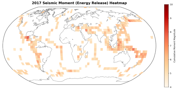
Heat Map of global seismic activity, scaled to total moment release from all M5+ earthquakes in each 5º grid square

Unlike last year, we did see a magnitude 8 earthquake this year, in the form of a M8.2 in the subducting slab off the coast of Mexico. The logarithmic relationship between magnitude and energy release – one unit on the magnitude scale equals 32 times as much energy – means this single earthquake shows up quite clearly as the darkest square on the heat map. A further six earthquakes – about one third of 1% – were between magnitude 7 and 8, and 104 – about 7% – were between magnitude 6 and 7. The remaining 93% were between magnitude 5 and 6.

Bar charts showing numbers of magnitude 5 to 6, 6 to 7, 7 to 8 and greater than 8 earthquake in 2017. The average, maximum and minimum frequencies since 1970, and the average for the past 6 years, are also shown.

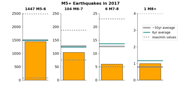
Number of earthquakes in different magnitude ranges in 2017, compared to longer term averages and ranges.

If we compare these tallies to the instrumental record of seismic activity since the mid 20th century, 2017 meets expectations at the low and high ends: based on the last 50 years, we expect around 1500 magnitude 5-6 earthquakes in an average year, and maybe one event larger than magnitude 8. In the middle, the numbers of M6-7 and particularly M7-8 earthquakes last year were lower than the 50-year average. Not ‘lower’ in the sense that they’re outside the observed variability in the instrumental record, but lower than they’ve been for some time: 1998 was the last time we had this few M6-7 quakes (109 vs 104), and 1982 was the last time it was lower (83 M6-7 quakes, at the end of a decade of fairly quiet years); 2017 also saw the lowest number of M7-8 (6) since 1980. In other words, it hasn’t been this quiet since I was a wee lad.

Bar charts showing yearly totals of earthquakes in different magnitude ranges since the mid-20th century. Lines show a smoothed, 6-year moving window average.

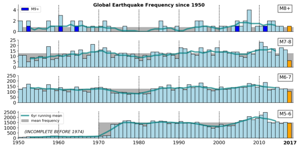
2017 earthquake frequency compared to the instrumental record since 1950 (note that M5-6 events are largely missing from the catalogue prior to the 1970s).

One surprising observation is the lack of large (M6-7) aftershocks of the M8.2 Mexico quake in September. The response was strangely muted: the largest aftershocks are mainly M5-6, with a M6.1 right at the edge of the aftershock cloud. The fact that it was an extensional event due to bending within the plate, rather than occurring on the subduction thrust, might explain this. There was a possibly linked M7 shock: an M7.1 close to Mexico city, that was also the year’s second deadliest behind a M7.3 on the Iran/Iraq border in November. Occurring 650 km away and 12 days later, it was too far away to be affected by permanent stress changes in the crust around the M8.2, and too late to be triggered by the transient stresses associated with passing seismic waves. The possible mechanisms of longer-term triggering at a distance are still poorly understood, but the timing is certainly suspicious.

Interest in decadal trends in global earthquake activity has been boosted recently by a newly published study that suggests a link between changes in the Earth’s rotation rate and the frequency of large earthquakes. As the lead author explains, we’re not talking about generating earthquakes that wouldn’t have happened anyway. Instead a small nudge, in the form of a slight deceleration in the Earth’s rotation that imparts some additional stress on the rigid lithosphere*, causes faults that are already poised to fail to rupture a little bit earlier than perhaps they would have otherwise. The mechanism is plausible: the daring part is that the authors have made a prediction that a recent slowing of the Earth’s spin is going to cause a spike in M7 or greater earthquakes over the next five years. If anything, this year’s relative calm makes monitoring that hypothesis a bit more difficult, because more than 7 earthquakes a year above magnitude 7 is a low bar that we’d generally expect to be exceeded even in the absence of any external factor. The question is whether we’ll see an increase significantly above the long-term average of around 15 events a year.

Definitely something to keep an eye on in the next year or five. I have questioned its usefulness for seismic hazard assessment, since we are talking about a relatively small change in a global signal: others have argued that in edge cases (such as a fault at the old end of its known recurrence interval) it may be relevant, and that there are in fact some interested parties with global exposure.

What is true that as we have seen again this year, bigger does not necessarily mean badder when it comes to earthquakes: the two deadliest earthquakes this year were both low magnitude 7. Any magnitude 7 earthquake represents a substantial hazard if it happens in the wrong place.

*Because the ‘solid’ Earth beneath the lithosphere is ductile and can flow in response to stresses, the Earth’s rotation causes it to bulge at the equator. The size of this bulge depends on the rotation rate; reduce the rotation rate and the Earth will (slowly) flow into a more spherical shape. The lithosphere is cold and rigid, so accumulates stress instead as the bulge shrinks beneath it.

Categories: earthquakes, geohazards, geophysics, tectonics

2017 in Review

Not much may have made it onto the blog, but it’s been a busy year for both Anne and Chris in 2017. Here’s a brief summary of what we’ve been up to – with pretty pictures where appropriate.

Spring:

Chris taught Structural Geology for the first time, and softened the mind-warping effects of structure contours and steronets by taking his students on a field trip to map some of the spectacular folds found in the Valley and Range of the Appalachians of West Virginia. He also taught the introductory How the Earth Works course.

Students at a prominent cliff-like outcrop of the Oriskany Sandstone, West Virginia

Some of Chris’s students getting a strike and dip off the distinctive Oriskany sandstone. Now where has the other fold limb got to? Photo: Chris Rowan, 2017.

Anne taught Watershed Hydrology and took her students on a field trip to the Shale Hills Critical Zone Observatory and the Johnstown Flood National Monument. She also survived her first admissions season as Graduate Coordinator for the department and her first time chairing a faculty search committee.

Group of students (smiling) standing in front of a wooden sign.

Kent State Watershed Hydrology students at the Shale Hills Critical Zone Observatory, home to one of the most intensely instrumented catchments in the eastern US. Photo: A. Jefferson, 2017.

Chris graduated his first MS student Matt Harding, whose thesis focused on the role of basement structures in controlling salt tectonics beneath the Allegheny Plateau.

Anne’s postdoc Pedro Avellaneda published a paper modeling the hydrologic response to a green infrastructure retrofit. This paper was built on our earlier experimental work on the project. With the model, we were able to isolate the effects of the bioretention cells versus other components of the retrofit, to identify the effects on the overall water balance of the catchment, and to quantify the effects of the green infrastructure on flows at specific probabilities (e.g., the “2-year” flow). Anne was really happy to have this be her first paper co-authored with her postdoc and her first paper where an undergraduate (REU) student was an author.

Chris’s undergraduate student Joe Wislocki presented some preliminary results of his analogue modelling of the development of the Pennsylvania Salient in the Appalachians at the GSA sectional meeting in Pittsburgh. Anne and her students gave talks in the urban hydrology session and a poster in the post-glacial rivers session at the same meeting.

Summer:

Anne, Chris, and family had another epic multi-national holiday. First, we spent a few (unusually hot) days hiking in England’s Peak District (a place we’ve enjoyed before). Then Anne headed for the HydroEco 2017 conference in Birmingham, where she gave a talk, sweltered in the heat, and saw the University of Birmingham’s Free Air Carbon Enrichment (FACE) experiment. Meanwhile, Chris and TerraTyke explored toddler-friendly spaces in Essex – mainly places on the (slightly cooler) coast.

A pretty – but highly unnatural – weir along Dove Dale in the Peak District. Photo: Chris Rowan, 2017.

University of Birmingham FACE experiment in action. Carbon dioxide is blown out of the ring of towers and the effects on the vegetation, soil, and and hydrology are studied. Photo: Anne Jefferson, 2017.

A collapsed World War Two pillbox on a gravel beach, with a cliff filled with river gravels in the the background

Erosion of WWII pillboxes and Pleistocene gravels on Mersea Island, Essex. Photo: Chris Rowan, 2017.

Our next stop was Iceland. What can we say? It’s geologist paradise and our streak of unusually hot and sunny weather continued. (Much more welcome in Iceland than the UK, Anne says.) On our first day, we did the famous Golden Circle stops of Pingvellir, Geysir, and Gulfoss, but at our own pace.

view over looking over the edge of a rift fault at Pingvellir.

Standing on the North American Plate, waving at the Eurasian plate: looking over the edge of a rift fault at Pingvellir. With bonus pahoehoe lava flow tops in the foreground. Photo: Chris Rowan, 2017.

Gulfoss drops into a spectacular slot canyon of columnar basalt. Photo: A. Jefferson, 2017.

Then we pushed a little further east, where highlights included a ‘Super Jeep’ excursion up into the highlands to explore the vents of the 1783-4 Laki fissure eruptions, and a ferry ride to the Vestmannaeyjar archipelago, where we explored the effects of a much more recent eruption on the island of Heimaey

A line of spatter cones marks the site of the Laki fissure eruption.

A line of spatter cones marks the site of the Laki fissure eruption. Photo: Chris Rowan, 2017

A lava flow viewed from its source volcanic cone, together with the small town it almost engulfed in 1973.

Looking down on the 1973 lava flow that almost blocked the harbour on Heimaey, from its source: Elfell volcano, also newly formed in the 1973 eruption. Photo: Chris Rowan, 2017.

Our summer tour concluded with a few relaxing days in southern Minnesota, enjoying the topography of the Driftless Area and spectacular views from Anne’s brother’s ridgetop farm.

In August, Chris spent a week at working with colleagues and students on Utah’s Markagunt landslide. This is the largest known terrestrial landslide, formed by the sector collapse of the Marysvale Volcanic Field about 20 million years ago. Chris is contributing to a student Master’s project that aims to constrain the timing and mechanism of landslide’s emplacement using paleomagnetic and rock magnetic techniques.

To round off our summer travels, we also took a weekend trip to the pretty, but unsurprisingly very crowded, Hocking Hills region in southern Ohio.

View from inside Rock House cave at Hocking Hills State Park, Ohio. Photo: A. Jefferson, 2017.

Fall:

Chris taught Geophysics and How the Earth Works (again), as well as a first year experience seminar. Geophysics is focussed on developing understanding of geophysical signals through forward modelling exercises in Excel and also in Python, using Jupyter interactive notebooks; the final project sees students working in teams, with a fixed “budget” to spend on data acquisition to identify the subsurface geophysical features of a mystery field area.

Anne was on a “research and creative activities leave”, so she was on a mission to get papers completed and new projects spun up.

Anne and 5 colleagues published a review and synthesis paper on what we know about the cumulative effects of stormwater management at the catchment scale. In this paper, they identified 100 studies from around the world, using field and modeling techniques, that had worked on elements of this problem. Synthesizing the studies, they identified concepts for which we have a reasonably good understanding of what happens as a result of stormwater management versus hydrologic processes and types of infrastructure for which we have big understanding gaps. They also identified the next needed steps in this research area. (Ironically, the paper was born out of a rejected proposal, where the reviewers doubted there were sufficient papers published to do such a synthesis. 100 studies later, Anne thinks they were wrong.)

With colleagues from the College of Public Health, led by Anne contributed to a paper on the prevalence and typing of Staphylococcus aureus at public beaches in northeastern Ohio. Tara Smith and her postdoc Dipendra Thali led the effort, which was born out an undergraduate (REU) project. Anne’s piece focused on the association between treated wastewater effluent in the lakes and the abundance of Staph. The two inland lakes that we sampled that had no wastewater also had less Staph in the water and sand samples. There’s a lot more to work out in terms of mechanisms, but this paper contributes a unique dataset to spur further research. The paper was published in AGU’s new open access GeoHealth journal and is free for anyone to read.

In addition to the papers, Anne also lead a proposal to NSF’s Environmental Sustainability program (fingers crossed) and contributed to one focused on hydrology education (more crossed fingers). She also enjoyed working with her team of graduate students on some new projects, with more to say in those areas in 2018 and beyond.

During fall semester, it felt like either Anne or Chris was always traveling, but never at the same time.

First, in September, Chris returned to southern Utah to participate in a GSA Thompson Field Forum on the Markagunt slide. He wins a point for earliest snow of the season.

View of the Markagunt landslide in Utah. Looking back across multiple ridges to the distant source area.

It’s really difficult to capture the scale of the Markagunt landslide, but in this view, we’re standing on the landslide (and not at the end) looking back towards its source, and everything you see in this picture is landslide. Photo: Chris Rowan, 2017

Then, in October, Anne took advantage of not teaching and attended both the GSA meeting in Seattle and a 4 day field trip over the North Cascades (in the snow) and through some Missoula megaflood carved landscapes. Then, she and her students gave talks and posters at the meeting itself. Anne’s first GSA meeting was in Seattle in 2003 and it was great to be back as a grown-up.

Like the mega-landslide Chris visited, it’s hard to pick a photo to capture the scale of Earth history’s largest floods. This is a lovely side canyon off of Grand Coulee, carved by one or more of the floods that predate the opening of Grand Coulee itself. Even 90 years after J. Harlan Bretz started to tell the story of the floods, there’ still so much to be figured out about exactly how and when each feature of the landscape formed. Photo by A. Jefferson.

In November, Anne spent a few days in Boulder, Colorado attending a workshop on promoting diversity and inclusion in the geosciences, through exercises focused on implicit bias, microaggressions, bystander intervention, and gatekeeping functions.

Chris then jetted off to Hong Kong for a friend’s wedding, and he also took the chance to (briefly) hike and ferry amongst the volcanic landscapes of the islands.

Lamma Island in Hong Kong. A volcanic rock jetty in the foreground, and a forested hilly shore.

A rare skyscaper-less view in Hong Kong, from the beach on Lamma Island. Photo: Chris Rowan, 2017.

And in December, Anne and Chris both stayed home for grading, cookie baking, and enjoying the mercurial nature of Ohio winter weather. We look forward to more adventures in 2018.

A snow-covered wood with some deer sheltering in the middle ground.

The view from our window as 2017 draws to a close. See if you can spot the deer sheltering under our trees! Photo: Chris Rowan (2017)

Categories: academic life, bloggery, by Anne, publication, teaching

Conifers capture the snow, but do they intercept it?

split figure with snow covered conifer on left with bare ground underneath. On right, snow covered ground with snowy deciduous forest in background.

Conifers (left) capture much more snow than grass (right foreground) or deciduous forest (right background). But will they keep the ground dry all winter? (Photo by A. Jefferson, 2017)

If you’ve walked through the forest on a rainy day and noticed that it’s drier under the trees, you’ve experienced interception.

In hydrology, interception is when water gets hung up on vegetative leaves, needles, or branches and never makes it to the ground. The precipitation gets evaporated (if liquid) or sublimated (if solid) back into water vapor directly from the vegetative surface before it gets a chance to hit the ground and infiltrate or run off. (If the water hangs out in the vegetation for a while but eventually makes it to the ground, we call it stemflow or throughfall depending on whether it ran down the tree trunk or not.)

Interception can be a pretty significant component of the water budget. In forests, the vegetation can intercept 20-40+% of precipitation. In grasslands, the numbers are in the 10-20% range. Even litter, the dead plant material covering the soil, can cause interception. Interception rates depend on plant type and density, but also how much rain you get, how fast it falls, and how much evaporation can occur during and between storms.

In the winter, interception still happens during snowfall, but now vegetation type really matters. Since deciduous trees shed their leaves in the winter, they become pretty useless for interception. In the picture above, you can’t really see the difference between the deciduous forest and the lawn — they are both fully snow-covered. On the other hand, since conifers retain their needles, they can capture a lot of snow — and you can see that in the bare ground under the trees at left.

Whether the conifers truly intercept all that snow is more complicated. Conifers can initially hold large snow loads, but wind can blow that snow onto the ground, it can be dumped off in large clumps, and melting within the snowpack on the branches can allow the water to drip to the ground. In order to effectively intercept the water and return it to the atmosphere, we’d need sublimation to happen faster than those other processes. But does that happen?

In a study in Oregon’s Umpqua National Forest (Storck et al., 2002), mature conifers initially captured up to 60% of the snowfall (up to at least 40 mm). When conditions were warm and conducive to snowmelt after the snowstorm, 70% of the water left the canopy as meltwater drip and 30% left as masses of snow falling to the ground. Only if the weather remained below freezing after snowfall, could sublimation work to reduce the snow storage in the trees. But that goes slowly, at an average rate of ~1 mm/day. If the weather got above freezing, then melting and dumping took over. Overall, the study site got about 2000 mm of precipitation in the winter and the ground in the forested areas experienced about 100 mm less than the ground in the open areas, giving a winter interception rate of about 5%.

Of course, that’s only one study and other modeling and experimental work adds more nuance and complication. Climate and solar radiation affect sublimation rates. Canopy density affects sheltering by wind and interception. And more. High spatial resolution modeling of two sites in Colorado and New Mexico gives interception values of 19% and 25%, respectively (Broxton et al., 2015). When they consider all of the processes happening to redistribute snow around a patchy forest, they conclude that the driest areas are under tree canopies and the wettest areas are <15 m from the edge of the canopy. If you get farther out into an open area, it gets drier again, though not as dry as under the forest cover. And the differences are not small, snow water input can be 30-40% higher near the edge of the canopy than underneath it. So next time you walk through a forest in the rain or snow, be impressed by the hydrologic work the trees are doing to keep you dry, and know that interception adds up to a significant amount of water. But if it's a warm winter day, don't be surprised to feel a cold meltwater drip from the pine tree above you -- or get a load of snow dumped on your head -- because even conifers can't hang onto the snow long enough to keep the ground dry forever.
Read more:
Broxton, P. D., Harpold, A. A., Biederman, J. A., Troch, P. A., Molotch, N. P., and Brooks, P. D. (2015) Quantifying the effects of vegetation structure on snow accumulation and ablation in mixed-conifer forests. Ecohydrol., 8: 1073–1094. doi: 10.1002/eco.1565. (pdf available via ResearchGate)

Storck, P., D. P. Lettenmaier, and S. M. Bolton, Measurement of snow interception and canopy effects on snow accumulation and melt in a mountainous maritime climate, Oregon, United States, Water Resour. Res., 38(11), 1223, doi:10.1029/2002WR001281. (open access)

Categories: by Anne, hydrology, ice and glaciers, photos

Speak up for NASA’s Earth Science funding

A post by Anne JeffersonIt’s Earth Science Week and Congress is still debating the budget for this fiscal year. That means that science funding is still on the line. The American Geophysical Union is running a campaign encouraging members to speak up for NASA’s Earth Science division which faced steep cuts in the White House budget proposal. Follow the link here to send a letter to your senators and representative. (You don’t have to be an AGU member to take part.) If you need some inspiration, here’s the letter I wrote to my representatives.

Dear Senators Portman and Brown and Representative Ryan,

In honor of Earth Science Week (8-14 October 2017), I’m writing to urge you to provide robust support for NASA’s Earth Science Division, which is invaluable to our nation and our local community.

As recent hurricanes and wildfires have vividly demonstrated, millions of Americans depend on NASA’s eyes in the sky to keep them informed and safe. Our economy also benefits massively from being able to prepare in advance for weather disruptions.

Closer to home, NASA satellites are providing important data on the harmful algae blooms in Lake Erie and our inland lakes. These satellite images are giving us important clues as to how lake conditions, river contributions, and weather interact to produce these toxic blooms.

As a hydrology professor at Kent State University, I use NASA products in my research and teaching every week. The new soil moisture active passive (SMAP) mission will be hugely valuable for understanding how changes in land use and climate conditions influence flooding and drought. The GRACE mission, which recently came to an end, was an important tool for understanding large scale groundwater declines and ice sheet changes. As there is now a gap until a replacement satellite can be launched, we are losing critical data on our changing planet.

It’s important to keep continuous and robust funding for NASA’s Earth Science division in order to keep NASA missions on track, so that we don’t fly blind in the face of severe weather, algae blooms, droughts, and all of dynamics of our home planet.

Thank you for your leadership and continued support of science.

Sincerely,

Anne Jefferson

Categories: by Anne, hydrology, public science, society

Hurricane Harvey and the Houston Flood: Did Humans Make it Worse? (Part 2: Urbanization)

A post by Anne JeffersonThere’s been a lot of speculation and discussion about the role of urbanization in contributing to the flooding from Hurricane Harvey in Houston. Fortunately, urban hydrology is my specialty, so even though I’ve never been to Houston, I feel like I can offer some insights. (Also, read part 1 on the climate change aspects of this disaster.)

Many of the damaged buildings were outside designated “100-year” floodplains. Why is that?
First, given that Harvey produced more rainfall than the contiguous US had ever before recorded from a single storm (51.88″ in one location), I think it’s safe to say that this storm has historically had a <<1% chance of occurring. In other words, based on historical data, we wouldn’t expect this storm to occur 1 time in 100 years in Houston, because nothing anywhere near has been has ever occurred before. But, history of course, is not a very good guide to a climate-changed present and future (see below).

Second, the FEMA maps are out of date in many areas. Not only do they not consider climate change, but they only account for the level of urbanization that has occurred at the time the map is made. They don’t take into account planned or projected future urbanization, levee building, etc.*

Yet, these maps aren’t updated very regularly and can be a decade or more out of date in some areas (mostly rural). Plus, local politicians don’t want to show that a large part of their community is in a floodplain (and require more expensive buildings and flood insurance), so there’s local pressure to keep delineated floodplains as small as possible. Finally, it doesn’t help, that the flood mapping program has always been under-funded and is a popular target for funding cuts.

We need to wrap our head around the scale of the damage. There are at least 90,000 residential structures damaged in 3 Texas counties, based on an early FEMA estimate. Harris County (where Houston is) officials are estimating up to 136,000 homes destroyed. I’ve seen one estimate that 40-50% of the damaged homes are located outside the mapped floodplain.

Did urbanization and impervious surface make flooding worse?

No. Impervious surface (pavement and rooftops) prevents infiltration. But there isn’t a landscape in the world that can take 50” of rain and infiltrate it without flooding (or landslides). Even if your landscape can infiltrate whatever rainfall is landing on the surface, the soil will wet up from the bottom as water tables rise toward the surface. And when the water table is at the surface, it doesn’t matter what your infiltration capacity is, water can’t move down.

Furthermore, Houston is in the Coastal Plain, which is made up of lots of fine-grained sediments, notoriously poor for infiltration. Southern Harris County’s soils are classified as group D, meaning that they are the worse of four classes of soil for infiltrating water.

Yes. Urban development that encroaches on natural water storage areas – floodplains and wetlands – makes flooding worse elsewhere. (And more to the point, it puts people and property in harm’s way.) If you fill in the low areas, install drainage pipes to shunt water elsewhere, or build levees to keep water off the floodplain, then that water has to go somewhere, and in fairly flat areas like Houston, that somewhere will become everywhere. Houston and its suburbs have faced criticism for rampant wetland destruction and for building whole neighborhoods in designated floodplains. The New York Times has a fantastic set of animated graphics that show how development overlays with floodplains in the Houston area (and how flood damages from Harvey aren’t restricted to mapped floodplains. I’m taking the risk of reproducing two screenshots below that I think are particularly good example of this phenomenon.

Development on a Houston area floodplain. via New York Times (click the link above and read their article too)

Won’t insurance pay for the damage to people’s houses?
Only if you have flood insurance, because standard homeowners and renters policies don’t cover flood damage. If you live in the 100-year floodplain and have a mortgage on your house, you are required to buy flood insurance, which can run $1000s per year. If you don’t live in a designated 100-year floodplain, flood insurance is totally optional. It’s also less expensive, since your risk of flooding is lower, but who among us says “Sure, I’ll buy totally optional insurance at a cost of several hundred dollars per year for something the government says isn’t going to happen at my house?” In all likelihood, the majority of Houston-area flood victims will not have any flood insurance to pay for their lost possessions and houses.

For those who do have flood insurance, the National Flood Insurance Program (NFIP) will help pay for them to repair and rebuild – in the same risky location. One percent of properties insured by the NFIP take up 25-30% of its payouts. The program loses money every year, and US taxpayers foot the bill.

Can we engineer our way out of disasters like this?
Stormwater management is not designed for extreme events. Most stormwater control measures are designed for the type of storm that happens a few times per year. In Harris County, stormwater controls have what’s called a “water quality volume” that is designed to treat 1.5″ of rain in 24 hours. Anything above that does not have to be detained or infiltrated by the stormwater control. Remember, the whole Houston metro area got >30″ of rain over 5 straight days and a new contiguous US record of 51.88″ was set in one location. Why aren’t stormwater controls designed for bigger storms? It would cost more and they would take up more valuable real estate. And most of the time, that extra storage wouldn’t be put to use. (Of course, it doesn’t help if a large number of your stormwater controls aren’t performing up to design standards.)

Flood control reservoirs work, to a point, but then they run out of storage volume and might even make things worse. Flood control reservoirs might be designed to reduce the effects of the 100-year flood, which has a 1% chance of occuring in any given year. For the Houston area, the 1% rainfall is 13” of rain in 24 hours. But that’s happened >8 times in last 27 years, so clearly the math is a bit off (likely out of date, thanks in part to climate change). Houston has two flood control reservoirs, Addicks and Barker, built in the 1930s, that sit dry until a flood comes along. Of their 10 highest levels, 9 have happened since 1990 and 6 have happened since 2000 (and that was before Harvey). When Harvey roared in, the reservoirs filled up completely and over topped for the first time in their history.

After flood control reservoirs are full, they can’t help store any additional rainfall and runoff. Plus, management operations will swiftly turn from storing the flood to protecting the structural integrity of the reservoirs. Meaning that the dam operators will start to release extra water downstream – even though that makes downstream flooding worse – because they don’t want the dam to fail. You don’t want a 100-foot high wall of water rushing towards downtown Houston either. The Houston reservoirs were forced to release water during the height of the flooding, making things worse in downstream neighborhoods. But dam failure is a risk that no engineer or hydrologist is willing to take.

What Barker Reservoir looks like empty. (US Army Corps of Engineers photo, public domain.)

Just like with stormwater controls, we don’t build flood control reservoirs for the most extreme events, because designing bigger capacities to accommodate a rare storm increases costs dramatically. This is particularly true in a flat area like Houston, where every additional foot of height on a dam means a much larger footprint for the reservoir, locking that area away from development.

Levees – walls built between the river and neighborhoods – might work locally, but they make flooding worse elsewhere. And like every other form of engineering, they can be under-designed for extreme events. And they can fail.

So what can be do to avoid a disaster like this in the future?

  • Stop filling wetlands. Support wetland restoration and mitigation efforts.
  • Don’t (re)build in floodplains. (Even beyond the official 100-year floodplain.)
  • Consider the likelihood of enhanced flooding from increased precipitation intensity and sea level rise when making rebuilding and future development decisions.
  • Develop smart, staged evacuation plans for the most flood-risky areas and for vulnerable populations.
  • Advocate for enhanced funding for FEMA’s flood mapping program.
  • Revamp the National Flood Insurance Program.
  • Take immediate action (individually and collectively) to reduce the greenhouse gas emissions that are causing climate change.


*A reader alerted me to this 2001 FEMA rule on “Future Conditions Hydrology” which says that at the request of a community, for information purposes only, the maps can reflect future conditions data, as generated by the community, in addition to the current 100-year (1%) “base flood elevation.” Areas outside the current 1% floodplain, but inside the future 1% floodplain are designated as area X. In those areas, homeowners are not required to buy flood insurance by federal rules, though a private lender could make that requirement. Similarly, under federal rules, structures would not have to be elevated, though local laws might require flood production in these areas. “Future conditions hydrology means the flood discharges associated with projected land-use conditions based on a community’s zoning maps and/or comprehensive land-use plans and without consideration of projected future construction of flood detention structures or projected future hydraulic modifications within a stream or other waterway, such as bridge and culvert construction, fill, and excavation.” Note that “public works in progress including channel modifications, hydraulic control structures, storm drainage systems and various other flood protection projects” had been considered in the FEMA maps since 1995. The TL;DR of all of this is that IF a community requests future conditions be displayed, and does the legwork of figuring out what those future conditions are, they do appear on maps generated since 2001, but they are not federally enforceable.

Categories: by Anne, geohazards, hydrology, society