
So, a piece was recently published at Undark called "The Magnetic Field Is Shifting. The Poles May Flip. This Could Get Bad.". Unsurprisingly, I have thoughts. Somewhat complicated thoughts. Let’s start with the important stuff:
Yes – the dipolar component (the dominant, bar-magnet like part) of the Earth’s magnetic field has been decreasing in intensity over the couple of hundred years we have had the ability to directly measure it. Based on the records of the Earth’s magnetic field intensity over previous reversals, preserved in igneous and sedimentary rocks formed at the time, reversals are associated with a substantial weakening of the dipole field.
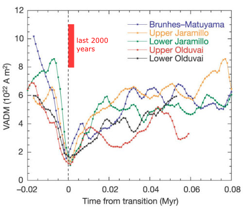
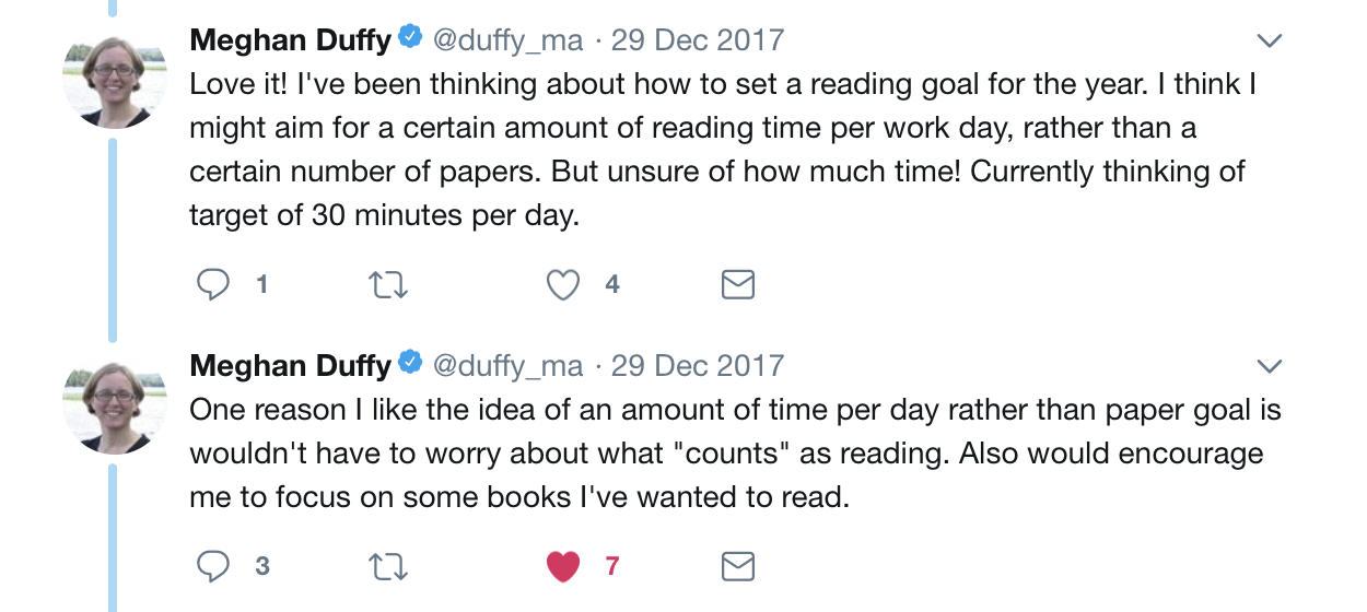
Records of dipole intensity over the last five reversals, showing a steady decrease over several tens of thousands of years before the actual reversal, which lasts of the order of 10,000 years. Source: Valet et al. 2005.
But no – the recent weakening trend doesn’t mean a reversal is necessarily imminent. It turns out that baking clay to make pottery is a great way of taking accurate snapshots of the Earth’s magnetic field, so thanks to archeology, we have a fairly good idea of the strength of the dipole field over the past few thousand years. When plotted on the geological records of reversals above, we can see that the current dipole field is still 2-4 times stronger than it seems to be during an actual reversal, despite the recent decrease. A closer look at the record for the last 10,000 years shows we’re actually coming down from a fairly significant peak in field strength at around 0 AD.
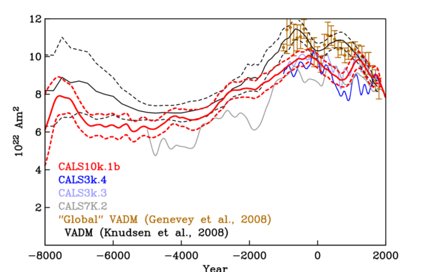
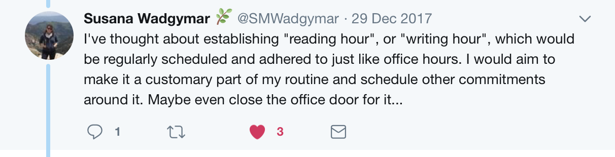
A figure summarising several different models of dipole strength over the past few thousand years, based on different compilations of paleomagnetic measurements of geological and archeological samples. All show a peak in field strength about 2000 years ago. Source: Korte & Muscheler (2012)
Yes – regardless of present trends, the field will reverse eventually. The rate has varied over geological time, but the recent rate of reversals is somewhere between 2-5 every million years; at 780,000 years and counting, the current polarity chron is definitely pretty long by recent standards. It is certainly possible that the current decrease is part of the run up to the next one.
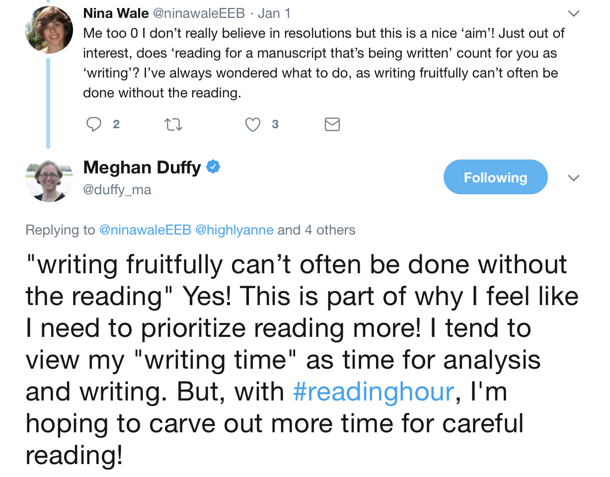
But no – when it does happen, a reversal will not happen overnight. Look again at the record of past reversals above, which shows a 30,000-50,000 year period of decaying dipole strength (which could be what we are witnessing the early stages of right now) before the dipole reverses and then more quickly recovers its strength. We can estimate the length of the transition period, when the dipole is weak and the higher-order components of the field dominate, from records of cosmogenic isotope production, which will be boosted in a weaker field because the atmosphere is less shielded from incoming high energy solar and cosmic particles. These records suggest a transition period of around 10,000-20,000 years, at least for the last reversal 780,000 years ago. If the field had started reversing when the Pyramids or Stonehenge were being built, we would still be waiting for the polarity switch to be completed. On current trends, even if the dipole continues to steadily weaken, the Empire State Building and the Eiffel Tower would be well into their second millennia of existence before the dipole field truly started to fail. Our many-times-great-grandchildren could easily be wondering about an ‘impending’ reversal in much the same way as we are.
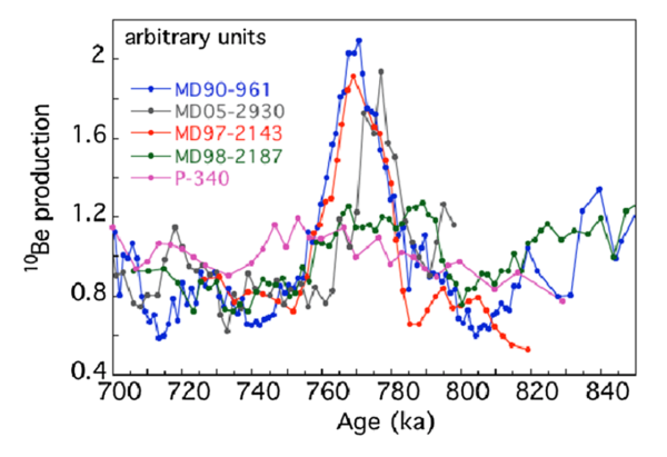
A spike in the levels of the cosmogenic isotope Beryllium-10 in sediment and ice-core records over a 20,000 year period 780,000 years ago seems to record the interval when the Earth’s magnetic field was more disorganised and weaker during the last reversal. Source: Valet & Fournier (2016)
Yes, there are potential problems arising from a weaker and more disorganised field during a reversal. Lower and more changeable ionospheric currents could disrupt electrical grids (as they can today during geomagnetic storms). Orbiting satellites will also face a more hostile radiation environment.
But no – a global cataclysm is not on the cards. There is zero evidence of any species extinctions associated with a magnetic reversal. Beyond the field not being dipolar, the actual behaviour of the field during the transition, particularly the rate of change, is not well constrained by the geological record*, but if we use recent behaviour as a guide, variation of the non-dipolar components of the field appears to mainly happen over centuries, not months and years. Migratory animals that have been shown to at least partially rely on sensing the magnetic field to navigate seem to have coped with past reversals just fine. And if you think about things from an evolutionary perspective, the fact that they have also retained this ability suggests that the changes during the thousands of years that the dipole is weak are not so rapid that successive generations are getting totally lost on their migrations.
What our civilisation would actually face during a magnetic field reversal would not be a quick catastrophe, but something more akin to the effects of sea-level rise: a long-term deterioration in the conditions that we are used to, and our society and infrastructure are tuned for. As the decades pass, we might start seeing more frequent disruptions of the grid due to ionospheric interference, and not just when there was an intense geomagnetic storm; we might see a drop in the average lifetime of orbiting satellites, and more random losses. Increased surface radiation levels in particular locations could also affect background cancer rates. These long-term trends present challenges, but not insurmountable ones. And again, we are talking about this playing out over centuries, or even thousands of years.
So, back to the article that prompted this. As I said, my feelings are complicated. Factually, there’s not too much wrong with it. The author, Alanna Mitchell, has written a new book on the Earth’s magnetic field and has clearly done her research**. The problem is more subtle. Here are some of the terms used in this piece to describe a reversal:
- "planetary anarchy"
- "under attack from within"
- "a battle…raging at the edge of the core"
- "a coup"
- "a revolution"
- "turbulent and ungovernable"
What do all these terms have in common? They all suggest an abrupt, rapid, violent event. The use of the present tense also strongly suggests an event that is on the verge of happening, if not happening right now. And that is true: from a certain point of view. If you ask a geologist if magnetic reversals are rapid, they would say yes. If you asked if a field reversal was imminent, I would say maybe, but you could definitely find scientists who would express more confidence. But these are Deep Time answers, where ‘rapid’ and ‘imminent’ have durations that are considerably more stretched out than their more everyday meanings.
If asked to name an abrupt geological event, most people would name things like earthquakes, volcanoes, and catastrophic landslides: processes that cause quick, violent upheavals over the space of a few hours or days. Geologists, reading the history of the Earth from preserved sequences of rocks, don’t quite see things this way. Each layer – of limestone, of sandstone, of volcanic ash, of mudstone – is a page that describes the prevailing conditions on the Earth at the time it formed. By reading through the book, from bottom to top, we can chart how those conditions change over time. But geological narratives are rarely exhaustive: they are more like a fast-paced thriller that you buy at the airport to read on your holidays. A lot of narrative can be squashed into a relatively small thickness of rock: a cliff-face built from sedimentary rocks might recount the passage of millions of years, and thousands of years might be missed in the turn of a page – between the end of one unit being deposited and the start of another.
So when geologists start talking about ‘rapid’ events, what we really mean is that in the compressed and fragmented books of Earth history, we can observe a change with a clearly identifiable ‘before’ that differs significantly from ‘after’, but the details of the transition are squashed into a single thin horizon, or even lost in the transition between two different rock units. When a centimetre or two of rock can span thousands of years, you can start to see that for geologists, an event that lasts millennia can be rapid: an event that is going to happen in a few thousand years can be imminent. From a geological perspective, the last 35 years of eruptive activity at Kilauea is a tiny blip in Earth history. An earthquake is part of a longer cycle that involves centuries – or millennia – of strain accumulation across a fault, which means there is little difference in terms of the record left behind whether it occurs tomorrow or a century from now. And the resolution of most geological records is such that changes that take several thousand years – longer than the length of recorded human history – are often more like punctuation marks than complete sentences.
Proportionally, ten thousand years in the multibillion-year lifetime of the Earth is the equivalent of an hour or two in the average human life. So there is a certain narrative sense to this stretching out of the timespans implied by commonplace words; it helps us translate the vast tracts of geological time into a frame of reference we can more easily grasp. But the downside of this linguistic appropriation is that while geologists recognise and understand code switching between the Deep Time meanings and the everyday meanings of ‘abrupt’ and ‘rapid’, the rest of the world does not. Field reversals are abrupt? Then we’re in disaster movie territory when it happens, aren’t we***?
Or, as Alanna Mitchell puts it, in the section of her piece which I do think treads a bit too far into scaremongering territory:
"NO LIGHTS. No computers. No cellphones. Even flushing a toilet or filling a car’s gas tank would be impossible. And that’s just for starters."
This mismatch is why I periodically find myself trying to tamp down magnetic field collapse hysteria – and will surely end up doing so again in the future. And yet: there is one further layer of complication, which at the very least makes me sympathetic to what ‘The Poles May Flip’ was (I suspect) aiming to do. If ‘rapid’ changes can last thousands of years, then threats can also slowly develop over similar timeframes. As our response to the threat of climate change rather depressingly illustrates, we are very bad at prioritising problems that manifest over timescales of decades, let alone centuries. The earlier we act, the less we have to do to stave off danger. But the harder it is to convince ourselves into action, because we take on all the pain and our distant ancestors reap all of the benefit.
Alanna Mitchell is right that the long-term deterioration of the field in the run-up to a reversal – should that be what ends up happening over the next century or five – is eventually going to be a problem. Coping with these changes may not technically present an insurmountable challenge. But spending the money required to build infrastructure that is not just fit for the conditions it faces today, but is also resilient to the threats that we know are coming in its working lifetime, turns out to be a tough ask. To our ape brains, urgent threats that accumulate over decades and centuries seem like a contradiction in terms; such things are so far outside of the way we think about time that we lack the language to even properly describe such things.
So how do we present such problems in a way that people actually perceive them as a problem that might require action? We have been discussing an example of the most obvious tactic: using words like ‘rapid’ and ‘abrupt’, which are technically correct in the Deep Time sense, and letting peoples’ more common understanding of these words add the sense of urgency. It surely works to grab attention, and sometimes inspire concern. But I question if it is effective at actually building a consensus for long-term action. Eventually, someone has to explain that we are not talking about the Day After Tomorrow, but the century or millennium after next. Once this happens, people will probably stop worrying again, and may also feel resentful that they were made to worry in the first place.
But what do we do instead? Sadly, I don’t have the answers. If our species is to face and survive the long-term threats presented by our geologically active planet, and our alteration of it, we need to find that new language, that expresses the fierce urgency of acting now to avoid trouble centuries hence.
But for today: your compass will continue to point north. Your children’s compasses will continue to point north. And their children’s too.
Footnotes
*if you want the gory, highly technical details of what we do – and don’t – know about reversals based on the paleomagnetic record, this excellent review is a good place to start.
**from a sneak peek, she even visited the site in France where the first reversed polarity paleomagnetic samples were collected, which makes me more than a little jealous.
***I love The Core. The fact that I know how gloriously wrong it is is probably what elevates it above your standard terrible disaster movie.

