The 2011 Grímsvötn eruption was the biggest explosive Icelandic eruption since Katla 1918*, producing twice as much material as Eyjafjallajökull 2010 in around one tenth of the time. During and after the eruption, scientists measured the effects that it had on the UK. The final version of our paper containing the findings was published last week.
The paper uses results of a citizen science tape-sampling exercise (co-organised by the British Geological Survey and this blog) along with data from public agencies such as the Department for Environment, Food and Rural Affairs (DEFRA), the Scottish Environment Protection Agency (SEPA) and the Met Office, to show where and when the ash fell.
We found that the north of the UK (mainly Scotland) received a light dusting of ash in the 48-72 hours following the beginning of the eruption, which caused little or no health or environmental problems. The previous blog post explains how we know this.
As with 13 months earlier, the greatest impact of the Grímsvötn eruption on the UK was the disruption to aviation. This blog post discusses how new flight rules introduced during the Eyjafjallajökull 2010 eruption meant that the eruption caused much less trouble than it could have done. It is more complicated than the Ash cloud is a myth! – Oh no is isn’t! story presented at the time. In short, I think that computer models did a pretty good job of predicting where and when there would be volcanic ash, and that new flight rules kept London airports open, but that initial estimates of contaminated airspace were too large and the currently defined concentration zones are flawed anyway.
Effects on aviation of the Grímsvötn eruption
Given the lack of health or environmental damage from the eruption, perhaps the title of this blog post should have been “Biggest Icelandic eruption since Katla 1918 doesn’t really affect the UK”. But, of course, there was an impact on aviation. Nine hundred flights were cancelled between 23 and 25 May and the closing of airports was controversial, with the media giving a significant platform to angry airline bosses venting their frustration.
This figure is less than 1% of the over 95,000 flights cancelled during the Eyjafjallajökull eruption of 2010, despite the Grímsvötn eruption being bigger. I have explained the main reasons for the limited disruption in a previous post. An important one was the way that the authorities handled this eruption. Below I describe what I think went well, and what can be improved. Although my research is done in collaboration with a number of different organisations, the views here are my own.
Computer models did a pretty good job of predicting where and when there would be volcanic ash…
Our new results show good agreement with the location and timing of ash-affected areas predicted by the Met Office model. I think that it’s really cool that predictions made using data from some of the world’s most powerful supercomputers can be tested by a bunch of kids with sticky tape. However, saying where and when the ash will be is the easy bit; the real challenge is estimating concentrations. As I have previously written, making concentration maps of ash clouds is really hard.
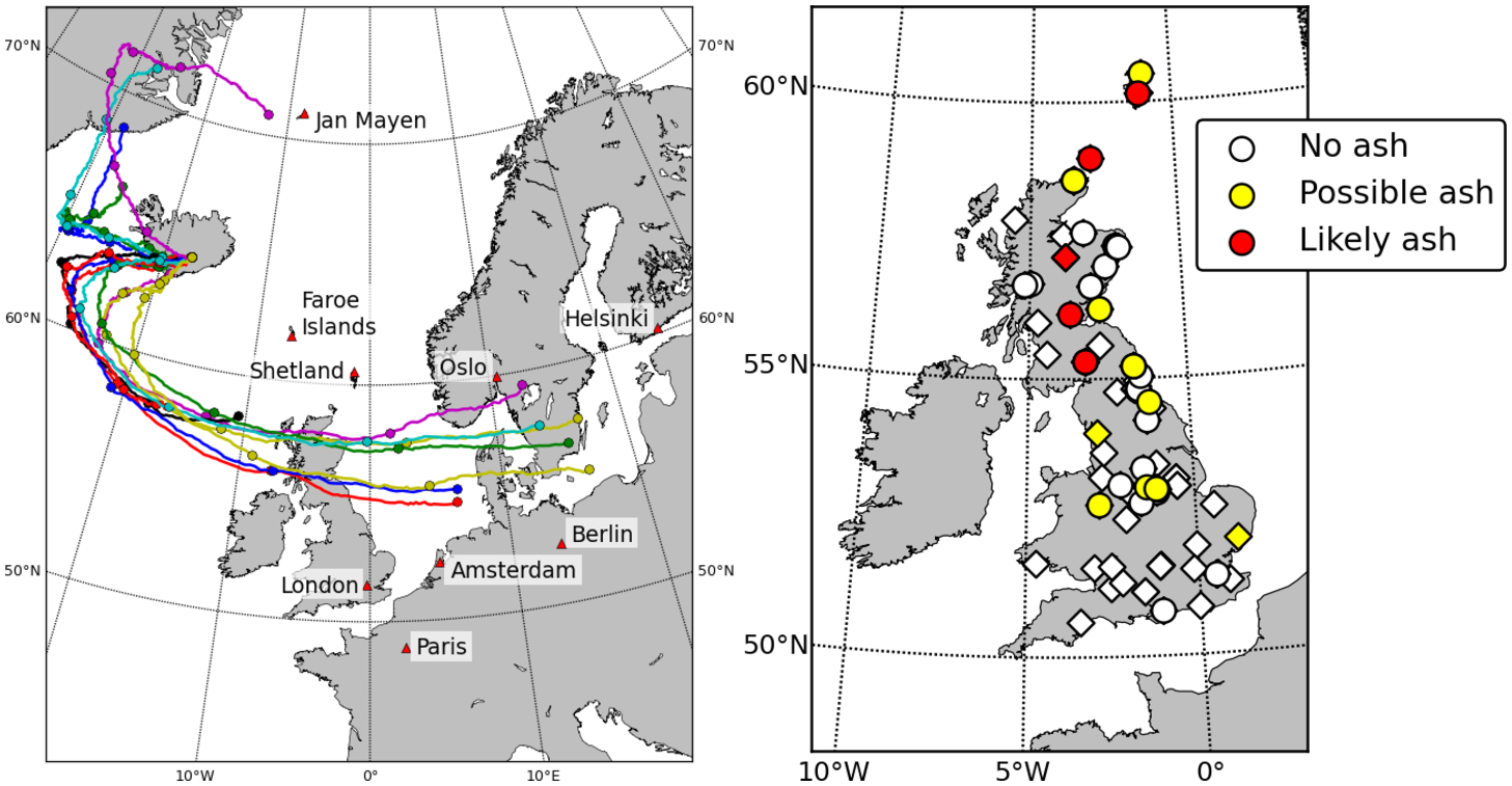
Paths for wind passing over Grímsvötn volcano at 00:00hrs on 22 May calculated by the Met Office computer model. They cross Scotland and the northern UK on 24 May, in good agreement with our results. See the full paper for more details.
… and new flight rules kept London airports open…
Prior to 2010, the rules were that aircraft should avoid all ash. When the Eyjafjallajökull eruption caused the widespread closure of airports across Europe, the rules were relaxed to allow aircraft to fly, even if the presence of some ash had been predicted. Three different zones of ash concentration were introduced. The zone of Low Contamination (blue in the map below) has a concentration of 200 micrograms per cubic metre (a few grains of fine sand in a bath). This is the same level that was used to identify contaminated airspace under the old system and is similar to the detection limit for satellite methods. It is now permitted to fly in this zone.
Zones of Medium (coloured grey) and High Contamination (coloured red), which correspond to concentrations of 2000 micrograms per cubic metre and 4000 micrograms per cubic metre, were introduced to mark the areas of most concentrated ash. Aircraft can only enter these with special permission. These rules were in force during the Grímsvötn eruption.
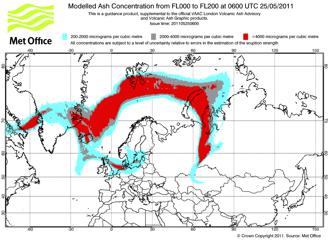
Section of map of predicted ash concentrations on 25 May during G2011. Under the old flight rules, all coloured areas would have been out of bounds. This would have resulted in another closure of London airports. Source: Met Office, Crown Copyright 2011. Click image for full plot.
The map above shows that highest concentrations are expected in the northern UK (as we actually found in our study), and flights were cancelled to and from northern airports such as Glasgow, Edinburgh, Aberdeen and Newcastle. But it also shows lower concentrations of ash across southern England and London. Under the old rules this would have closed the airports there, too, causing massive disruption and losses for the second time in just over a year. The new rules prevented this and were a big part of the reason that the Grímsvötn eruption had a smaller impact than Eyjafjallajökull, despite being significantly more powerful.
…but the initial estimates of contaminated airspace were too large…
As our findings show, computer models are pretty good at working out where the ash will go. To estimate the concentration you need to know what is coming out of the volcano. The mass discharge rate of a typical explosive eruption can be calculated from the height of the eruption column using an equation based on data from many past explosive eruptions. This is standard practice at Volcanic Ash Advisory Centres across the world. The equation is very sensitive and if you increase the plume size by 20% it doubles the mass discharge rate. In Iceland, the height of the eruption column is usually estimated using radar data from the Icelandic Met Office. The problem is that Grímsvötn 2011 was not a typical explosive eruption.
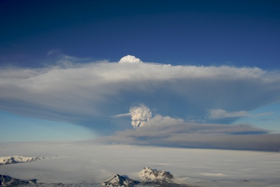
The eruption plume from the Grímsvötn eruption. The top part travels north, but is mainly steam. Most of the tephra travels south in the lower part of the plume. Photograph by Ólafur Sigurjónsson í Forsæti.
The photograph shows the eruption plume. The upper white part reaches nearly 20 km into the air, but it contains mainly steam and sulphur dioxide. The steam was produced as the eruption passed through a lake within the ice. Much of this fell back to Earth as dirty ash-filled hailstones. Most ash grains (and pumice and other volcanic debris, collectively known as tephra) are in the bottom of the plume. Sticky from the moisture in the plume, lots of the ash clumped together and fell down quickly to be deposited near the volcano. This extra fallout meant that less ash left Iceland than was predicted by the standard methods. This caused dispersion models to predict concentrations that were too high, and so too much airspace ended up in the grey and red zones.
Comparing the predicted ash clouds with information from satellites showed something was wrong. There was much less ash over Greenland than the model had predicted. With these observations, and following discussions with volcanologists (disclosure: I was one of them), the Met Office adjusted the model (details provided here, with permission) to reduce the amount of ash in the plume. This decision certainly limited disruption during the later stages of the eruption. If it had been made sooner then perhaps some of the flight cancellations during the early stages could have been avoided, too.
This is all much clearer with hindsight, of course, and this was the first eruption of Grímsvötn since it became necessary to estimate ash concentration. To do better next time, the ability to collect and make use of accurate new data as quickly as possible is important. The British Geological Survey and Icelandic Met Office are working together to improve volcano monitoring in Iceland, and current hot topics for research in the wider scientific community include finding ways to make it easier to compare model predictions with satellite images and to use satellite data to set model parameters.
…and the currently defined red and grey zones are flawed anyway
The introduction of zones of different ash concentration did a lot to keep aircraft flying during the two recent Icelandic eruptions, but this system still has two big problems.
The first problem is that the zonation scheme gives the impression that flying in the blue zone is ‘safe’, but this is not necessarily the case. Volcanic ash accumulates continuously within jet engines as they fly through the cloud and so a long flight through the blue zone (or even in lower ash concentrations outside marked areas) may do more damage than a short flight in the red zone. Furthermore, flying in any amount of ash will result in increased maintenance costs for aircraft operators. It seems sensible to move to a system that estimates the ‘dosage’ of ash for given flight routes.
The second problem is that it isn’t actually possible to map the boundary between the grey and red zones. I still can’t find an official justification online for why these levels are set where they are. The blue zone, which is roughly equivalent to what satellites can detect, is reasonable. The lower limit of the grey zone (2000 micrograms per cubic metre) is 10 times higher than the blue zone and can perhaps be justified because aircraft operating from dusty airports in desert areas already fly through this level of contamination (but of sand, which has a higher melting point than volcanic ash).
Setting the lower limit of the red zone at double this (4000 micrograms per cubic metre) makes little sense, because comparisons of satellite concentration estimates with measurements made by aircraft and other sensors show that they cannot distinguish between these two levels with any confidence. Comparing the Met Office model predictions of peak concentration to other measurements (which have uncertainties of their own) shows that they agree within a factor of 2 only around a quarter to a third of the time. This increases to a half to two thirds of the time if an 80 km wide buffer zone is used. This is because making maps of ash clouds is really hard.
Given this uncertainty, the huge range in possible ash concentrations and evidence that ash-aircraft encounters that actually stopped engines involved concentrations of over 1,000,000 micrograms per cubic metre, setting the levels of different zones at 200, 2000, 20,000, 200,000 etc. would seem to be more appropriate.
What it all means
There are two main messages from this post:
- Dispersion models are good at predicting where volcanic ash will go, and this system worked fine for two decades when aeroplanes had to fly around it. Flying through volcanic ash requires estimates of the concentration, but these currently have large uncertainties. Improving them needs further scientific research into eruption deposits, on-site monitoring, computer modelling techniques and satellite detection methods. This is important to remember at a time when budget cuts in the US have severely reduced the capabilities of the Alaskan Volcano Observatory.
- Things have come a long way since Eyjafjallajökull erupted in 2010 and new flight rules mean that only the very largest eruptions now have the capability to shut down all of European aviation (and there is a lot of it) in such dramatic fashion. I suspect that the biggest economic threat to the UK in the future is probably from long-lasting eruptions causing short, but frequent and unpredictable, closures of small regions of airspace over periods of many weeks or months.
Further reading
This is the second of two posts about the effects of the Grímsvötn eruption on the UK. Read the first post to learn where and when the ash fell.
Our study was published in the Journal of Applied Volcanology, which is an open access journal. This means that anyone can download and read the full report for free by clicking the link below:
-
Stevenson, J. A., S. C. Loughlin, A. Font, G. W. Fuller, A. MacLeod, I. W. Oliver, B. Jackson, C. J. Horwell, T. Thordarson, and I. Dawson (2013), UK monitoring and deposition of tephra from the May 2011 eruption of Grímsvötn, Iceland, Journal of Applied Volcanology, 2(1), 3, doi:10.1186/2191-5040-2-3.
Last year, we published a similar paper in the Journal of Geophysical Research about the deposition of Eyjafjallajökull ash across Europe :
- Stevenson, J. A., S. C. Loughlin, C. Rae, T. Thordarson, A. Milodowski, J. S. Gilbert, S. Harangi, R. Lukács, B. Højgaard, U. Árting, S. Pyne-O’Donnell, A. MacLeod, B. Whitney, and M.Cassidy, (2012), Distal deposition of tephra from the Eyjafjallajökull 2010 summit eruption, J. Geophys. Res., 117, B008904, doi:201210.1029/2011JB008904.
For other Iceland-volcano related posts, covering topics such as the probability of ash clouds reaching the UK, why volcanoes explode and an account of an expedition to Grímsvötn’s crater, follow the links from my Every Post Ever page.
* Technical point: There are a number of ways to define the size of a volcanic eruption, such as plume height, volume of material erupted, volume of magma involved. These are incorporated into the Volcano Explosivity Index. Here we are talking about the volume of widely-dispersed tephra deposited from a (sub-)Plinian eruption column. The 1963-1967 submarine eruption of Surtsey, and the 1996 subglacial eruption of Gjálp both produced larger volumes of tephra (mainly hyaloclastite), but it was not widely dispersed.


Pingback: Grímsvötn 2011 (Part 1): UK ash deposition from the biggest Icelandic eruption since Katla 1918 | Volcan01010
Pingback: A history of ash clouds and aviation | Volcan01010
Pingback: Alaskan ash in Ireland: context, implications and media coverage | Volcan01010
Pingback: An Icelandic eruption 100 times more powerful than Eyjafjallajökull | Volcan01010
Pingback: How do satellites map volcanic ash clouds? | Volcan01010