The fault that made a mountain range

A post by Chris RowanApparently Grand Teton National Park suffers somewhat from being in the shadow of Yellowstone, just to the North. I really can’t think why.

Click for larger image. Photo: Chris Rowan, 2010

The tendency of this handsome panorama to be cut off by rain clouds hovering a few hundred feet above the valley floor may be an issue for some, but on a clear day the view is pretty much unbeatable. And for a geologist, there’s an additional source of wonder and excitement: the presence of such an abrupt jump in the topography, the extreme linearity of the range front, and the abrupt transition from gravel and silt only a few thousand years old on the valley floor, to hard, crystalline granites and metamorphic rocks that are more than 1.5 billion years old in the mountains, all scream, ‘fault!’. You don’t have to take my word for it, either: if you turn your eyes towards the lower slopes of the mountains just north of Jenny Lake, it is relatively easy to trace a linear scar disrupting the glacial till deposited by melting glaciers at the end of the last ice age, about 14,000 years ago. This initially smooth surface has since been broken; multiple earthquakes have lifted the far side of the breach upwards about 30 metres relative to the near side, creating a sizeable fault scarp.
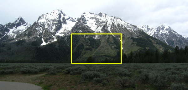
View from the Cathedral Group Turnout. Can you see the fault scarp? Photo: Chris Rowan, 2010
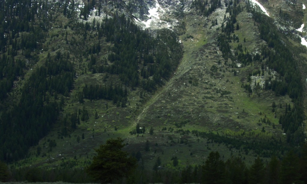
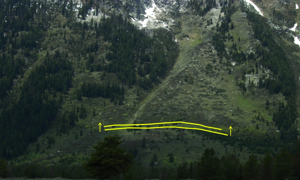

Teton Fault scarp, annotated

Scarp marking movement on the Teton Fault since the end of the last glacial period (click for larger images). Photos: Chris Rowan, 2010.

Multiply that up a few orders of magnitude, from maybe ten earthquakes in ten thousand years to ten thousand earthquakes in 10 million years, and voila: your fault scarp forms the face of an entire mountain range. And what is really striking about the Tetons is how clearly this fact – that the Teton Range and the Teton Fault are essentially the same thing – is firmly written in their geomorphology. The total displacement that accumulates across a fault is not constant along its length; faults do not go on forever, and the points where they peter out are, by definition, places where there is no displacement. This means that the total movement on a fault is greatest towards its centre, and decreases towards either end. If you look you trace the profile of the Teton Range from north to south, it matches this form pretty closely, even if erosion has carved numerous large gap.


The morphology of the Teton Range matches the displacement profile for a growing fault, with the middle moving furthest (click for larger image). Photos: Chris Rowan, 2010.

The total distance from the valley floor to the highest peak is about two thousand metres. But if you think a two kilometre-high fault scarp is pretty impressive, remember that the total displacement on the Teton Fault is even greater than. Not only is material constantly being removed from the peaks by erosion, but that material is then transported, by water or ice, down into the hole being created by the faulting, filling it and raising the level of the valley floor. On the western side of the fault, the Precambrian rocks equivalent to those towering above Jackson Hole valley on the eastern side of the fault are at least two kilometres beneath our feet. That implies a minimum displacement of about four kilometres. [Update: I was being far too conservative, it seems: Callan demonstates how exposures of Cambrian sandstones on Mount Moran indicate more like 9 km of displacement.]
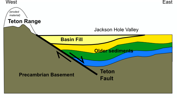
E-W cross section through the Teton Range, showing the half-graben structure created by uplift on the Teton Fault

It’s a big fault – and furthermore, it’s a big fault that hasn’t ruptured for a while. When it does, it will produce a magnitude 7-8 earthquake, and throw the Teton Range a few metres higher up into the clouds.

(with regards to the video, it’s a bit of an experiment – I’m not sure it works well as a standalone, but it does provide a nice sweep over the whole range, showing how it rises and falls again as you trace along its length.)

Categories: geology, geomorphology, outcrops, photos, structures

Heat in the Southeast

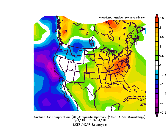
A post by Anne JeffersonHere in Charlotte we had a hot summer. We barely escaped the dubious distinction of hottest summer on record, with an average temperature of 81.1° F (27.3 ° C) between 1 June and 31 August. The record had been set in 1993, when Charlotte recorded an average temperature of 81.5° F (27.5 ° C). In terms of record breaking heat, we actually fared better than many parts of the east coast, where temperature records from New York City to Greenville-Spartanburg, South Carolina were broken. Below there’s a nice map from NOAA of how far average temperatures deviated from the 30-year climate normal period (here, 1966-1996).

U.S. surface temperature departure from average (°C), June 1 to August 31, 2010, from NOAA/ESRL Physical Sciences Division, Boulder Colorado

U.S. surface temperature departure from average (°C), June 1 to August 31, 2010, from NOAA/ESRL Physical Sciences Division, Boulder Colorado

Of course those average temperature records belie the minima and maxima experienced by each place over the course of those three summer months, so there’s another statistic that I’m finding even more interesting: the number of days where maximum temperatures exceeded 90° F (32.2 ° C). I think of it as Anne’s index of intolerable heat, especially when combined with the Southeast’s oppressive humidity. In Charlotte, between 1 June and 31 August, we had 67 days that exceeded 90° F. That means that 73% of days this summer were intolerably hot (at least for me). Also, that’s only counting the days in the climatological summer. We had 90+° F degree heat in early April, some in May, and we’ve already had some in September, with more in the forecast this week. I suspect that by the time the year is out, our total days above 90° F will be something around 80, if not more.

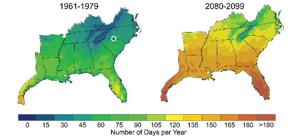
The long-term predictions for the index of intolerable heat look grim for Charlotte and the rest of the southeast. The image below shows historical and modeled days with peak temperatures exceeding 90° F. By the end of the century, at least under a high emissions scenario, 80+ days of intolerable heat will be considered a cool summer in North Carolina. We’re heading towards 120 days or more of hot, hot weather, a doubling of our historical average. In parts of Florida and Texas, more than half the year will be hotter than 90° F. Yuck. Glad I won’t be around here then.

Historical and predicted days with peak temperatures above 90 degrees Fahrenheit

These temperature trends are not just bad news for people who like to play (or do field work) outside in the summer, but are too wimpy to drop bucketloads of sweat. Hotter average temperatures and more days with ridiculous heat have real health consequences. On hot days, the chances go up that people playing outside end up with heat exhaustion or life-threatening heat stroke. People without air conditioned homes or workplaces, people too poor to pay tremendous energy bills for air conditioning, or people who just happen to have their AC break do not even need to play outside to be at risk of heat related illness or death. About 700 people already die each year from heat-related causes, and the elderly are a disproportionate share of the victims. Those with cardiovascular disease are also at substantially increased risk of heat-related mortality.

And it’s not the heat alone that spells bad news for the Southeast. With hotter temperatures come increasing rates of photochemical reactions…such as the production of ground-level ozone from nitrous oxides and volatile organic compounds released by car exhaust, power plants, and natural sources. The chemistryof photochemical ozone production is pretty complex and we don’t have a fantastic handle on how coming climate changes will impact the percent of hot days with sun versus clouds, but if the number of hot sunny days increases, it is likely that ozone production will increase too. Ozone brings its own host of adverse health effects, particularly respiratory problems, so even if you don’t mind the heat, running around outside on hot, sunny days can be a bad idea. Once again, children, the elderly, and those with asthma and other respiratory problems are most at risk on high ozone days. Such days, labeled as orange alerts, occur sporadically thoughout the summer already. In Charlotte, we’ve had 13 days with air quality in the orange category since May 1 this year. On those days, people at risk are encouraged to avoid outdoor exercise, and daycare centers limit the time kids spent playing outside. Some days, the air quality is bad enough (red alert) that even healthy adults are encouraged to avoid to outdoor exercise. That’s happened once this year in Charlotte.

As Charlotte and other parts of the southeast move towards one-third of their days in the intolerably hot range, with the probable added bonus of worse air pollution, it will be interesting to watch the societal shifts in attitudes toward the climate. Will Southerners get serious about reducing emissions from cars? Will Charlotteans end their love affair with sprawl in order to improve air quality? Will the Southeast be depopulated of Yankee transplants like me, who finally decide that they can’t take the heat? Or will we just stay inside and crank up the air conditioning units and complain about the weather?

Categories: by Anne, climate science

Stuff we linked to on Twitter last week

A post by Chris RowanA post by Anne JeffersonBefore we get on with the link sharing, Lockwood has issued the call for the next Accretionary Wedge Geo-carnival. The theme is
‘Important Geological Experiences’ and the submission deadline is September the 27th.

Also this week, the geology PodClast is back: episode 15 covers everything from the latest earthquake research in Tonga, Haiti and California, to the floods in Pakistan, and is now available for your listening pleasure. And Anne discusses her blogging in a nice interview in the Charlotte Observer.

Blogs in motion

Erik Klemetti’s excellent Eruptions blog, and its knowledgeable and lively community of volcano spotters, has now moved to Big Think, and another new voice has added itself to the geoblogosphere in the form of Glacial Till. It’s a good thing that there only 2 new science blogging networks launched this week, at PLoS and the Guardian, or we might not be able to keep up.

Earthquakes and Tectonics

Volcanoes

General Geology

Environmental

Water

Interesting Miscellaney

Categories: links

Tectonics of the M7 earthquake near Christchurch, New Zealand

A post by Chris RowanThis post was written in response to the Darfield earthquake in September 2010. The most recent seismic activity is discussed here.

[Updated 8th September 1200 GMT – see bottom of post. And check out the PodClast discussion of this earthquake, featuring Kiwi Chris Town, Ron Schott, and myself.]

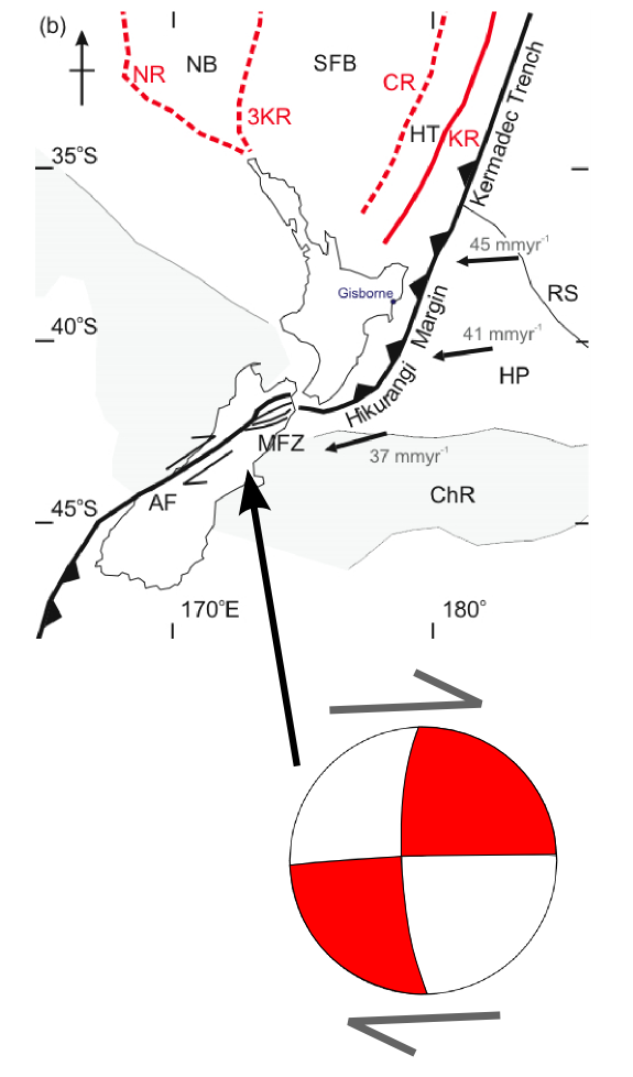
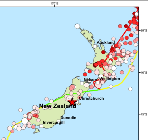
The South Island of New Zealand has just been shaken by a large earthquake, reported as a magnitude 7.0 by the USGS. It appears to be quite a shallow rupture, on the Canterbury Plains close to Christchurch, and the focal mechanism indicates largely strike-slip motion.

Focal mechanism of September 3rd earthquake, and it's location with respect to the plate boundary in New Zealand

As the figure above illustrates, New Zealand is not just located on top of the boundary between the Pacific and Australian plates: it is located at a point where the nature of that plate boundary changes in some rather fundamental ways. The subduction zone running down the East Coast of the North Island terminates off the Northeast coast of the South Island, about 100 kilometres north of Christchurch, and gives way to a transform boundary cutting through the continental crust of the South Island, where the plate motions are accommodated by largely dextral strike-slip on the faults of the Marlborough Fault Zone (MFZ in the figure above) and the Alpine Fault (AP). Whilst this latest rupture clearly occurred some way south of both of these fault systems, the focal mechanism can be interpreted as showing as dextral strike-slip on an east-west oriented fault, suggesting that it is still linked to deformation at the plate boundary.

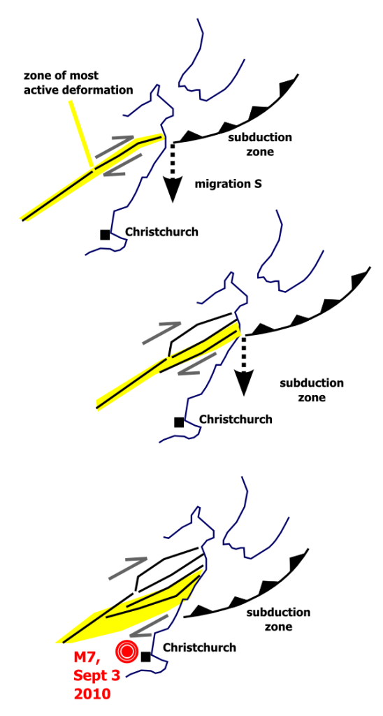
New Zealand is a region of distributed deformation: the relative motions between the Australian and Pacific plates are not accommodated on one or two faults in a narrow zone, but on many faults across a much wider zone. It is therefore perhaps not surprising to observe large earthquakes accommodating plate motions some distance from where the two plates actually meet. However, the occurrence of such earthquakes in this particular region of the South Island is probably also linked to ongoing changes in the nature of the plate boundary at the junction between the subduction zone and the continental transform. If you look at the displacement history of the individual faults in the Marlborough Fault zone, the northern faults are older, were more active in the geological past, and have quite small recent (in the geological sense of ‘the last few 100,000 years’) displacements; the southern faults are younger, and have much larger recent displacements. The most obvious explanation for these changes is that the most northern of the Marlborough faults was originally directly linked with the end of the subduction zone, but that these two structures moved out of alignment as the subduction zone moved south, causing new strands of the Marlborough Fault system to grow in order to more efficiently accommodate plate motions.

Growth of new plate boundary faults on the South Island of New Zealand in response to southward propagation of the subduction zone

This tectonic evolution is ongoing, and since the end of the subduction zone is now actually to the south of the southernmost and youngest of the Marlborough faults. Some of the plate boundary deformation is probably therefore being shunted into the region around Christchurch, where it needs to be accommodated by dextral strike-slip faulting. Eventually, over geological time, this deformation will lead to the formation of a new, more southerly strand of the Marlborough Fault system. It also means that earthquakes of this type of size are unlikely to be a one-off event in this area. Unsurprisingly, then, seismic surveys have identified a number of active faults beneath the recent sedimentary cover on the Canterbury plains (although they were identified in the linked study as reverse faults accommodating compression, strike-slip deformation is very difficult to identify if you only have a 2 dimensional cross section to work with).

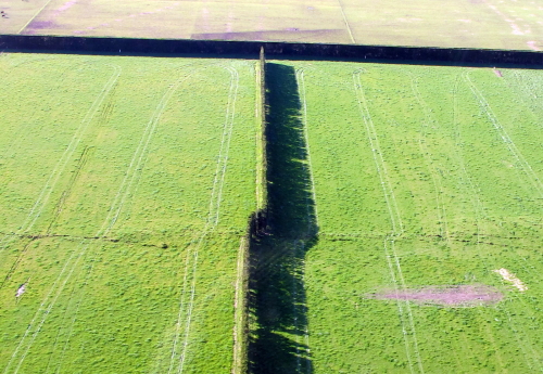
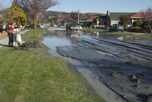
Whilst this map of large historic earthquakes in New Zealand shows that earthquakes of this magnitude can occur pretty much anywhere in New Zealand, seismicity in this particular area has some particular hazards; it is close to a heavily populated region (Christchurch) built mainly on unconsolidated Quaternary sediments, which will intensify the potential shaking and damage to unreinforced buildings. Fortunately, whilst this earthquake appears to have caused a fair amount of damage, from the early reports casualties seem to be light.

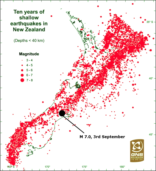
Update: 4/9/10 Here’s a couple more plots to that help to further put this earthquake in context. Via GeoNet, here’s a plot of all the earthquakes in New Zealand over a ten year period, including magnitude 3 and 4 tremors that only really disturb seismometers. This gives us a much more complete picture of how the crust in New Zealand is deforming, and shows us that yesterdays earthquake occurs towards the edge of, but still within, a zone of distributed plate boundary deformation on the northeast South Island.

The historical seismicity map from the USGS shows that in the last couple of decades there were a couple of earthquakes with very similar strike-slip focal mechanisms a bit further to the north-west, closer to the actual plate boundary, with magnitudes of around 6-6.5.

>M 5 earthquakes on the South Island since 1990. Source: USGS

Some other useful links:

Update: 5/9/10 More useful links:

Update: 6/9/10

  • New Zealand geologists have been doing a sterling job of getting good information out to the public. In this press release from New Zealand’s Science Media Centre, Professor Euan Smith of Victoria University in Wellington has done a great job of describing the quake (he thinks that we’re looking at sequential ruptures of the same fault) and the seismic hazard going forward.
  • The British Geological survey have put out a bulletin (pdf) that includes a plot of every >M 6 earthquake since 1843 – which must be pretty much the entire historical record.

    Magnitude 6+ earthquakes in New Zealand since 1843. Source: BGS

    The most striking feature of this map is the section of the Alpine fault in the central South Island that has not ruptured in the last couple of centuries – which suggests there might be a fair amount of strain belt up waiting to be released.

  • There is a Christchurch earthquake group on flickr, with a good collection of earthquake damage photos.
  • For those interested in learning more about liquefaction, this (pre-quake) poster from Environment Canterbury (pdf) gives both general background and a hazard map for the whole region – it would be interesting to see how it matches up to the reality.


Update: 8/9/10

  • New Zealand’s GNS have posted a video of their survey of the fault surface rupture on their YouTube channel.

  • GNS have also been calculating the focal mechanisms for all of the past weeks’ aftershocks. The pattern of strike-slip to the east of the main shock and compression to the west is quite interesting. Thanks to commenter Lanthanide for the link.
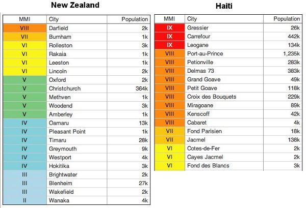
  • Many people, myself included, have contrasted the Canterbury earthquake with the Haiti earthquake as an illustration of how poverty, and the consequent lack of building standards or preparedness, contributed to large differences in the damage and casualties. This is certainly an important point, but via Andy Revkin on Dot Earth, a comparison of the shaking intensity and population exposure for these two earthquakes should caution us about pushing the comparison too far. [Update: As is discussed in the comments, this USGS chart seems to underestimated the intensities in New Zealand: Christchurch, for example, is more like a VI-VII than a V. Nonetheless, the point still stands.]

    Comparison of shaking intensity and population exposure for Canterbury and Haiti earthquakes. Source: USGS, via Dot Earth

Categories: earthquakes, focal mechanisms, geohazards, tectonics

Diversity in the geosciences and the impact of social media

A post by Anne JeffersonResearchBlogging.orgOne year ago, Kim Hannula, Pat Campbell, Suzanne Franks, and I launched a survey about women geoscientists reading and writing in the blogosphere. We presented the results at the Geological Society of America meeting, and Kim wrote a great post summarizing and discussing our data. Then I took Kim’s post, polished it up with great wording and thinking suggestions from all of the co-authors and submitted it for publication. It went out to reviewers and a few months later, we were accepted for publication.

In the September issue of GSA Today, you can find our article on The Internet as a resource and support network for diverse geoscientists. We wrote the article with with the idea of reaching beyond the audience that already reads blogs (or attends education/diversity sessions at GSA), with the view that we might be able to open some eyes as to why time spent on-line reading and writing blogs and participating in Twitter might be a valuable thing for geoscientists to be doing. And, of course, we had some data to support our assertions.

GSA Today is an open-access journal, so everyone can and should go ahead and read the whole 2-page paper. But if you want a few highlights, here are some selections from the paper:

The online opportunities for mentoring, networking, and knowledge sharing may be particularly valuable for women and minority geoscientists. Virtual networks offer opportunities to provide support and reduce the professional isolation that can be felt in physical work environments where there are few colleagues of a similar gender, race, or ethnicity. …

Women reported professional and social benefits from reading blogs. We used a five-point scale (1: strongly agree; 3: neutral; 5: strongly disagree) to assess perceived benefits. Of the professional benefits, respondents were most positive about learning things outside their specialty (avg. 1.9), followed by learning within their specialty (avg. 2.3), learning about pedagogy (avg. 2.4), and learning about technology (avg. 2.5). Based on these responses, we conclude that these women blog readers perceive positive professional benefits from their online reading. This suggests that social and other online media could be strategically used to supplement the resources available to all geoscientists, regardless of their gender, ethnicity, geographic location, or employment status. …

Geoscience students perceived the strongest benefits from blog reading, while faculty most strongly agreed that blogs helped them find role models and normalize their experience by finding that many other faculty share their experiences and perspectives. Women in industry perceived less social benefit from blog reading than those in academia, but women in government were the most negative about their blog-reading experiences. In particular, their responses indicated that blog reading had not been helpful to them in finding role models. …

Blogs and other social media may provide a source of community and role models for women geoscientists and help in the recruitment and retention of women from undergraduate education to faculty or industry careers. Our survey results show that blogs are already providing valuable benefits to white, academic women geoscientists, but that existing social media networks could be doing a better job of supporting minority geoscientists and those outside academia. We believe that professional societies, employers, funding agencies, and individual geoscientists should recognize the potential value of social media for supporting a diverse geoscience community. To be effective, such recognition should be accompanied by policies that encourage geoscientists to actively participate in geoscience-related social media opportunities. …

As a white woman geoscientist in academia, I have definitely personally and professionally benefited from my blog reading and writing time. (I even have a publication to show for it!) But I would to love to hear more from minority and outside-of-academia geoscientists about what blogs, Twitter, and other internet-based forms of support could be doing to better support you. As you can see from the paragraph above, what we ended up advocating was that institutional support for blogging and blog-reading would help increase participation. We thought that, with increased participation, more minority and outside-of-academia geosciences voices would emerge, helping others find support, community, role models, and mentoring in voices similar to their own. Meanwhile those of us closer to the white/academic end of the spectrum could learn from all that a diverse geoscientist community has to offer.

One final note, I’m a newbie member of the Diversity in the Geosciences committee for the Geological Society of America. If you have ideas for how GSA could be doing a better job of promoting and supporting diversity off-line and/or on-line, please let me know.

Jefferson, A.J., Hannula, K.A., Campbell, P.B., & Franks, S.E. (2010). The Internet as a resource and support network for diverse geoscientists GSA Today, 20 (9), 59-61 : 10.1130/GSATG91GW.1

Categories: bloggery, by Anne, publication