This authors of the paper the figure below comes from claim that it’s a fossil of some kind:
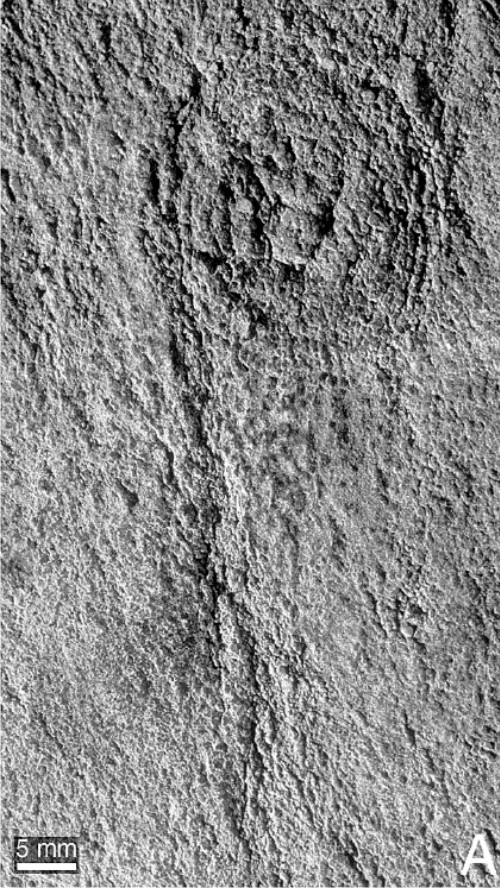
Do you agree? What do you think it is, and how old do you think it is?

This authors of the paper the figure below comes from claim that it’s a fossil of some kind:
Do you agree? What do you think it is, and how old do you think it is?
There’s lots of volcanic action in the Aleutians arc at the moment, with three volcanoes: Okmok. Cleveland, and Kastochi, all erupting at various points in the last month or so.
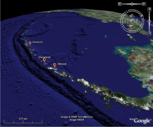
The Volcanism Blog and the Eruptions blog have both been keeping us up to date with the waxing and waning of these eruptions. However,given my past interest in possible seismic triggering of volcanic eruptions, it’s possibly no surprise that I’ve been wondering whether the near-simultaneous eruption of three volcanoes in the same geographic region is entirely a coincidence. Could the eruption of one have triggered the others?
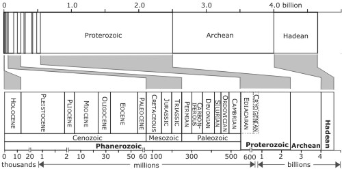
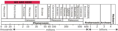
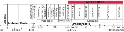
What is the best way to represent geological time? When I was working on my little timescale project, I had one very specific aim in mind: I wanted a scale that clearly showed the names and ages of all the different geological periods, without becoming ridiculously big. As it turns out, this isn’t very easy. From a temporal perspective the divisions of the timescale are somewhat irregular, ranging from tens of thousands of years in length (the Holocene) to a couple of billion (the Proterozoic). In fact, if you plot the entire 4600 million years of Earth history linearly, even the periods which last tens of millions of years, which is most of them, are pretty narrow.
The Seed overlords would like to find a little bit more about who you are. If you take the time to complete this survey, you are rewarded with the chance to win Apple stuff.
Some of my fellow Sciblings have also been enticing their readers to reveal themselves, and give them some bloggy feedback. I’ve found this sort of exercise valuable in the past, so consider the comments below an open forum. Who are you? What brought you here? What (if anything) keeps you coming back? Are there any subjects you’d like to see me talking about more, or less? Is there anything else I should do to aid the more geologically-challenged to take their first steps in a larger (and cooler) world?
So I’ve been playing around a bit with my mini timescale, and it is now available in two flavours, the original, but improved, right to left orientation:
Download EPS version
and the all-new left to right version, which I have to concede might indeed be ‘better’:
Download EPS version
For those that want to use this on their own blogs, the EPS files I link to can be imported into programs like CorelDraw and Illustrator, so you can modify the red locator bar (and anything else) to suit before exporting an all-new jpeg.
As for this blog, which one do you prefer?
Update: In answer to Brian’s question below, this chart was based on the information from the webpage of the International Commision of Statigraphy, specifically this page (you can also download a pdf chart here ).
Further update: Just to be clear, anyone who finds these figures useful is welcome to use them for any (non-commercial) purpose that they like. Attribution would be nice where practical, but I won’t be sending in the faceless copyright zombies if you don’t.

For lot's more videos on soil moisture topics, see Drs Selker and Or's text-book support videos https://www.youtube.com/channel/UCoMb5YOZuaGtn8pZyQMSLuQ/playlists
[…] Announcing STORMS | Highly Allochthonous on Recent News […]

Nice plan for content warnings on Mastodon and the Fediverse. Now you need a Mastodon/Fediverse button on this blog.