Why I went on strike over civil servant pay

On the day that the chancellor delivered his budget, 15 March, I went on strike. I’d never been on strike before, so it was a big deal for me. The strikes were over low pay in the civil service and how it causes problems with recruitment and retention. It didn’t seem like a big deal in the media, however. Civil servants were one group among many on strike, and probably the least well-defined. I didn’t see any reports that specified how low the pay is or what the problems were.

I’m a Senior Software Developer in the Informatics group at the British Geological Survey (BGS). I have recently spent a big chunk of my time recruiting Information Technology (IT) staff and so have first-hand experience of the issues.. I’m writing this blog post because I think that concrete numbers and real-life examples are the best ways to illustrate the difficulties that we face. These words are mine and not those of the BGS or of UK Research and Innovation (UKRI), our parent organisation where our pay grades are set.

About the strikes

I’ve been working at BGS for over 5 years and I love (nearly) all aspects of my job. The British Geological Survey is a public sector organisation whose mission is to “provide impartial and independent geoscience advice and data”. As I am not directly employed by the Crown, I am technically a public servant and not a civil servant, but, like civil servants, my salary is ultimately decided by government policy. For simplicity, I will use the term civil servant throughout this post as this is how our strikes have been reported. Civil servants are not as visible as nurses or teachers, but our work is still important to the smooth running of the country. Any big project that involves building things, burying things or digging them out of the ground is likely to interact with the BGS. Besides providing geological maps of the rocks beneath your feet, our data and research will help the UK move to low-carbon energy sources and reduce the impact of natural hazards.

Many BGS staff are members of the Prospect Union, which represents scientists, engineers and technical experts. Prospect has called for industrial action against low pay. The pay offer from the government was 2-3%, against a Consumer Price Index inflation rate of 10%. This is on the back of 13 years of consecutive below-inflation pay rises (real-terms pay cuts). In previous years, people grumbled about these but carried on; this year the hit to living standards is too much and 80% of union members voted to strike, on a turnout of 72%.

If I had worked that Wednesday, it would have been on automating groundwater flood forecasts (because floods can be caused by water moving beneath the ground as well as over it). I was also due to update our asset register of BGS-developed software tools and services to help prioritise which to maintain and which to retire. It annoys me that these projects, which explicitly aim to make our work more efficient, have been delayed by strike action as well as by the conditions that led up to it.

Low salaries harm recruitment

The strikes are over low pay caused by the government’s repeated failure to match public sector pay rises to inflation. As a result, the gap between public and private sector salaries for IT staff is now huge.

Salaries are 25-50% lower in the public sector

Below are the job titles and salaries from the first page of a search on the Indeed.co.uk jobs site for software (developer or engineer), ranked approximately by seniority:

Job titleSalary
Junior Software Engineer£28.4-35.5k
Software Developer*£32k
Embedded Firmware Engineer£35-50k
Software Data Engineer – Platform services£47k
Software Engineer – React.js£42-56k
Software Development Engineer II£46-70k
Senior Systems Engineer£55k
Senior Software Developer£55-61k
Senior Software Engineer£65k
Lead Software Developer£48.2-72.4k
Software developer salaries from jobs website search.

*This position is at a public sector organisation

And here are the corresponding grades at UKRI / BGS:

Job TitlePay GradeSalary
Junior Software DeveloperC£25.7k
Software DeveloperD£31.9k
Senior Software DeveloperE£39.7k
Software developer salaries in UKRI / BGS.

In most cases, the public sector salaries are 25-50% lower than the private sector counterparts. This can be a difference of tens of thousands of pounds per year. There are no software developer positions at Grade F (£50.7k) or above.

It’s easy to find examples where the difference is even greater. Emerging disciplines such as DevOps (automating the building, testing and running of software products) and data-intensive fields such as Data Engineering and Data Science command a premium, as do jobs in the Financial Technology (FinTech) sector. A report on managing NHS data by the Department of Health and Social Care describes difficulties in hiring data specialists for £25-45k when private sector salaries are in excess of £80k. LinkedIn recruiters regularly advertise developer jobs with salaries over £100k.

As an even more extreme example, this week His Majesty’s Treasury posted an advert for the position of Head of Cyber Security. The salary was £50,550. This may be less than 20% of the market rate.

It is often pointed out that civil service jobs tend to have good annual leave and pensions, but converting these to salary does not make up the shortfall. Prior to the pandemic, flexi-time and remote-working were considered perks of civil service jobs; now they come as standard.

We recruit from a smaller pool

Low salaries narrow the types of applicants to our job vacancies. Applicants that make it to interview usually belong to at least one of three categories:

  1. People starting their careers in IT / software
  2. People with a strong interest in (geo)science
  3. People from overseas who balance the lower salary against our ability to offer visa sponsorship

For more senior positions, the first group disappears. Applicants with years of experience in the private sector are rare because anyone coming into a Senior Developer role is likely taking a pay cut to do so. Numerous mid-level jobs, particularly those requiring very specific skills in areas such as network security, have failed to attract any suitable candidates and have had to be re-advertised.

At BGS we are fortunate in that coding has become essential to modern scientific workflows and so there are many geoscientists that understand software and fall into the second group. On the other hand, it makes hiring geologists more difficult when they could be earning more writing software elsewhere.

The third group contains very strong applicants, each with a computing degree and several years’ of commercial experience in their native (non-European) countries followed by an IT Masters’ or MBA in the UK. Sadly, the superb qualifications have to be balanced against how long they are likely to remain with us for £26k per year. Since 2021, applications from other European nations have dropped sharply.

The government’s argument for removing the cap on bankers’ bonuses was that you have to pay high salaries to recruit the best and brightest people. Why does this not apply to public sector pay? Do the government not want their own employees, delivering the services they are responsible for, to be the best and brightest? I want to be interviewing candidates from Google who want to come to show us how they do things there.

(There is actually a fourth category of interview candidate – those who didn’t read the salary on the job description. When asked their salary expectations, one candidate suggested double what we were offering. Another was disappointed when we explained that, while their requested salary would be available for a Senior Developer role, this job was as a Junior Developer.)

Lack of progression harms retention

It is very hard to get a pay rise

Low pay hinders recruitment, but at least people know the salary when they accept the job. A further issue for retention is lack of progression once in post. I don’t think it is widely known how difficult it is to get a pay rise in civil service jobs.

A major hurdle to increased pay was government’s scrapping of “in-band” pay progression for parts of the civil service, including the British Geological Survey, in 2015. With in-band pay progression, wages gradually increased with time spent in the job, reflecting the increased knowledge and experience that staff gained while in post. BGS has 650 staff across 4 sites and nearly 200 years of institutional history so there are big productivity gains as you learn the systems and who is who.

Over 3-4 years, staff could progress to the middle of their pay grade, earning around 10% more than when they started. Nowadays, staff are typically recruited on a starting salary at the bottom of the pay band and that is where they stay.

Without in-band progression, the easiest way to get a pay rise is to successfully apply for another job within the organisation at a higher grade. This is only possible if someone above you leaves or a new position is created. Also, the higher grade positions are managerial, not technical, so software developer pay is effectively capped at around £50k.

The harder way is to go through the “merit promotion” scheme. This is a months-long process where staff gather evidence to show that they are already working at a higher grade. Even with suitable evidence, the application can be denied because there is “no business case”. The process is (rightly) rigorous to ensure that it is fair, but all these hoops come at a cost. One ex-colleague went through the process unsuccessfully then promptly got a job elsewhere. They remarked on how much simpler it had been to just send off a CV and covering letter. They ended up with a much higher salary, too.

The final way to get a pay rise is via a Recruitment and Retention Allowance (RRA). The RRA allows BGS to offer more money to staff who have a job offer from elsewhere to encourage them to stay. It is not good for the organisation for it to come to this. Firstly, the RRA increase cannot put the salary into the next grade, even if the offer is tens of thousands of pounds higher. As a result, the external offer is often too good to refuse and staff simply leave. Secondly, the staff who ask for RRAs tend to be those who are most confident or assertive. This is not correlated with how good someone is at their job and it undermines attempts to reach pay equality.

If you can’t get a pay rise beyond the below-inflation pay settlements, it feels like you are going backwards. New starters on your grade earn the same as you while you use your years of experience to train them. Every year that you stay in your job you are financially worse off than the year before.

This is bad news for retention, particularly in high-demand IT fields. The three staff from the latest recuitment round in software development and DevOps were replacing people who had stayed 13, 14 and 19 months. In contrast, the probation period is 6 months and some of our projects last decades. In the twenty-first century, as the infrastructure of government becomes almost entirely digital, it seems insane that the government will not pay the market rate for skilled people to build and maintain it.

High staff turnover is hugely inefficient

The government narrative in 2010 was that the public sector had grown too big and that by cutting funding it would become more efficient. I don’t know about then, but in 2023, the opposite is true. Across the civil service (e.g. in the Health and Safety Executive) reduced funding has overloaded staff, reduced capabilities, caused delays and degraded the quality of service. (It is worth remembering this when you wait for a public service e.g. a passport renewal. Then ask yourself if cutting staff pay is likely to make it better).

When staff leave, it is up to those who remain to pick up their work. Then, as they become overloaded, time is spent firefighting instead of working on projects with longer term benefits. My asset register project ground to a halt for more than 6 months after two of the developers left and has only recently resumed. Another project is in limbo, 60% finished, because the person who requested the work has gone.

Each round of the recruitment process consumes many days for multiple senior staff. This work has to be fitted in amongst everything else and sometimes it isn’t possible. We lost our preferred candidate for one post as the interviews had to be scheduled around other commitments over several days. By the time we had interviewed everyone and were able to make our decision they had taken another job. When the new staff begin, more time is invested in training them in the skills that their predecessors had just been taught, sometimes less than a year previously.

To maintain capabilities an organisation must balance the skills and knowledge lost with departing staff with recruitment and training to replace them. If staff leave faster than replacements can be trained, capabilities decline. This is a retention problem, whatever the absolute numbers of resignations per month. The resulting inefficiencies and delays reduce capability further in a downward spiral. Projects over-run or are cancelled; there is no time to bid for extra income; some things break and are never replaced. The compounding nature of the damage is like exponential growth – things get worse slowly at first, then very quickly.

Do you get paid on strike? and other questions

In conversations with friends and family over the past few weeks, a few questions came up repeatedly.

Do you get paid when you are on strike?

No. By withholding my labour to go on strike I am also sacrificing my pay (and pension contribution). Each day on strike costs me about 0.5% of my annual salary. This salary is gambled in the hope it will be regained by negotiating a pay rise. Any pay rise would apply to all of BGS, whether striking or not, but the strike will be more effective if more people participate. It would feel unfair to me to benefit from the sacrifices of others (especially junior staff) without contributing myself.

Why don’t you get a different job?

This is the most common question. There are a few reasons.

Firstly, it’s basically my ideal job – apart from the salary. My whole career has been geoscience and computers (look around the blog posts to see) and here I get to do both. I have multiple interesting projects that it would be very satisfying to see to completion. It is important to me that my work contributes to some wider societal good and I get that, too. Also, the holidays are very good, especially with young family, and I would hesitate to swap them for the monetary equivalent.

Secondly, there are the other staff. BGS is full of smart, highly-trained and motivated people with a common interest in science and the environment. They are also really nice. I haven’t been in a workplace with the same sense of camaraderie since the research group where I did my PhD two decades ago. These people are my friends and I would miss them and feel like I was letting them down if I left.

Thirdly, I got an RRA. There is still a big gap between what I earn and what I was offered to work elsewhere, but it makes a difference each month and at least I have some sense of having progressed.

Without the RRA, it would have been harder to justify staying at BGS. It’s not like we can’t live on the current salary (some Prospect members are now resorting to food banks), but it does define how we live. My wife and I have been together for years, both working, plus we made money doing up our last house and we have benefited from parental help, so we are fortunate to have a stable financial position. Nevertheless we have to to spend carefully. For most of the last decade my wife has earned a higher daily wage, while also doing the majority of the childcare and project-managing work on the house. I have to make the case that it is reasonable that our peers and their families enjoy more expensive house renovations, bikes and trips than we do because I want to keep doing this job. It has been said that the civil service is a job for life, but this is not sustainable.

The final reason, although perhaps the most important in the context of the strikes, is that the issues with salary aren’t caused by BGS, or indeed UKRI, but by government policies. Any manager that I have discussed these issues with wishes that they could pay us more.

What do you think will happen if the government doesn’t raise pay?

In short, the current problems will get worse.

I cannot claim to speak for other BGS staff, but I suspect that I am not the only one who feels this way about their work and colleagues or who has taken steps so that they can “afford” to keep working at BGS.

(The danger with staffing the civil service this way is that you miss out on the creativity that comes from mixing people with different backgrounds, experience and attitudes. The Telegraph and the Daily Mail fret about the civil service being a homogeneous ‘blob’. To expand the pool (and presumably increase the proportion of small-state-advocating, rugged individualists), you need to pay enough that people will do the job for the money alone.)

Over the past year, what people can afford has reduced dramatically. Mortgage payments are rising. Milk has gone up 66% in the last year. Luxuries are becoming fewer and further between.

Against this backdrop, failure by the government to raise the pay of civil service IT staff means that it takes us five days to earn what our private sector counterparts earn in three or four. When civil servants compare their salaries to their private sector peers, or to the day rates of the contractors and the consultants brought in to do the work that they don’t have time to do themselves (or even to the second salaries of MPs), they feel like their contribution to society is being taken for granted.

It’s not right.

Unfortunately, having interesting projects and nice people to work with does not pay the bills. Furthermore, anger at being treated this way erodes any good will to continue out of a sense of civic duty.

If pay does not rise, more civil service staff will decide in 2023 that enough is enough and that leaving is the only way to support the lifestyle that they want. Breakdowns in public services will become more frequent and more severe and the whole country will be worse off as a result.

Conclusion

I went on strike last week for the first time in my life. This blog post to was written to explain why. I wanted to give concrete examples of the low pay and the resulting recruitment and retention issues that have led to the strikes.

If you are a public sector worker in IT and have any other “anecdata” about how these issues are affecting you, please add them in the comments (check your organisation’s Social Media Policy first). It would be nice to build up a collection of examples of what government pay policy means on the ground. Alternatively, if you are involved in hiring software developers in the private sector, it would be interesting to hear how things compare there.

This post turned out much longer than I was expecting. Thanks for reading this far. It’s a shame that this was what brought me out of blogging hibernation, but here we are.

Note: this post was updated on 2023-03-31 to fix minor factual errors and clarify sources of opinions. It was updated again to restructure and improve the FAQ section on 2023-05-09.

Categories: Uncategorized

Volcanic ash layers in Svalbard hold clues to the formation of the North Atlantic

This is a guest post by Dr Morgan Jones, a Researcher in Volcanology at the Centre of Earth Evolution and Dynamics (CEED) at the University of Oslo, Norway. It describes his new study along with colleagues at CEED and the Massachusetts Institute of Technology (MIT) that is published in the Nature journal Scientific Reports today. The paper is open access and is freely available online at www.nature.com/articles/s41598-017-06170-7. This blog is intended to supplement the paper and make the findings available to a wider audience. His email is m.t.jones@geo.uio.no 

Summary (TL;DR)

Plate tectonic reconstructions show how the Earth’s plates have moved through time. While we know from the geological record that these movements took place, it is sometimes difficult to work out when key events occurred and their correct order. One such example is prior to the formation of the northeast Atlantic Ocean around 62-55 million years ago, when there were several changes in the relative motions of North America, Greenland, and Eurasia in just a few million years.

One possible solution is radioisotopic dating, which allows exact ages to be determined from volcanic rocks. This study shows that compression between the Greenland plate and Svalbard began 61.8 million years ago, leading to a mountain belt with an adjacent sedimentary basin. This precise age of formation can now be compared to other locations, and it turns out that this compression occurred at the same time as key events in the Labrador Sea and in the North Sea. For the first time, these concurrent changes around the Greenland plate provide conclusive evidence that these events are connected.

What is Geochronology?

A continuing struggle for Earth scientists is trying to work out when and in what order geological events occurred. This is important for understanding what may be driving changes to the Earth system, including plate tectonic motions and climate change. A range of techniques are used to decipher the correct chronological order of events. One important tool is Radioisotopic Dating as it can provide precise ages for the formation of certain rocks that can then be compared between different geographical areas. Radioactive isotopes of elements are inherently unstable, meaning that over time they will degrade from one form to another. The half-life (the rate at which radioactive decay occurs) of each system varies from milliseconds to billions of years, which means that different isotope systems can be used for dating, depending on how far back in time your interest lies. For example, 14C has a half-life of 5,730 years, which means carbon dating is a perfect tool for dating organic remains in archaeology. When considering millions to billions of years in the past, uranium-lead (U-Pb) dating is ideal as 238U has a half-life of about 4.5 billion years.

Uranium-lead dating is particularly powerful due to a wonderful mineral called zircon. Zircons are formed as crystals in cooling magma chambers, and its crystal structure is very accommodating to uranium but is extremely incompatible with lead. This means that upon formation there is quite a lot of uranium but no lead within zircon crystals. Over millions of years, the radioactive decay of uranium into lead means that all of the lead in a zircon today is entirely radiogenic, the product of radioactive decay. Therefore, the ratios of uranium and lead can give a precise age of the zircon crystal formation 10’s to 1000’s of million years ago. This means that if volcanic deposits such as lavas or volcanic ash layers are preserved in the rock record, they can be used to accurately date the sequence.

Plate Tectonics in the Palaeocene

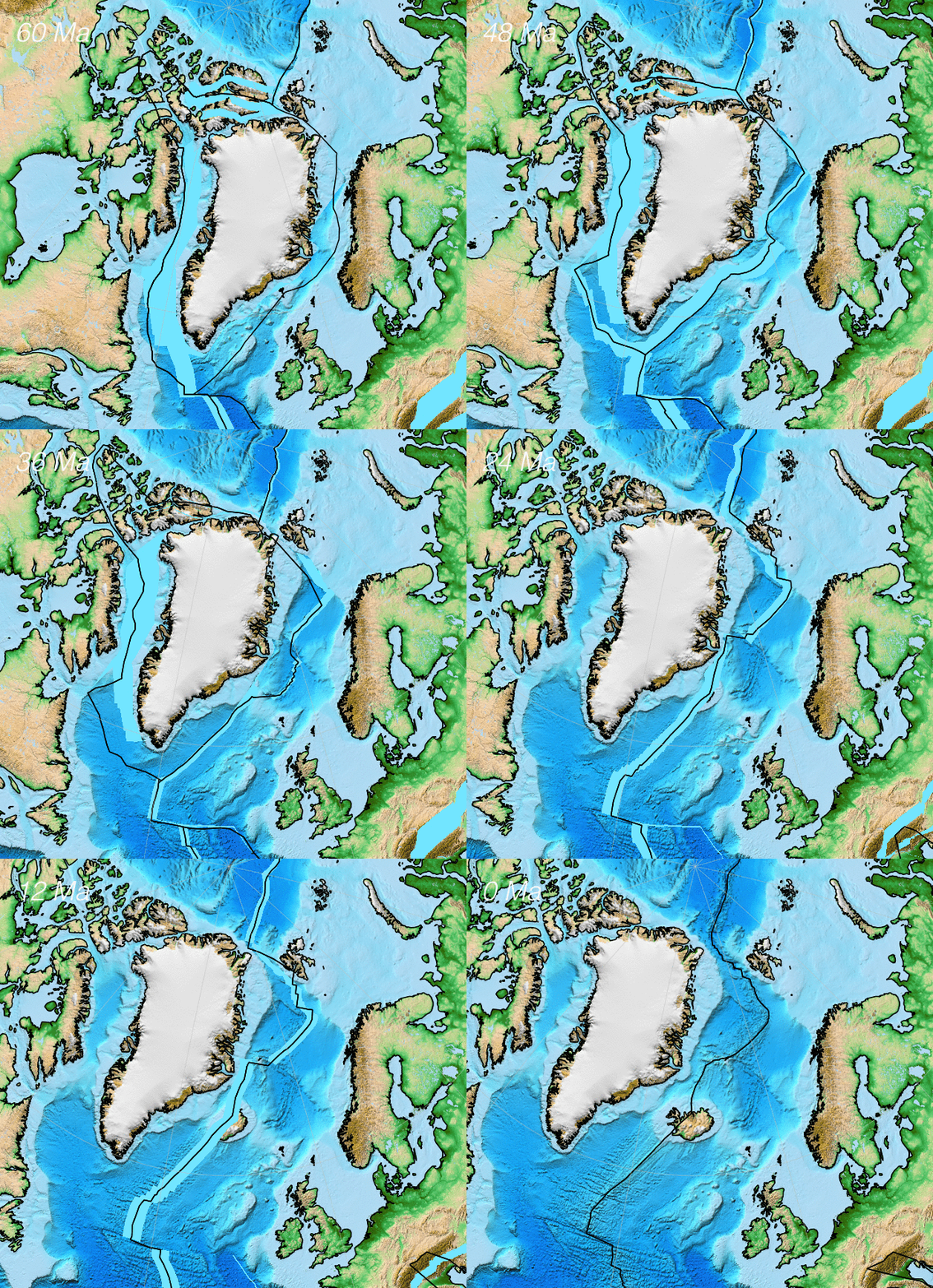
The Palaeocene epoch was between 66-55.8 million years ago (Ma), occurring after the Cretaceous period. The change from Cretaceous to Palaeocene at 66 Ma is marked by the well-known catastrophe that led to the extinction of the dinosaurs. The Palaeocene was an important time period for plate tectonic motions in the northern hemisphere.  At the time the dinosaurs became extinct the North Atlantic Ocean was still in its infancy and seafloor spreading did not extend further north than the Newfoundland/Iberia (see figures below). Over the course of the next few million years, North America and Eurasia began to break apart, which eventually resulted in a seaway that connected the Atlantic and Arctic Oceans. However, the break up was a complicated process. Two distinct rifting zones appeared as seafloor spreading migrated to the north. The first rift zone was between North America and Greenland, in what is now the Labrador Sea and Baffin Bay. The second rift zone was between Greenland and Eurasia, which ended up being the successful rift that formed the northeast Atlantic Ocean. The Labrador arm rifted first, but at some point in this time interval both rift zones were active. This meant that for a short period (geologically speaking) Greenland was a separate plate moving independently of both North America and Eurasia.

The aim of our study is to pinpoint exactly when compression began between Greenland and Svalbard, as this compression is directly related to the rifting further south. If rifting was active between North America and Greenland at the same time as rifting between Greenland and western Europe, then the Greenland plate must move north (relatively speaking). This means that understanding the geological history of Svalbard can shed light on when plate motions changed further south.

northatl-forward

A reconstruction of the formation of the North Atlantic from 60 million years ago until the present day made by Grace Shephard. It has a fixed Eurasia reference frame, i.e. all plate motions are shown with respect to Eurasia. This model was created in the open source plate tectonics software GPlates using the data from Seton and co-authors from their 2012 paper (http://www.sciencedirect.com/science/article/pii/S0012825212000311)

The Central Basin of Svalbard

The mountains that now form the bulk of south-central Svalbard are sedimentary rocks that were once deposited in deltas and shallow seas. The rock outcrops show that the depositional environment was a long but thin basin that subsided very quickly. Such valleys are called foreland basins and they are found adjacent to mountain ranges. The weight of the mountains causes the crust to bend or flex, creating a valley next to the mountains. Modern examples include the Po Valley next to the Alps in Italy and the Ganges Basin next to the Himalayas in India. The mountains that were next to the Central Basin of Svalbard are called the West Spitsbergen fold-and-thrust belt. These intensely deformed rocks show that there was compression between Greenland and Svalbard, which was followed some time later by transpression (a combination of compression and lateral movement) as the northeast Atlantic Ocean began to open. Evidence of compression and transpression can also be found along the northern margins of Greenland and Ellesmere Island in northeast Canada. This whole suite is known as the Eurekan Deformation. Importantly, foreland basins form at the same time as the evolving mountain chain, which means any volcanic deposits preserved in the strata may be used to accurately date when the basin (and therefore also when the mountain range) started to form.

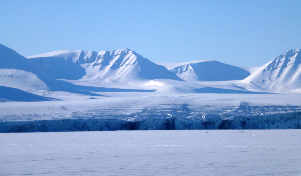
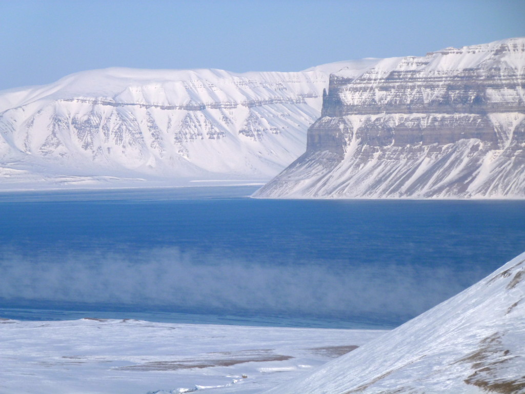
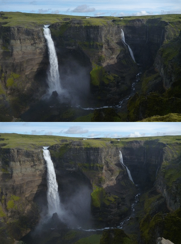
P1030171 P1030035

This is what the Central Basin of Svalbard looks like today. Since the formation of the sedimentary sequence, the area has been uplifted and then eroded. Rocks that were formed in shallow seas now form high points cut by deep fjords and glaciers.

Dating First Compression between Svalbard and Greenland

Fortunately, the lower parts of the Central Basin strata have numerous volcanic ash layers preserved within the sandstones and shales. These ash layers are likely to have originated from volcanoes in northern Greenland and Ellesmere Island, now over 1000 km away across the ocean. We successfully dated four samples, three from the same ash layer very close to the base of the sedimentary sequence. The age of this lowermost ash layer is 61.596 million years old (Ma), with an uncertainty of ± 28,000 years. Having multiple dated horizons allows us to estimate the sedimentation rate in the basin, which then can be used to calculate when sedimentation first began. This age of formation, and therefore the initiation of compression between Greenland and Svalbard, is predicted to be at 61.8 Ma. These ages are significant because they overlap with key changes further south. At around 61.6 Ma there is a dramatic change in the sedimentation in the North Sea. After around 40 million years of continuous carbonate deposition (including the famous chalk that makes up the white cliffs in Dover), there is a shift to more sandy and silty deposits due to the uplift of the Scotland-Shetland area. While more difficult to accurately date, there is also a well-documented change in seafloor spreading in the Labrador Sea and widespread shear deformation along the eastern Greenland margin around this time. The synchronicity of these events strongly indicates a common driving force affecting all margins of Greenland.

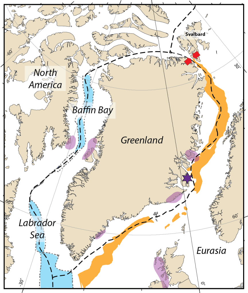
Blog figure

This is an edited version of Figure 5 from the paper, created using the open source plate tectonics software GPlates. It shows a regional reconstruction of how the tectonic plates were ~62 million years ago. The blacked dashed lines show where the plate boundaries between North America, Greenland, and Eurasia are predicted to have been. The light blue areas show the approximate extent of ocean seafloor in the Labrador Sea and in Baffin Bay. The orange areas show where rifted basins were found in the zone where the northeast Atlantic would later open. The purple areas show the known extent of magma intrusions and volcanic deposits from the first pulse of the North Atlantic Igneous Province (NAIP). The purple star is where the centre of the mantle plume is predicted to be at this time. Finally, the red arrows show the onset of compression between Greenland and Svalbard, beginning at 61.8 million years ago.

Potential Causes

A remaining mystery is what caused Greenland to change direction. There are several possible candidates that could have caused the shift, either individually or together. The propagation and acceleration of seafloor spreading in the Labrador Sea has the potential to drive changes in relative plate motions. It is also plausible that events further afield may be important. Greenland was in between the North American and Eurasian plates, so the change in motion may be a result of forces acting on one of these much larger plates. A third possible option is the arrival of a mantle plume at the base of the crust. Mantle plumes bring considerable heat from deep in the Earth, resulting in widespread crustal melting and volcanic activity. The products of such events are called Large Igneous Provinces, with the North Atlantic Igneous Province (NAIP) being one such example. The NAIP arrived in two main pulses, one at around 62 Ma and a second at around 56 Ma. Enhanced melting continues today, albeit at a much reduced rate, and is responsible for the continuing volcanism that forms Iceland. The scale of volcanic and magmatic products from the NAIP is truly enormous. Current estimates put the total amount of igneous material at 6 to 10 million cubic kilometres. Much of this activity is still exposed along the edges of the northeast Atlantic, including the British Isles, Faroe Islands, and East Greenland. There are also considerable deposits found in West Greenland. It is therefore possible that the change in plate motions may be connected to the first pulse of magmatic activity. However, further work is needed to test this hypothesis.

Our study provides a key link between the beginning of deformation in Svalbard and tectonic changes further south around the margins of Greenland. This gives scientists who work in plate tectonic reconstructions the ability to refine their models to understand how North America and Eurasia began to break apart.

Comments Off on Volcanic ash layers in Svalbard hold clues to the formation of the North Atlantic
Categories: Uncategorized

Recommended sources of information on Katla volcano

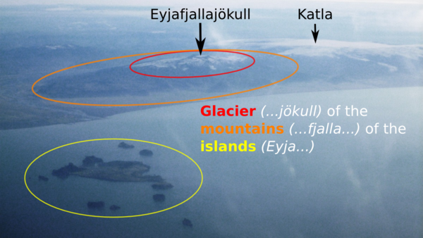
Eyjafjallajökull from above

Here is the first picture of Katla that I found to illustrate this post. It was created to show how Eyjafjallajökull’s name comes from the islands offshore, as seen in this view from an aeroplane window. See the source post for details.

Seismic activity has been high at Katla during the past 24 hours.  The aviation colour code has been changed from green to yellow (Volcano is experiencing signs of elevated unrest above known background levels) and the Icelandic Civil Protection have declared an Uncertainty Phase (Increased monitoring, research and evalution).

Inevitably, the internet and social media will be awash in a jökulhlaup of doom-mongering click-bait.  Ignore it.  Here are my recommended sources for information on Katla volcano.

Web

The Icelandic Met Office presents the most up to date monitoring data.  Three useful pages are:

  1. English language home page: Important changes will appear as new articles here
  2. Aviation colour codes: Katla will change colour if it starts to erupt
  3. Myrdalsjökull earthquakes: See earthquakes appear in real time

In the event of an explosive eruption, the London Volcanic Ash Advisory Centre, based in the UK Met Office, is responsible for forecasting where an ash cloud will go.  They will post updates on their Volcanic Ash Advisories and Graphics page.

The Catalogue of Icelandic Volcanoes is the definitive reference for information about Katla, including the size and frequency of past eruptions.

The Icelandic Civil Protection page has useful information (in both English and Icelandic) for people living in Iceland.

Icelanders are used to eruptions, and their media are far less hysterical than their international counterparts.  The Icelandic National News has some English-language articles and set up a dedicated page during the 2014 Bárðarbunga eruption.

Erik Klemetti is a volcanologist working in the USA.  His Eruptions Blog reports on volcanic activity worldwide and includes reports on Icelandic activity.

Twitter

The Icelandic Met Office (@vedurstofan), Civil Protection (@almannavarnir) and National News (@RUVfrettir) are all on Twitter, as is the Eruptions blog (@eruptionsblog).

UK volcanologists doing lots of work in Iceland include @EIlyinskaya@subglacial@tephrashard, @JacquelineOwen, @geomorganjones and @htuffen.  I am @volcan01010.

It is also worth following @gislio, an Icelandic crisis manager, who tweets lots of relevant information and who set up a list of useful people to follow during the 2014 Bárðarbunga eruption.

Facebook

The Icelandic Met Office and the Icelandic Civil Protection also have Facebook pages.  Much Icelandic volcano monitoring is done alongside scientists from the Institute of Earth Sciences at the University of Iceland.  They frequently post results and photos to their news feed.

volcan01010

I’ve been writing this blog since 2011 and have lots of posts about Iceland, volcanoes and ash clouds. Here are a selection that you can read to become an instant Iceland expert.

Katla

Ash clouds

Other background

Comments Off on Recommended sources of information on Katla volcano
Categories: Uncategorized

A sedimentologist’s guide to volcanic particle grain size (and foetal development)

volcan01010 is taking part in Paige Brown Jarreau’s #SciBlogReaders study.  It aims to understand why people read science blogs.  If you have a few minutes spare between now and Halloween, please take the survey.  The results will help understand science blogging and to improve volcan01010.  Also, you’ll get free science pictures and a chance to win a t-shirt or a $50 Amazon.com gift card! You can find the survey here: http://bit.ly/mysciblogreaders.

Volcanology has a lot of jargon.  This can obscure simple information, even from trained geologists.  Students are often put off by words like lapilli or tephra that sound terribly technical, even though they only mean little stones (in Latin) and ashes (in Greek).  For this reason, I find it helpful to ignore the volcanology part and just treat the deposits as you would any other sedimentary rock.  After all, studying explosive eruptions is just sedimentology in the atmosphere, and a volcanologist’s lapilli tuff is simply a breccia to any other geologist.

Pregnancy books are obsessed with fruit and vegetables, which are compared to the size of the growing foetus in week by week guides to development.  Such comparisons are helpful to people who have never seen a ruler.  They are no substitute for real numbers, though.  Is a kumquat bigger than a fig?  I have no idea.  Nevertheless, they are fun to visualise.

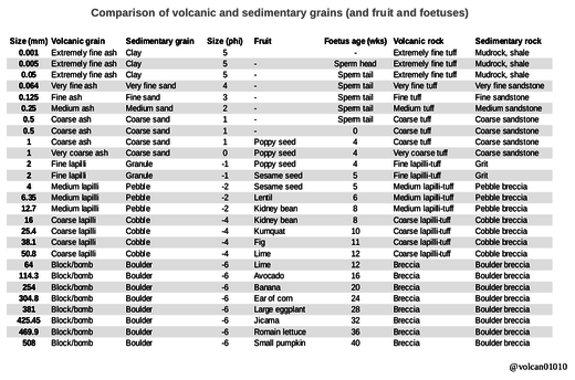
For these reasons, I have compiled the following table that compares the size of volcanic particles, sediment grains, fruit and growing foetuses.  I hope that it will go some way towards demystifying volcanology to sedimentologists, and gynaecology to gardeners.

Comparison of volcanic and sedimentary grains, and fruit and foetuses

volcano_sediment_fruit_foetus_600

Click to enlarge.

Using this table, you can imagine volcanic processes in a whole new way. For example, a block and ash flow caused by a collapsing lava dome can be imagined as a hot fruit salad, containing everything from poppy seeds to (whole) pumpkins, thundering down the side of the volcano.  There is also the question of the size of grains in a volcanic ash cloud;  aircraft that sampled Icelandic examples them found grains about the size of sperm-heads, while the grains that are found on the ground can be two sperm long.

Further reading

  • Metric babies: an old rant of mine against reporting birth weights in imperial units.
  • The table includes a column for the phi scale of grainsize, which is used when data are collected by sieving sediments.  Read more about it on the Wikipedia grain size page.

References

Science Blog Readers survey: http://bit.ly/mysciblogreaders

Comments Off on A sedimentologist’s guide to volcanic particle grain size (and foetal development)
Categories: Uncategorized

Bárðarbunga: satellites and computer models quantify sulphur dioxide release

This is a guest post by Anja Schmidt, an Academic Research Fellow at Leeds University, and Claire Witham of the Met Office’s Atmospheric Dispersion Group. It describes Anja’s paper quantifying the sulphur dioxide gas release from the 2014 eruption of Iceland’s Bárðarbunga volcanic system at Holuhraun that she wrote with Claire and a large, international, team of scientists, including myself.


The biggest Icelandic eruption in more than 200 years

It is very likely that you remember the 2010 eruption of Eyjafjallajökull in Iceland and the ensuing travel chaos that resulted from volcanic ash drifting in and out of European and North Atlantic airspace for more than a month. In total 10 million travellers were stranded and the airline industry incurred financial losses in excess of 1.7 billion US dollars. Then, in 2011, another Icelandic volcano called Grímsvötn had an eruption about 100 times as powerful as Eyjafjallajökull, producing twice the amount of volcanic ash. Yet far fewer people will remember it due to its limited impact on aviation.

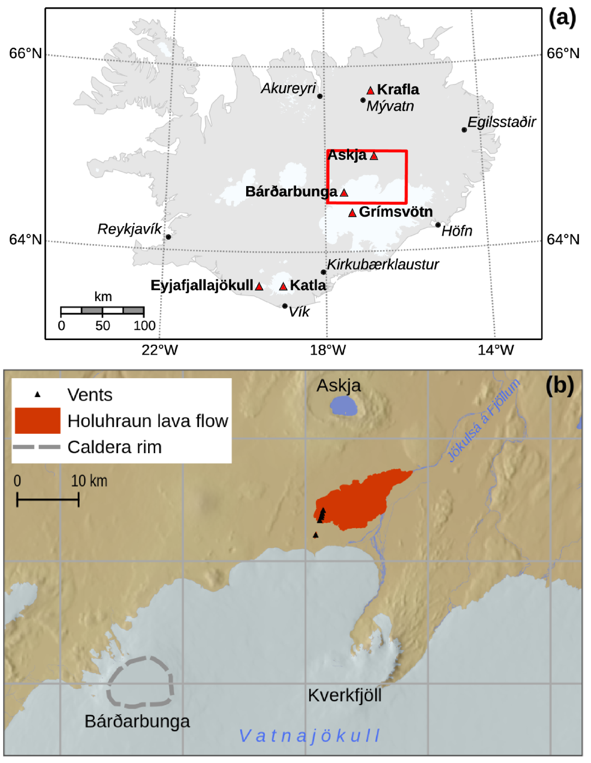
Ash-producing Icelandic eruptions affect Europe frequently – about once every three to five years. However, there are other types of volcanic eruptions in Iceland that typically produce very little volcanic ash but lots of lava and toxic volcanic gases. We generally refer to these as effusive eruptions and specifically as fissure eruptions. The biggest of these fissure eruptions produce lava volumes that fill up to 100,000 Olympic-sized swimming pools per day for months to years. These big eruptions occur on average every 200 to 500 years, whereas smaller-volume fissure eruptions occur every 40-50 years on average. In the early hours of 31 August 2014, the biggest fissure eruption in more than 200 years began about 45 km away from the Bárðarbunga volcano at the Holuhraun lava field (shown in Figure 1). This eruption was truly spectacular, lasting six months and presenting some great scientific opportunities. Yet not many people outside Iceland would have taken note because there was no disruption to air travel.

dsf

Figure 1. The top panel shows the locations of Icelandic towns and volcanoes, including the Bárðarbunga volcanic system. The red rectangle outlines the region shown in the bottom panel. The map in the bottom panel shows the Bárðarbunga caldera (dashed grey line) and the lava flow field and vents of the 2014-15 eruption at Holuhraun. Figure from Schmidt et al., (2015). Click image to enlarge.

No volcanic ash, but lots of lava and sulfur dioxide

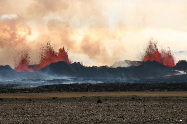
During its first month, the eruption at Holuhraun was extremely powerful spewing fountains of lava up to 150 meters high (see Figure 2) along a 1.5 km long crack in the earth’s crust (which puts the “fissure” in “fissure eruption”). The eruption discharged lava at a rate of more than 200 m3/s, which is equivalent to filling five Olympic-sized swimming pools with lava each minute. Six months later, when the eruption ended, it had produced about 1.5 km3 of lava, covering an area of around 86 km2, which is the same area as Manhattan. In stark contrast to the eruptions of Eyjafjallajökull 2010 and Grímsvötn 2011, the eruption at Holuhraun produced negligible amounts of volcanic ash, but a lot of lava and sulfur dioxide. Sulfur dioxide is a toxic gas that was emitted into the lowermost atmosphere up to 6 kilometers high.

Credit: Michelle Parks

Figure 2. Lava fountaining above the volcanic fissure at Holuhraun (Iceland) in September 2014. Photo taken by Michelle Parks (University of Iceland). Click image to enlarge.

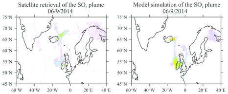
It became clear very quickly that the eruption was producing truly staggering amounts of sulfur dioxide, but continuous ground-based monitoring and measurement of the gas fluxes was very challenging due to the remoteness of the eruption site and the weather conditions in Iceland. This is where satellite data of the volcanic sulfur dioxide plume came to the rescue. In our new study we analysed such satellite data and combined these with computer modeling using the Met Office’s NAME model. This allowed us to track and compare the dispersion of volcanic sulfur dioxide (see Figure 3). It also enabled us to assess how much sulfur dioxide was emitted independent of the ground-based measurements in Iceland. We found that at its most powerful the eruption emitted about 120 kilotons of sulfur dioxide per day, which is eight times more than the daily amount of sulfur dioxide emitted from all man-made sources in Europe. We also calculated that during September 2014 a total of 2.0±0.6 million tons of sulfur dioxide was emitted by the eruption. This makes Holuhraun the largest volcanic sulfur pollution event in more than 200 years in Iceland. Its bigger sister, the Laki eruption took place in 1783-1784 CE and produced, over the course of 8 months, about ten times more lava and about 60 times more sulfur dioxide than Holuhraun did in September 2014. The Laki eruption is thought to have caused cooling of climate and substantial environmental stress across Europe in the mid-1780s.

The panel on the left shows the distribution of sulfur dixoide from the 2014-2015 eruption at Holuhraun on 6 September 2014 as seen by the satellite instrument called OMI which is onboard NASA's Aura spacecraft. The panel on the right shows the distribution of sulfur dioxide as predicted by the computer model simulation for the same day. Figure from Schmidt et al., (2015).

Figure 3. The panel on the left shows the distribution of sulfur dixoide from the 2014-2015 eruption at Holuhraun on 6 September 2014 as seen by the satellite instrument called OMI which is onboard NASA’s Aura spacecraft. The panel on the right shows the distribution of sulfur dioxide as predicted by the computer model simulation for the same day. Figure from Schmidt et al., (2015). Click image to enlarge.

Detection and monitoring of volcanic sulfur pollution

Over the course of the eruption, air quality monitoring stations in Iceland recorded unprecedented levels of sulfur dioxide, often significantly exceeding the current 10-minute mean air quality standard for sulfur dioxide set by the World Health Organization (WHO) to protect public health. However, volcanic pollution was not confined to Iceland: our study shows that volcanic sulfur dioxide was transported over large distances and detected by air quality monitoring stations up to 2750 km away from Iceland. For instance, on 6 September 2014 volcanic pollution reached Ireland where air quality monitoring stations recorded short-lived (up to 24 hours) spikes in surface sulfur dioxide concentrations. Air pollution regulations introduced in the 1980s mean that sulfur dioxide levels due to emissions from industrial sources are very low nowadays; hence the concentrations recorded on 6 September 2014 were really unusual. Other stations across Northern and Central Europe recorded similar pollution episodes during September 2014.

The air quality monitoring stations across Europe were essential for the detection and characterization of the air pollution events resulting from the eruption. These observations and our model simulations demonstrate that volcanic pollution from Icelandic fissure eruptions can easily reach Northern Europe and degrade air quality temporally. Away from Iceland there was no risk of long-term detrimental health effects because exposure to volcanic pollutants was brief. Right now the number of sulfur dioxide monitoring stations across Europe is in steady decline because sulfur dioxide concentrations are usually very low as a result of successfully legislated reductions of man-made emissions since the 1980s. We argue that existing air quality monitoring stations ought to be retained or extended to monitor volcanic pollutants from future eruptions in Iceland. This would facilitate the characterization and mitigation of volcanic gas and aerosol particle hazards, which could be severe in the event of a large-magnitude Icelandic eruption like a repeat of the 1783-1784 CE Laki eruption in Iceland. The Scottish Environment Protection Agency is going to extend their air quality monitoring of sulfur dioxide and volcanic ash in response to the eruptions in Iceland since 2010.

The next eruption…

Every eruption is different and what the eruptions of Holuhraun and Eyjafjallajökull have shown is that future Icelandic eruptions will pose new hazards and challenges for science and society. With each eruption we learn more about the volcanic processes involved and broaden our understanding of how to best utilize observations and computer models to understand these hazards and inform decision makers. We cannot predict the next eruption, but recent activity proves that in Europe we should prepare for the impacts of not only volcanic ash but also volcanic gases and airborne particles.


Further reading

Our paper describing the results is open access, which means that anyone can download and read it for free. The full reference is:

  • Schmidt A, Leadbetter S, Theys N, et al (2015) Satellite detection, long-range transport and air quality impacts of volcanic sulfur dioxide from the 2014–15 flood lava eruption at Bárðarbunga (Iceland). J Geophys Res Atmos 2015JD023638. doi: 10.1002/2015JD023638

I wrote a pair of blog posts describing fieldwork at the lava flow itself. You can can read them at:

There is also some background about even larger lava eruptions than at Bárðarbunga, including Laki 1783-84, in this post:

UPDATE: I was on the BBC Radio Scotland Drivetime show discussing the results of the study.  You can listen to the interview below:

Comments Off on Bárðarbunga: satellites and computer models quantify sulphur dioxide release
Categories: Uncategorized

Installing Linux on Lenovo Thinkpad 11e

EDIT: 2018-11-30

I have been running this laptop for 3 years now.  I love the keyboard and, with Linux, it is reasonably fast (for the size and price).  It also feels sturdy as I had hoped.  However, there were three little annoyances that stopped me being completely happy:

  • Sometimes the battery drained even when the machine was powered off! I think that this was meant to be related to some kind of ‘smart suspend’ feature but what it meant for me was that I could never depend on it having power when I came to turn it on. This is hopeless for a fieldwork laptop.
  • I had to keep the function key permanently enabled to be able to use F1 to F12. This wasn’t too much of a problem, except that it had the side effect of turning the ‘End’ key into ‘Insert’.  This was really annoying.
  • I couldn’t do any BIOS updates because they required Windows.  I was stuck on version 1.14 from May 2015.

This week, I discovered that it is now possible to do BIOS updates via bootable USB. I followed these instructions. and downloaded the latest version (1.34) from the Lenovo website Support section. This includes a fix for the function keys and for “an issue that drained the battery during shutdown”. The only hurdle was that the one-time boot order selection didn’t work (I got some PXE error that meant it was trying to boot from network), so I had to change the standard boot order and put USB HDD at the top. After that, all went smoothly.

I am running Ubuntu Mate 18.04.1 with the ‘Netbook’ layout. The brightness keys worked out of the box. My function keys now work properly having set them in the BIOS. I was able to set CapsLock as Ctrl in the Mate Keyboard Settings. All good so far, and most of what is below is redundant (except touchpad fix at the bottom, which should be fixed as standard soon).

I haven’t tested the power situation yet, but I am optimistic. If it has been fixed, then this laptop may finally live up to the high hopes that I had for it.

The original post is below the line.


I recently updated my laptop to a Lenovo Thinkpad 11e.  The laptop meets military specifications for shock, humidity, temperature and dust and I swapped the hard drive for a solid state drive that has no moving parts.  It should be ideal for geological fieldwork.

I installed Linux Mint 17 XFCE, which is based on Ubuntu 14.04 Long Term Support.  Mostly things worked out of the box, but there were a few tweaks that I had to make to get everything as I wanted.  These notes are here to remind me and in case they are helpful to anyone else.

Enable brightness changing via function keys

Initially, the brightness function keys wouldn’t actually adjust the brightness.  The icon would appear but the brightness remained the same.  To fix:

  • Add the following to /etc/default/grub:
     GRUB_CMDLINE_LINUX_DEFAULT="video.use_native_backlight=1"
  • Then run:
    sudo update-grub

Swap End/Insert keys

By default, the function keys are set up to change brightness, volume etc.  Turning on FnLock sets them to the more useful F1 to F12 but has the unwelcome side effect of changing the End key into Insert.  I don’t know who thought that was a good idea.

There are a number of solutions described online that use xmodmap.  The downside with these is that they are forgotten when the laptop is suspended.  To make the change persistent:

  • Edit /usr/share/X11/xkb/symbols/pc so that it reads as follows:
    key  <INS> {    [  End        ]    };
    key  <END> {    [  Insert     ]    };
  • Then delete old keymaps:
    sudo rm /var/lib/xkb/server*.xkm

Turn CapsLock into another Ctrl key

This is more for personal preference, as is more comfortable when using Vim text editor, where the aim is to keep your fingers on the home row as much as possible.

  • Create a file /usr/share/X11/xorg.conf.d/10-keyboard.conf with the following contents:
    Section "InputClass"
            Identifier "system-keyboard"
            MatchIsKeyboard "on"
            Option "XkbOptions" "ctrl:nocaps"
    EndSection

Add myself to dialout group

This was necessary because my GPS connects via USB to serial adapter as /dev/ttyUSB0.  I needed to be part of the dialout group to have permissions to access it.

  • Run:
    sudo usermod -a -G dialout my_username
  • Then logout and back in.

Fix unstable wifi connection

Sometimes the wifi connection drops out intermittently, or is just slow.  The wifi card is an Intel Dual Band Wireless AC7260.  There seem to be a number of potential reasons and solutions for this online, ranging from hardware faults, problems with the router, power management and old drivers.  There are a number of questions about this on AskUbuntu, including here and here.  It isn’t too much of an issue for now, but when I find a solution I’ll update this post. <UPDATE: this went away when I upgraded to kernel 3.13.

Touchpad not working in Ubuntu 18.04.1

(Updated 2018-11-29). Since a recent update, my touchpad stopped working. I found the following post that fixed it: https://askubuntu.com/questions/1091044/xubuntu-18-04-18-04-1-upgrade-synaptics-touchpad-not-working

The process was to add the bionic-proposed repository and then run the following:

sudo apt install libkmod2
sudo update-initramfs -u

After a reboot, the touchpad worked again.

Categories: Uncategorized

How big are the grains in a volcanic ash cloud?

Ever since European airspace was temporarily shut down during the 2010 eruption of Eyjafjallajökull, aircraft in the region have been allowed to fly through parts of volcanic ash clouds where the concentration is low. Satellite-based infrared sensors can be used to estimate ash cloud concentration, as well as other parameters such as grain size and height, in a process called a retrieval. Last month’s How do satellites map volcanic ash clouds? post explains how it works. The retrieved information, as well as data from computer simulations and other satellite- and ground-based sensors, is used to map the likely concentrations of airborne volcanic ash. The results inform decisions about where aircraft can fly.

There are few direct measurements from within ash clouds, so we must look for other information in their deposits on the ground. At large distances from a volcano (over 500 km) these exist as cryptotephra (hidden ashes) that are extracted from peat bogs and lakes. These grains were some of the largest particles within the cloud from which they fell, so are not representative of the average size at that point. However, they must be a significant component of the ash clouds closer to their source.

This week we published a paper showing that Icelandic cryptotephra deposited in the UK and northwest Europe are much bigger than satellite infrared retrievals would suggest. Investigating the difference in results between measurement types, we found that this is partly because current satellite retrieval algorithms are biased towards smaller sizes. Our results will help quantify the uncertainty in estimates of volcanic ash cloud properties. This is important because if aircraft are to fly through low concentrations of ash, you need to know how sure you are that the concentration really is low. They also suggest that incorporating the irregular shapes of volcanic ash grains in computer simulations and satellite infrared measurements will lead to improved results.

The main findings are explained below.


Understanding the discrepancy between tephrochronology and satellite infrared measurements of volcanic ash

The paper was divided into three sections, reflecting three areas of study: tephrochronology, ash transport computer models and satellite-based infrared retrievals. Each section reports a new result. Another aim of the paper was to increase understanding between these different fields.

Big grains go far…

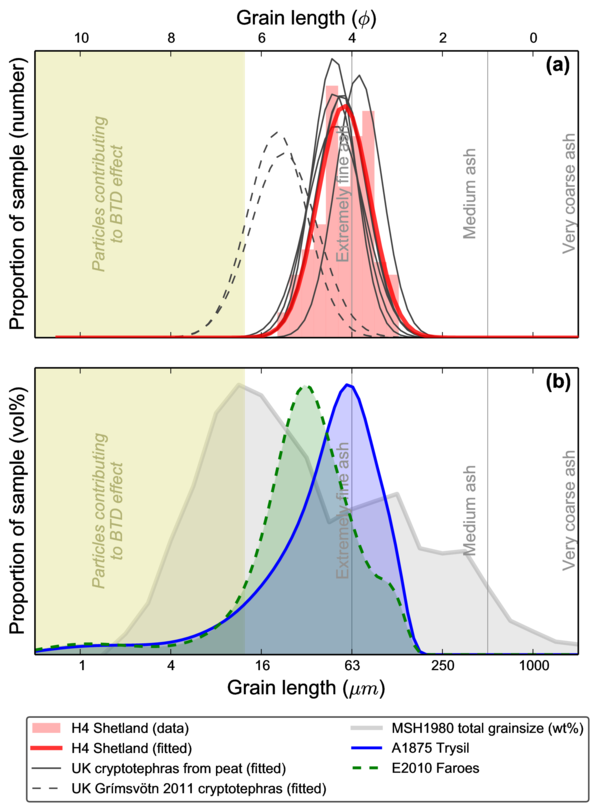
The graphs below show the size distributions of Icelandic ash grains from across the UK, including samples collected by the public during the Eyjafjallajökull 2010 and Grímsvötn 2011 eruptions. The top graph has results obtained by measuring grains down a microscope, the bottom results were collected by a laser technique. The microscope method misses grains <10 microns diameter, but both methods give similar peaks showing that the smallest grains are a minor component.

sizes_and_map_600


The size of cryptotephra grains from the UK and northwest Europe. Image from Stevenson et al. (2015), Atmos. Meas. Tech. doi:10.5194/amt-8-2069-2015. See paper for full caption and details.

The median length of the cryptotephra grains ranges from 17-70 microns, with 5% of grains coarser than 45-125 microns (similar to the width of a human hair). These are similar to the lengths of individual grains reported elsewhere. In comparison, published median diameters retrieved from satellite infrared data are less than ~6 microns (similar to the size of a red blood cell) and represent size distributions that contain tiny numbers of grains larger than 30 microns.

…in agreement with model predictions…

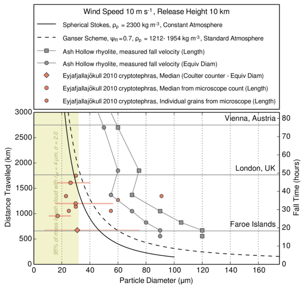
Imagine dropping a handful of volcanic ash particles from 10 kilometers high. This is similar to the height of the 2010 Eyjafjallajökull plume, but a big eruption could carry material two or three times higher. The next graph shows how far ash grains of different sizes falling in a constant wind would be carried before they reached the ground. It represents a very simplified scenario, with no weather or particle-particle interaction, but gives an idea of the sizes of particles that can be expected at different distances. The different lines represent different particle shapes. Data from Eyjafjallajökull are shown for comparison; many of these particles were erupted when the plume was low.

TravelDistance_Riley_Model_600


Calculated travel distances for ash grains of different sizes and shapes. Image from Stevenson et al. (2015), Atmos. Meas. Tech. doi:10.5194/amt-8-2069-2015. See paper for full caption and details.

Even under the modest conditions simulated here, ash grains with simple,
spherical, shapes up to 41 microns diameter can be airborne for 24 hours, and those up to 29 microns could reach London. Using more complex and realistic shapes increases the travel distance, sometimes by up to a factor of three.

…and satellite infrared retrievals underestimate their size.

To understand how coarser-grained ash clouds would appear in satellite retrievals, we created a series of virtual clouds with different grain size distributions in the Met Office computers. Then we calculated simulated satellite images that showed how they would appear to satellite-based infrared sensors. Finally, we fed that information into the ash-detection software and ‘retrieved’ ash cloud properties such as grain size and concentration. The assumptions used to simulate the ash clouds are the same as those used in the retrieval, so this is a test of the algorithm and not of the physics of ash detection.

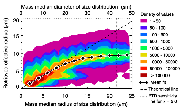
In the graph below, the x-axis is the size that we put in and the y-axis is the retrieved particle size. It is given in terms of the effective radius, which describes a distribution of particle sizes. The dotted line shows the answer that we would expect for a perfect retrieval. The diamonds mark the mean retrieved effective radius value.

big_grains_effrad_combo_600


Comparison between input and retrieved particle sizes from simulated satellite images. Image from Stevenson et al. (2015), Atmos. Meas. Tech. doi:10.5194/amt-8-2069-2015. See paper for full caption and details.

The retrieval algorithm uses various measurements, including the brightness temperature difference (BTD) caused by particles with a radius of less than 6 microns, to identify pixels in the images that contain volcanic ash. It then looks for the combination of ash cloud grainsize, concentration and height that would give the best match to the observations (including the BTD) based on the assumption that the grains are all dense spheres.

When the grainsize of the simulated ash cloud increases, the algorithm begins to miss more and more ash-containing pixels. This happens because the BTD effect gets weaker as the proportion of particles smaller than 6 microns decreases, so the cloud becomes harder to detect by this method. Trained forecasters may still be able to identify contaminated airspace by using other data, but retrievals of ash properties in these regions are not possible.

The graph shows that the mean effective radius is retrieved correctly for small particles, but reaches a maximum of around 9 microns for larger particles. This result is interesting because an ash cloud with an effective radius of 16 microns could contain a significant proportion of cryptotephra-sized grains. However, those values are rarely reported and published values are always 9 microns or less.

At larger grainsizes, it becomes harder to find a combination of parameters that give a good match to the observations. The retrieval becomes more strongly influenced by where you tell it to start looking. The influence of our chosen value of 3.5 microns, which is similar to airborne measurements of dilute ash clouds, is visible on the plot. Retrievals of the mass of volcanic ash also show deviations of over 40% from the input values.

Moving on from spherical grains?

Our results demonstrate that the grains in a volcanic ash cloud, hundreds of kilometers from the source, are up to several tens of microns in diameter. The proportion that these cryptotephra-sized grains represent within the airborne cloud is still unknown. Bias towards small grain sizes by retrieval algorithms may explain differences between cryptotephra- and satellite retrieval-based size distributions in such locations.

However…

Retrievals have also been made of ash clouds close to their source volcano. Here, the deposits contain grains with diameters of hundreds of microns. Again, the retrieved sizes are very low. This suggests two things about satellite retrievals:

  • They are able to recognise a wider range of grain sizes than the current theory suggests should be possible.
  • The underestimation of grain size is even more significant close to the source volcano.

We suggest that this is a consequence of the assumption that volcanic ash grains are dense spheres. This forces any ash cloud exhibiting a BTD to be interpreted as being dominated by fine-grained particles.

grain_shapes


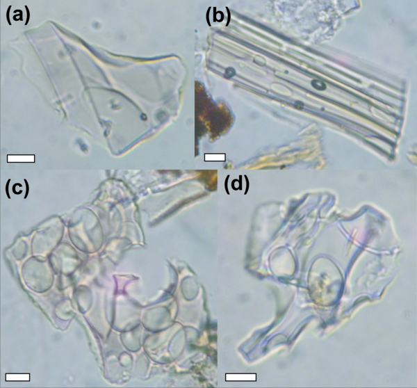
Photographs of cryptotephra grains. The scale bar is 10 microns long. These are not dense spheres. Image from Stevenson et al. (2015), Atmos. Meas. Tech. doi:10.5194/amt-8-2069-2015. See paper for full caption and details.

Cryptotephra grains are extremely irregular and bubbly, as demonstrated in the image above. If it is possible for bubbly particles to cause BTD effect at larger particle sizes, as was suggested by a recent study, then ash cloud size distributions could be much coarser than current interpretations suggest. Developing alternatives to the dense spheres approximation is therefore likely to improve agreement between ash cloud retrievals and the deposits on the ground.


Further reading

Our study was published in Atmospheric Measurement
Techniques
, which is an open access journal. This means that anyone can download and read the full article for free by clicking on the link below:

  • Stevenson JA, Millington SC, Beckett FM, Swindles GT, Thordarson T (2015) Big grains go far: understanding the discrepancy between tephrochronology and satellite infrared measurements of volcanic ash. Atmos Meas Tech 8:2069–2091. doi: 10.5194/amt-8-2069-2015

Atmospheric Measurement Techniques has an interactive peer review system, so the original version of the paper is also online, as a discussion manuscript, along with the reviewers’ comments. You can read those here:

  • Stevenson JA, Millington SC, Beckett FM, Swindles GT, Thordarson T (2015) Big grains go far: reconciling tephrochronology with atmospheric measurements of volcanic ash. Atmos Meas Tech Discuss 8:65–120. doi: 10.5194/amtd-8-65-2015

There are many other blog posts on volcan01010 about ash clouds and Icelandic eruptions, such as Ash cloud closes UK airports: what are the chances?, Grímsvötn 2011 UK ash deposition and A history of ash clouds and aviation. There is a full list on the Every post ever page.

Categories: Uncategorized

How do satellites map volcanic ash clouds?

Explosive eruptions can spread volcanic ash across continent-scale distances. Ash from the 2011 eruption of Chile’s Puyehue-Cordón Caulle volcano went right around the globe. The only realistic way of monitoring them is from space. Most people are familiar with the beautiful photos (visible light images) that satellite-based sensors can take but the most useful information for mapping volcanic ash clouds actually comes from invisible infrared light. This can be used to see ash clouds in the dark, to measure their altitude and even to give an indication of their grainsize and concentration. This post uses images from a spectacular eruption at Chile’s Calbuco volcano last week to explain how.

Visible light images

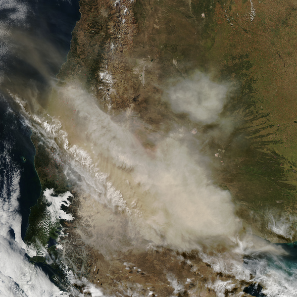
Imagine you are in charge of mapping the Calbuco ash cloud. Where is the atmosphere contaminated by ash? The middle of the cloud is obvious, as the tan-coloured ash is clear to see. But how can you define the edges? Do those wispy, white clouds in the southeast corner contain volcanic ash or are they just water droplets? Is there ash in that hazy region to the southwest?

Natural-colour image of the Calbuco ash cloud, taken at 18:35 UTC on 23 April by the MODIS instrument on NASA’s Aqua satellite. Source: NASA Earth Observatory. Click the image to enlarge.

These questions can be tricky, but they aren’t your biggest problem. The airline industry needs updated maps every six hours, but night is coming soon. Visible light images rely upon reflected sunlight so they are only useful during the day. You cannot map ash clouds using satellite photos alone.

Infrared images

Everything in the Universe emits energy as electromagnetic radiation (e.g. heat, light, x-rays). Hotter objects radiate more energy, and at shorter wavelengths. You can calculate the amount of energy radiated at different wavelengths, by an object of a given temperature, using Planck’s law, which is just a way of saying that white hot is hotter than red hot, but with maths.

Most of the radiation emitted by the things around us e.g. clouds, hills, trees, buildings, students, traffic cones, is in the infrared region of the electromagnetic spectrum. It’s invisible to our eyes, but satellites have sensors that are very sensitive to it. Radiation is emitted all the time, so infrared measurements can be made during the day or the night. Furthermore, the amount of energy can tell us about the temperature, because hot things radiate more.

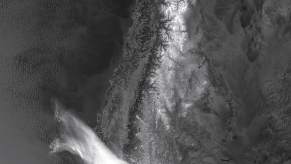
Long wave infrared (11.45 µm) image of the Calbuco plume taken by the VIIRS instrument on the NOAA/NASA Suomi satellite on the morning of 23 April. Source: NASA Earth Observatory. Click the image to enlarge.

The image above looks like a black-and-white photograph. It isn’t. It is a map of long wave infrared energy emission. It has been drawn with a back-to-front colour scheme, where the objects emitting the most energy are darker. The ocean is dark because it is warmer than the land. The mountain tops are pale because they are high and cold, but only some of the have snow on them (compare the infrared with the visible image above). This type of colour scale, where colder is lighter, is typical for weather satellite data because it makes cold, high clouds appear white, just as they do in photographs.

Brightness temperatures

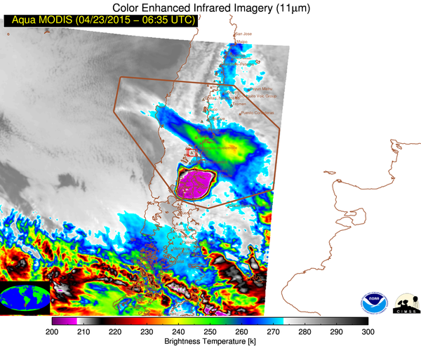
Planck’s law lets you estimate of the temperature of an object, based on the amount of energy that it radiates. This is known as the brightness temperature (BT). If you know how the temperature of the atmosphere changes with altitude, for example from weather balloon (radiosonde) data, and if you assume that the ash cloud is at the same temperature as the atmosphere around it, then you can convert the BT into an estimate of the altitude of the cloud. The BT image below has a pseudocolour scheme that has been set to highlight changes in temperatures in the highest, coldest, clouds. It shows the highest plume (coldest temperatures) directly above the volcano. Based on the BTs, the maximum height of the plume was estimated to be 18-20 km.

Brightness temperature image derived from data collected by the MODIS instrument on NASA’s Aqua satellite at 06:35 UTC on 23 April. Source: NOAA/CIMSS Volcanic Cloud Monitoring website. Temperatures are in Kelvin, which is the number of degrees Celsius above absolute zero e.g. 210 K = -63°C. Click to enlarge.

For nearly a decade, ash cloud heights have also been measured using a laser fired down from space by the CALIPSO satellite. It only measures along a line beneath the satellite track, so it cannot be used to make maps, but the data give precise measurements and have lots of vertical detail. They show that ash clouds are often made up of many thin layers at different levels, rather than just one single body.

Brightness temperature difference

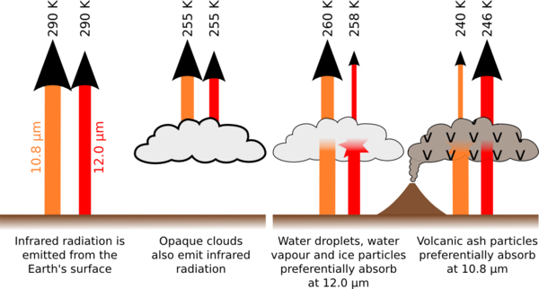
Calculating the altitude of clouds from their BT is useful, but it doesn’t tell you whether the cloud that you are looking at is volcanic ash or just weather. The clouds that are highlighted in the lower part of the previous image are not volcanic. This is where the brightness temperature difference (BTD) method comes in. It is also known as the split window or reverse absorption technique and has been used for over 20 years. It works by comparing the brightness temperatures measured using two different wavelengths of infrared radiation, which behave differently as they pass through clouds of volcanic ash or water droplets. The diagram below shows how the difference arises.

The brightness temperature difference occurs because some radiation from the surface is absorbed as it passed through clouds. Volcanic ash absorbs more at shorter wavelengths than weather clouds.

The left hand diagram shows the radiation emitted by the ground (or ocean) and by thick clouds passing directly to the satellite sensor. The BTs calculated using the signals from the two wavelengths are the same. On the right hand side, the radiation from the surface passes through a semi-transparent cloud of water droplets (left) or volcanic ash (right) and is partly absorbed by the particles within it. The important factor here is that different wavelengths behave differently, depending on the composition of the cloud. Water droplets, water vapour and ice particles preferentially absorb infrared at longer wavelengths than volcanic ash. The BTD effect is strongest when the particle diameter is similar to, or slightly less than, the wavelength of the infrared light i.e. 10-12 µm. The BT recorded above an ash cloud on the 10.8 µm channel is lower than on the 12.0 µm channel. Subtracting one from the other gives the BTD; negative values are an indication that the cloud contains volcanic ash.

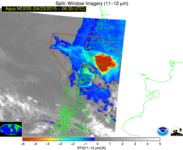
The BTD image below highlights the location of the volcanic ash cloud. The strength of the signal depends mainly on the ash concentration, the grainsize and the cloud height. The weather clouds to the south of the eruption are no longer highlighted. Notice also that there is no BTD very close to the volcano (e.g. the purple region in the BT image above). Here, the ash is so concentrated that the cloud is opaque and blocks all radiation from below. External factors such as the presence of weather clouds above or below the ash cloud, high atmospheric moisture levels or extremes of ground temperature also affect the signal and can lead to false alarms or undetected pixels. The detection limit of this method is around 200 µg/m³, which corresponds to “low concentration” in the post-Eyjafjallajökull European flight concentration zones.

Brightness temperature difference image derived from data collected by the MODIS instrument on NASA’s Aqua satellite at 06:35 UTC on 23 April. Source: NOAA/CIMSS Volcanic Cloud Monitoring website. Click to enlarge.

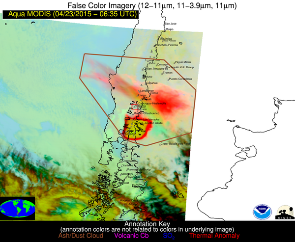
The BTD signal can also be incorporated into false colour images such as the RGB ‘dust’ scheme. These are designed to make ash clouds easy to identify. In regions of the world where aircraft have to Avoid All Ash, images such as this are very useful for mapping out no-fly zones.

False colour RGB ‘dust’ image derived from data collected by the MODIS instrument on NASA’s Aqua satellite at 06:35 UTC on 23 April. Source: NOAA/CIMSS Volcanic Cloud Monitoring website. Click to enlarge.

Retrieval of ash cloud properties

Retrieval algorithms use satellite infrared data to estimate the properties of ash clouds. This is where things get really interesting. Such data have become more important since the Eyjafjallajökull eruption of 2010, as flight restrictions in European airspace are now based on zones of varying concentration. They work because it is possible to estimate what the BTs at different wavelengths would be for ash clouds with varying properties. For example, if you assume that the ash particles are tiny little spheres, there are equations that can tell you how they absorb different wavelengths of infrared light. Other inputs to the calculations include particle size, ash concentration, ash cloud height and thickness, and ground temperature. The results of the calculations are compared with observations to see what gives the best match. Retrievals can be carried out on any pixel that is identified as ash.

The particle size and the concentration are the most important factors. Ash clouds contain particles of a range of different sizes. The effective radius is the particle size that has the equivalent optical properties to the ash cloud as a whole and is used to simplify calculations. The concentration is represented by the mass loading, which is the total mass of ash between the satellite and the ground. If the thickness of the cloud is known, this can be converted into a concentration. For example, for a 1 km thick cloud, 200 µg/m³ (low concentration zone) corresponds to a mass loading of 0.2 g/m², while 2 mg/m³ (medium) is 2 g/m² and 4 mg/m³ (high) is 4 g/m².

The simplest retrievals use a fixed cloud height and find the effective radius and mass loading that best fit the observations on the two channels of infrared data that were used to calculate the BTD. Others incorporate data from a third infrared channel and either retrieve the cloud height as well, or retrieve a series of other parameters from which the effective radius, mass loading and cloud height can be calculated.

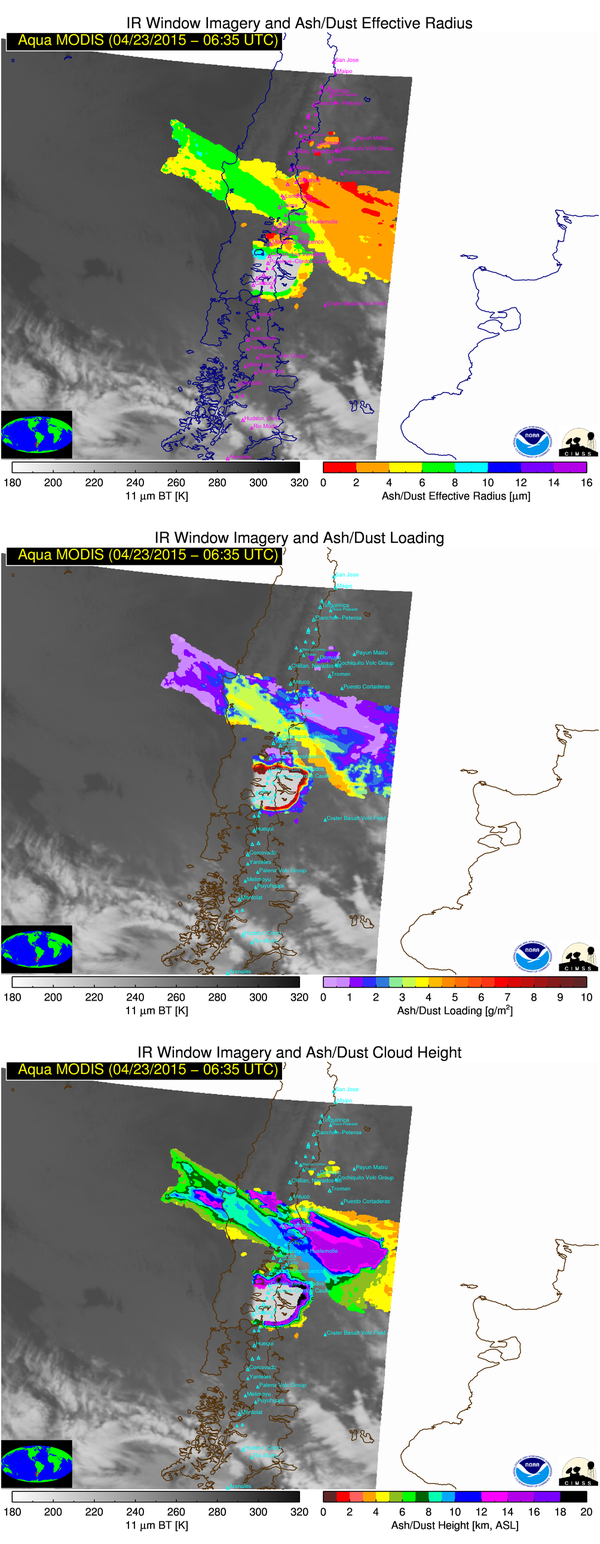
Retrieved volcanic ash cloud parameters (effective radius, column loading, cloud height) derived from data collected by the MODIS instrument on NASA’s Aqua satellite at 06:35 UTC on 23 April. Source: NOAA/CIMSS Volcanic Cloud Monitoring website. Click to enlarge.

The figure above shows retrieval parameters for the Calbuco cloud. When interpreting the retrieved data it is important to bear a number of points in mind:

  • Retrieval quality is affected by the same external factors affecting the BTD (e.g. clouds below the ash).
  • The retrievals are made on the assumption that the particles are dense spheres.
  • The effective radius represents a size distribution, with diameters typically ranging from around 0.2 to 2 times the effective radius value.
  • Retrieval algorithms choose the best-fitting values to the observations, but they are not unique. Many combinations of effective radius, mass loading and cloud height can give the same BTD result.

The Calbuco data show the mass loading (ash cloud concentration) decreasing away from the volcano. They also show that the smallest particles are at the north eastern edge of the cloud.

More than just photos

This post showed how satellite infrared data can not only be used to map ash clouds but also to make estimates of their properties. There is a lot more to satellite data than just photos, and we didn’t even touch on satellite detection of volcanic sulphur dioxide, which can also be used to track volcanic ash (provided that the ash and the gas disperse together) and is important for understanding the effect of volcanic eruptions on climate. Neither did we mention computer models of ash dispersion, which are now being used alongside satellite data (e.g. by generating simulated satellite images) to improve the results from both techniques.

It’s amazing how much detailed information is now available during eruptions, online and in real time, for anyone to read. Hopefully this post will help you to get the most out of it.


Sources of satellite images

The visible and infrared images used in this post came from the NASA Earth Observatory page, as linked to by Calbuco calms down after explosions post on Eruptions Blog. All of the MODIS images are from the NOAA/CIMSS Volcanic Cloud Monitoring Web Portal, which provides access in near real time to data covering much of the globe, for the previous 35 days.

Categories: Uncategorized

How to watch the eclipse on the side of your car

There will be a solar eclipse visible in the UK on Friday (20 March), peaking at around 09:30-09:45 in the morning, depending on where you are.  This BBC News article describes when and where it will be visible.  It also links to the Royal Astronomical Society webpage, which has a How to Observe an Eclipse Safely guide.  The secret is not to look at the Sun.

This post describes a method that is a cross between the RSA’s pinhole and binocular methods.  We used it to watch an eclipse when we were doing geological fieldwork Tenerife in September 2005.

Project the eclipse onto the side of your car

You will need

  1. A piece of card or paper (to create a shadow)
  2. Binoculars (to magnify and focus the image)
  3. A car, or similar smooth surface (to project the image onto)

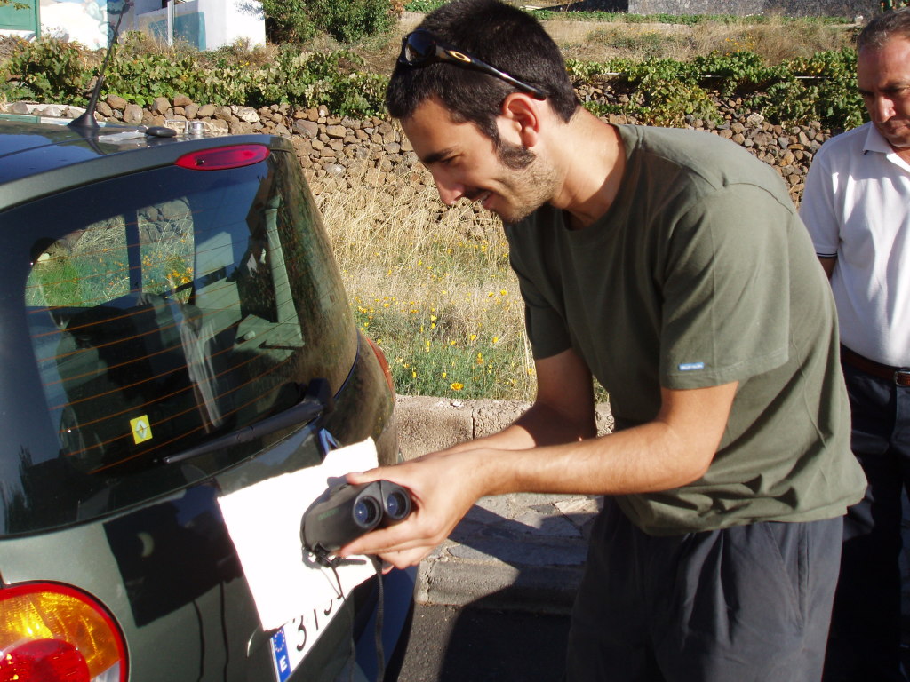
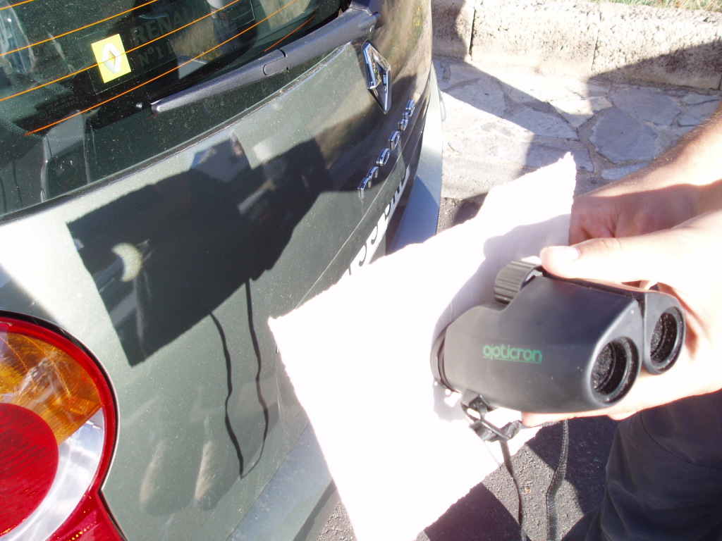
OLYMPUS DIGITAL CAMERA

Rodrigo del Potro projecting an eclipse onto a car. Make the image larger by moving the binoculars further from the car.

OLYMPUS DIGITAL CAMERA

Using the paper casts a shadow on the car that makes the image from the binoculars much easier to see.

Instructions

  1. Make a hole in the middle of the card about the size of the eyepiece lens on the binoculars.
  2. Put the card against the binoculars so that one of the eyepieces is over the hole.
  3. Hold both in front of the car so that the paper casts a shadow.
  4. While looking at the car, angle the binoculars towards the Sun.

The final stage is the tricky one, as the Sun is a small target and it’s hard to know exactly where the binoculars are pointing.  The shadow cast by the binoculars onto the sunny side of the paper can help you to position them – try to make it as small as possible.  You can sharpen the image using the focus control on the binoculars.

Improvements

There are obvious ways in which to improve this, such as putting the binoculars on a tripod and using tape to attach them to the card.  The appeal of this method is that it is quick, and it only needed things that we already had with us.

Warning

This should be totally obvious, but I’ll say it anyway:

DO NOT LOOK DIRECTLY AT THE SUN THROUGH BINOCULARS!!!

If you want to know why, just try holding your finger where your eye would be.

The forecast is for clouds in Edinburgh on Friday morning, but maybe we’ll get lucky and there will be a break so we can see it.  Enjoy!

Categories: Uncategorized

Four years of volcan01010: Highlights of 2014

Four years!  Well, that’s gone by pretty quickly.  Check out this post for highlights from the last 12 months.  As always, expect Iceland, volcanoes, Python and open source software/GIS.

Iceland and volcanoes (volcan…)

This year on the blog has been dominated by basalt lava, and in particular the eruption of Bárðarbunga volcano at Holuhraun, Iceland.  I joined the team of University of Iceland scientists working there at the start of September and wrote two posts describing the eruption and particularly the effects of the sulphur dioxide gas that it was producing.  Part of the second post was quoted by the NASA Earth Observatory website, which also featured one of the videos, in an article about two great satellite images of the lava flow.

Photos, explanations of what the eruption was doing and descriptions of how it is to work there.

Videos of the crater and the lava flows including sampling and mapping the outline.

The other most popular Bárðarbunga post was a guest article by Ed Baines (@edwinbaynes).

The post is about the powerful floods that could result from a subglacial eruption at Bárðarbunga.  Ed describes how the current Jökulsá á Fjöllum canyon was produced by giant floods of the past.  His research into this was published this month.

Four other volcano-related posts you CANNOT AFFORD to miss:

  1. The distance this volcanic ash travelled to reach Ireland will amaze you!
  2. The secret is out about microbes’ new Eyjafjallajökull lava diet.
  3. You NEED to read this reliable information about Icelandic flood lavas.
  4. 20 journals that volcanologists just keep citing.

Open source software and GIS (…01010)

QGIS is an open source GIS package that’s especially great for putting together maps for printing.  It’s also really quick to import data from a csv file or spreadsheet.  The OpenLayers plugin loads maps from online sources e.g. Google Satellite, Open Street Map, Bing Aerial that you can use as a background.

This post outlines the routine that I follow at each sample site in the field.  It describes how to use handheld GPS (or smartphone GPS tracking app) alongside a normal camera to geotag your photos and logs, using the gpsbabel and GpsPrune software.

A handy script for anyone working with geochemical data for igneous rocks.  It adds fields with the names of different magma compositions to plots of Total Alkalis vs Silica.

Pretty picture

The sole purpose of the (Almost) 3D picture of Háifoss waterfall post was to share this picture/illusion, because I think it is pretty cool.

Haífoss, Iceland.  Click image for larger version.

Haífoss, Iceland. Click image for larger version.

 Highlights from 2011-2013

A list of all posts from 2014, and in fact since the blog began, can be found on the Every Post Ever page.  I’ve also picked out highlights from each of the previous years so far in the following posts.

Progress since last year

The Bárðarbunga eruption was a big help in bringing people to volcan01010.   Over 1,000 people visited the site during one day when the eruption began.  The blog had 58,000 page views in 12 months, compared to 28,000 last year.  Most of the traffic is still from the UK and USA and there is a steady flow to the software posts.  The Mail Online don’t need to worry about competition from me yet, but it is nice to see traffic increasing.  I’ve managed to keep posting about once a month.  The Twitter account now has 1902 followers (up from 881 last year), lots of whom joined back when the eruption began in September.

If you have enjoyed or found any of the posts useful this year, please spread the word.

Comments Off on Four years of volcan01010: Highlights of 2014
Categories: Uncategorized