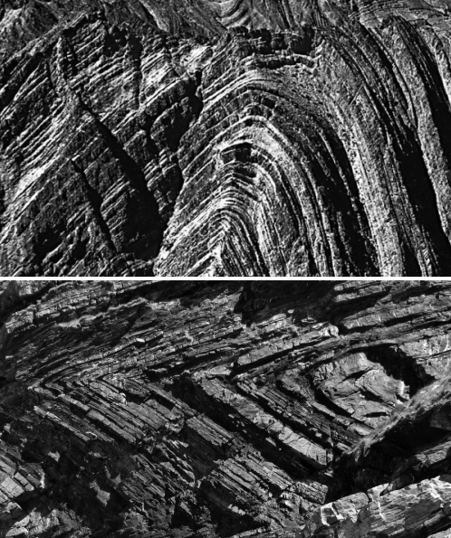
![]() In earth science, you often find yourself working and thinking over a range of different lengthscales and timescales – from micrometres to megametres*, from seconds to petaseconds**, or more. Because of this, making sure you’re clear on exactly what scale you’re meant to be thinking at today is an important part of a geologist’s mental toolkit, and in some of us it translates into a certain obsession with scale bars. For example, when folds kilometres across can – and do – resemble centimetre scale ones, it is nice to know exactly how big the photo or sketch you’re looking at actually is.
In earth science, you often find yourself working and thinking over a range of different lengthscales and timescales – from micrometres to megametres*, from seconds to petaseconds**, or more. Because of this, making sure you’re clear on exactly what scale you’re meant to be thinking at today is an important part of a geologist’s mental toolkit, and in some of us it translates into a certain obsession with scale bars. For example, when folds kilometres across can – and do – resemble centimetre scale ones, it is nice to know exactly how big the photo or sketch you’re looking at actually is.

Folds the size of an outcrop? The size of a cliff? The size of a mountain? You decide!
This obsession with scale bars is mostly harmless, generally manifesting itself in stationary choices entirely motivated by how good they look in field photos.
But it does give us a tendency to mutter about wrong, inappropriate and missing scales wherever we come across them (or, in the latter case, where we don’t – generally in students’ field notebooks). Of course, nowadays, Twitter allows those mutterings to be transmitted to a much larger audience.
http://twitter.com/#!/eruptionsblog/status/58255092364742656
Oddly enough, Erik’s particular penchant for scale pedantry had come up in a discussion with my co-blogger just a couple of days ago.
http://twitter.com/#!/highlyanne/status/58260934967312384
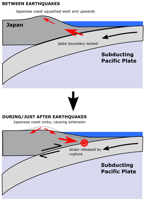
Erik’s tweet has got me wondering if I am as rigorous in this regard as I should be on this blog. Take, for example, this figure from my last post, which illustrates the elevation and subsidence of the Japanese coast over an earthquake cycle. These movements are measured in metres to tens of metres, so on this figure they have been clearly exaggerated; for reference, the width of this cross section is around 250 kilometres, and the crust on the Pacific plate is 10-15 km thick.
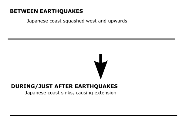
The problem here is not my selective application of a massive vertical exaggeration on this figure. I’m talking about the uplift and subsidence is terms of regional tectonics and seismology, so I needed to show the structure of the subduction zone. If, having done this, I kept to the same scale for the coastal movements, the topographic profiles would look like this.

No vertical exaggeration.
This may be more accurate, but it’s not particularly illuminating. However, not highlighting the vertical exaggeration is a potential problem. I, and other geologists reading this blog, can automatically compensate for the lack of proper scaling, but we can only do this because we already know that these motions are of the order of 10 metres, rather than 100 metres, or 1000. Without this prior knowledge, even if interested laypeople work out, without being told, that the scale is off, they may not know by how much – which may lead to confusion. This confusion could be avoided with a bit more rigour on my part.
Of course, compared to the offence that prompted Erik’s original tweet, I don’t think I’m in too much trouble.
http://twitter.com/#!/eruptionsblog/status/58261090999599104
But I do think that I need to be more careful in future. I also have at least one past figure caption to amend…
*One million metres or 1,000 km
**One petasecond – 1015 seconds – is about 30 million years.


Comments (3)