The Patagonian experience is dominated by one thing: the wind. It is constant, incessant, and relentless. Windsocks at airports are permanently horizontal and the few trees that survive on the hillsides all point east. It doesn’t even have significant gusts or lulls; it just is.
When I was there in 2004 the wind made such an impression on me that I wrote the following in an email home.
It is very windy here. […] It has reaffirmed my faith that the world is round, because if all this air wasn’t just doing a lap of Antarctica and coming back round again, then wherever it was coming from would surely have run out by now.
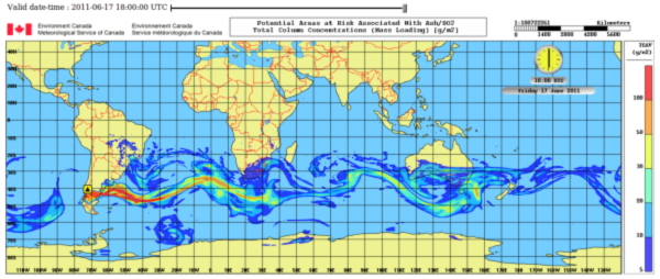
This week, I saw a great image that illustrates this concept beautifully, all thanks to a volcanic eruption in Chile.
The eruption at the Puyehue-Cordón Caulle began nearly a fortnight ago, on the 4th June, producing an impressive eruption column over 12 km high and depositing a thick blanket of pumice on the surrounding landscape (Nice image gallery on the BBC website). Since then, the finer-grained ash has been carried eastward on the wind, causing air travel disruption and pretty sunsets in South Africa, Australia, Tasmania, and New Zealand as it goes.
The image below is the output from a computer model simulation of the Puyehue-Cordón Caulle eruption plume. It was produced by the Meteorological Service of Canada, using their MLDP0 computer model. It shows the predicted distribution of the ash on Friday 17 June, with the cloud doing a lap of Antarctica and coming back round to Patagonia again. The usual caveats and uncertainties of plume modelling apply, especially with respect to concentration estimates, which are strongly dependant on the estimates of how much ash is being erupted per second. Consequently, they have published these maps for guidance only. [See also the first comments, below]
Especially cool is the animated version – click here to see it.


That’s a very nice image (and animation). I have to admit, when I first realised that the ash reaching New Zealand and Australia was coming from the west, rather than the east, my mind was a little blown.
I notice that on this simulation, South Africa is also in the path of the ash cloud, but a quick google search doesn’t seem to bring up any tales of disruption to aviation. Are they just ignoring it?
I don’t know why there was less disruption there, but they won’t just be ignoring it. Even if there were no safety concerns, the airlines would want to avoid the ash for all the extra maintenance costs that it brings.
It is important to note that the map in the figure is the Total Column Concentration i.e. all the the ash at all different altitudes from the surface upwards. So you can’t take the concentrations as representative of any particular altitude, which will be much smaller. Also, if the ash is at high levels, planes may be able to take off and land beneath it.
The plume spans the areas of the Buenos Aires, Toulouse, Darwin and Wellington volcanic ash advisory centres (VAACs), each of whom will produce their own charts. The Toulouse charts, here, show only low ash concentrations over South Africa. (If the Toulouse chart no longer works, here is an example image from 17 June 2011).
The model simulation is interesting, I hope they become commonplace like weather radar :=D
If the volcano were to erupt for months the ash cloud would be quite a band I imagine.
Volcanoes have been doing this forever that is common knowledge. Yet somehow its surprising to me whats happening all the time every month across the globe when I see images like this.
Laki must have been bad to live through in the 18th century, all of Europe was in the cloud for around a year I think. No summer etc.
Pingback: Cenizas volcánicas al microscopio | Ciencias y cosas
Hi John,
I stumbled across your website while looking for a good estimate of the tephra emitted from Puyehue Cordon-Caulle in 2011 for my dissertation. I didn’t find a single good site for estimating this value, unfortunately, but I loved your quote about the winds in Antarctica (I’ve spent some time there and on the Drake, so I know what you mean!). I wonder if you’d mind if I use it in my dissertation epigraph, with proper attribution to you, of course?
Best,
Jonathan Bent
Graduate Student, Scripps Institution of Oceanography
Pingback: Alaskan ash in Ireland: context, implications and media coverage | Volcan01010
Pingback: How do satellites map volcanic ash clouds? | Volcan01010