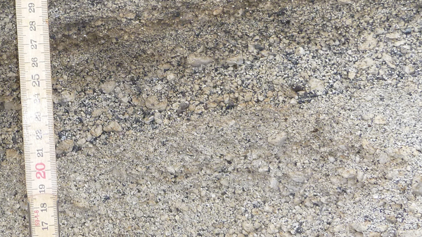
When a volcano erupts explosively, the tephra that comes out is a mixture of material that was molten at the time and bits of other old, cold rock that happened to get caught up in the blast. These are referred to as the juvenile and the lithic components and consist of bubbly, pumice-like fragments and of chunks of lava and hydrothermally-altered material, respectively.

Lithic-rich deposits from the explosive Hekla 4 eruption. The yellow-grey-white grains are juvenile pumice, the dark grains are lava lithics that were caught up in the eruption. I reckon that there are up to 40% lithics here. How about you? Click to enlarge.
The relative proportions of juvenile and lithic grains can tell us something about the eruption. For example, if the deposits are full of lithics, it might indicate that the vent where the material was erupting was getting wider or that underground water was coming into contact with the magma and turning explosively into steam, breaking up the surrounding rocks in the process.
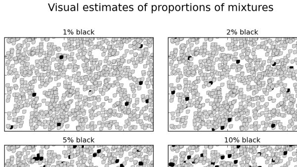
The best way to measure the relative proportions of juvenile and lithic grains in a sample is to get out the tweezers and separate them by hand, but this is often impractical, and a lot of time a visual estimate is sufficient. Visual estimates are a lot better if you have some known values to compare them with. That’s where the chart comes in.
Visual estimates of the proportions of mixtures
The following chart gives examples of what mixtures of different proportions look like. Download it, print copies, use it whenever you need to make visual estimates of proportions of mixed materials.

A chart demonstrating the visual appearance of mixtures of different proportions. Click to see the full-size version, or use 'Right-click, Save As...' to download a copy.
Make your own charts
The charts were made using the Python programming language. The source code is given below so that you can make and customise your own plots. If you are learning Python, try messing around with the code. First try changing the numbers and sizes of grains; next change the number of plots and give the grey grains different shapes to the black ones; finally, try plotting mixtures of 3 different grain types, each with different size distributions. Happy hacking!
import numpy as np
import matplotlib.pyplot as plt

number=1000
x = np.random.rand( number )
y = np.random.rand( number )
percentages=[1, 2, 5, 10, 20, 30, 50, 75]
fig = plt.figure(figsize=(8.27,11.69))

for i in range(8):
    percent=percentages[i]
    black = np.round( percent*(number/100.0) )
    color = np.array( black*['black'] + (number-black)*['lightgrey'] )
    np.random.shuffle(color) #randomise so black aren't all at the bottom
    # define a marker shape here to make something that looks more like rocks
    marker=[(0.17,0.12),(0.15,0.42),(0.14,0.75),(0.35,0.87),(0.68,0.90),
            (0.98,0.86),(0.90,0.29),(0.72,0.14),(0.45,0.05),(0.17,0.12)]
    ax=plt.subplot(4,2,i+1)
    plt.scatter(x, y, color=color, s=60, linewidth=0.25, edgecolors='black',
                marker=(marker,0))
    plt.xlim(0,1)
    plt.ylim(0,1)
    plt.title('%i%% black' % (percent), fontsize=12)
    ax=plt.gca()
    ax.xaxis.set_ticklabels([])
    ax.yaxis.set_ticklabels([])
plt.subplots_adjust(left=0.05, right=0.95, bottom=0.05, hspace=0.15, wspace=0.1)
plt.suptitle('Visual estimates of proportions of mixtures', fontsize=18, y=0.97)
plt.suptitle('http://all-geo.org/volcan01010/2012/09/pumicelithicsproportions',
             x=0.95, y=0.045, horizontalalignment='right',
             verticalalignment='top', fontsize='x-small')
plt.savefig('PumiceLithicsProportions.png', dpi=150)
plt.ion()
plt.show()


THIS IS EXCELLENT!
I have been wishing to have a script like this for a long time. This is going to come in handy for our core logging team (gold deposit) where I will tailor the script for use in estimating mineral abundances.. being able to adjust the size of the grains will allow us to represent different minerals, too!
Many thanks for this
Glad that you liked it.
John do you have any references that speak on the reproducibility of visual estimates.
I see that the ranges are board and am wondering if esimates at decile intervals are reliable.
thanks
I’m afraid that I don’t have any information on reliability. I suppose that you could make some for yourself with some random plots and a class of willing students. For these plots, I decided that the approximately logarithmic distribution of percentages would be more useful than a linear spacing. But in my actual data, I have used made estimates between the examples e.g. 25%.