The Grímsvötn eruption ended today, but there is still plenty of ash up there. Despite contrasting views in the press, firm evidence that the plume crossed the UK is slowly surfacing. Discussion has moved on from volcanology, to detecting and predicting ash clouds. There are still many interesting questions to think about…
So the eruption is over, just like that?
Yes. From a 20 km high, billowing, lightning-lit column of pulverised rock, the eruption plume has declined to just a steady venting of steam and Iceland’s most powerful eruption in 50 years has fizzled out. The contrast is stark, as can be seen in photographs on Erik Klemetti’s Eruptions blog. The eruption followed the same pattern as a number of previous Grímsvötn eruptions, with the rate declining as the pressure in the magma chamber was released. Imagine using up a deodorant aerosol in one go: it blasts out quickly at first (SSKKKOOOOSSSSSSHHHHH!!!!) then fades away to a pathetic hiss (sss…ssssss….sss….ss). The process is the same.
Excellent! So I don’t need to worry about my flight on Friday, then?
Hopefully not. The eruption was really big, though. This animation demonstrates the power of the plume. Comparing it with other eruptions that had similar-sized plumes, it is probable that around 0.5 cubic kilometres of material were ejected. Much of that material is still up in the atmosphere. The Met Office models show the huge area that it covers. Some further disruption is not impossible while the remaining ash disperses.
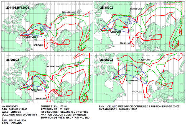
The Met Office prediction of the ash cloud distribution for Wednesday and Thursday.
But lots of people are saying that there was no plume at all. Are they right?
No. They are wrong. Unfortunately, the speed of the scientific process is nothing in comparison to that of a certain Irishman’s tongue, but the evidence is beginning to come together that the plume crossed the northern part of the UK yesterday as predicted. So far, we have indications from satellite data, observations by the public, and air quality monitoring data. All of these will be scrutinised and double-checked in the future, but the case is already very compelling. [Note: the purpose of this section is to demonstrate that the ash cloud is real. It doesn’t give sufficient information to say whether or not the concentrations of ash are safe to fly through.]
Satellite data
The figure below shows data from the SEVERI infrared detector on the European Meteosat-9, processed by the Norwegian Institute for Air Research. The image shows patches of ash over the Atlantic and the North Sea. But the image is just a taster; the animation is a must-see! Click here to watch it. Remember that the scale on the image is in grams-per-square-metre, the thresholds for aircraft safety are measured in milligrams-per-square-metre.
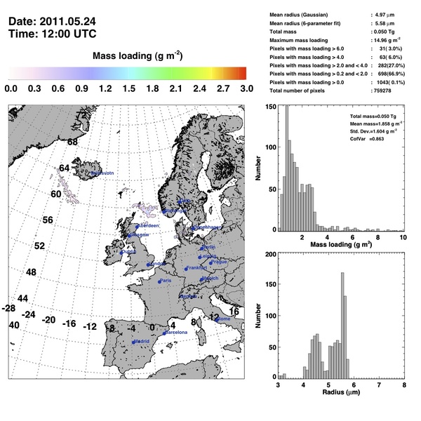
Map of Grímsvötn ash as detected by the SEVERI instrument.
Observations by the public
The British Geological Survey set up a webpage where people could report ash fall in their area, similar to one that they use for reporting earthquakes. The results are below. How much you trust them depends on how much faith you have in the British public. The high density of points in Scotland, where the population is much lower, and the large number of negative findings in the South East are certainly consistent with the ash cloud crossing northern Britain.
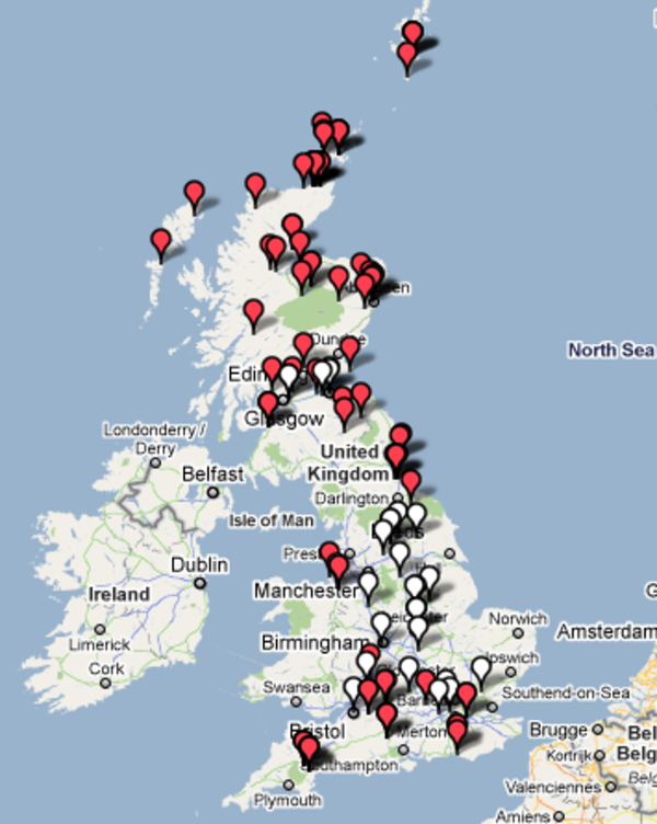
Map of reported ash fall from the BGS website. Red markers have ash, white ones don't.
Furthermore, volunteers from across the country were collecting samples of this ash. These are being sent to the BGS for analysis. Results should begin to come out in the next few days.
Air quality monitoring data
There is a network of air quality monitoring stations across the UK. Many of them publish their data online, so that they can be accessed by the public. One of the parameters measured is PM10 (particles less than 10 microns in diameter). Many of the ash particles in the plume will be less then 10 microns in diameter. The International Volcanic Health Hazard Network have information on the health risks of ash on their website. The following plot comes from the Scottish Air Quality website, and shows data for all of their sites in Aberdeen. There is a clear spike in PM10 levels at every site on Tuesday 24 May. Aberdeen airport was closed on Tuesday.
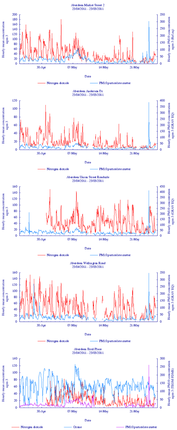
Air quality data for sites in Aberdeen from the Scottish Air Quality website. While there is a fair amount of background noise, the sharp peak in every station on Tuesday is clear.
Do you know, I’ve always wondered how people can make maps of the ash cloud thousands of kilometres away from the volcano.
Really? Well that is a truly incredible coincidence. Only this afternoon, I took part in a live Q&A session on the Guardian website about his very subject! I’ll summarise the most relevant excerpts for you below. You should also check out the original site for more, and to read answers from Dr Colin Brown from the Institute of Mechanical Engineers about how much ash a jet engine can tolerate.
Why are the forecasts so vague?
Because tracking an ash cloud is an extremely difficult thing to do. The distances are huge, and the concentrations that correspond to the safe flying threshold are tiny. Both empirical measurements (e.g. satellite data, direct sampling) and computer models (e.g. the Met Office’s NAME model) are used. Neither strategy is perfect, and each has it’s own advantage and disadvantages. In reality, both need to be used to make decent maps of where the ash cloud is present.
OK. Tell me about measurements first.
Satellite data can be used to track the plume across the Atlantic. Visible light images (e.g. photographs) could show areas of high ash concentration, but only during daylight hours and if the ash was above the meteoric (weather) clouds. Ultraviolet images are able to pick out sulphur dioxide, but it is unclear whether it can travel separately from the ash. Thermal infrared (TIR) images are useful, because they contain information about both the extent and the altitude of the ash cloud. If you assume that the ash has the same temperature as the surrounding air (which is reasonable given the small size of the grains), and we know how the temperature of air changes with altitude, then you can work out its altitude from its temperature. This method falls down, however, if there are meteoric clouds at similar altitudes in the area, as they will also emit thermal infrared.
Using lasers in space, the altitude of the ash cloud can be checked, and the thickness could be measured. When people went through the data from the Eyjafjallajökull eruption, they found that the TIR methods underestimated the altitude of the ash by up to 1.5 km. The thickness was usually <1 km. Using a combination of TIR and lasers in space, the mass of ash in the cloud was estimated, but the uncertainties were around 40-50%. Ground based lasers were also able to measure the height and thickness of the cloud, and gave confirmation of ash above a number of locations across continental Europe. Ground-based lasers (LiDAR) have the disadvantage that they can’t see through cloud, and only give information at a specific point (or along a narrow track in the case of a satellite-based system). Knowing the ash content above Manchester is of little help to a 747 over the middle of the Atlantic.
Sounds complicated. So are models the answer, then?
Because measurement techniques are so strongly conditions-dependent and spatially limited, models are necessary to fill in the gaps. The models can give you a result for any time and place, irrespective of other factors. The way that they work is quite straightforward.
Imagine an ash grain, falling through the sky. The aim of the model is to work out how it moves during each second (or other time step) of the modelled time period. The motion is a controlled by four factors:
- How big the grain is, because fall velocity is size dependant. This controls how far it falls in each step.
- The local wind direction. This controls the sideways movement of the grain for each step.
- Some turbulence factor. This controls how particles spread out to form a cloud.
- The weather. Because the rain will wash some grains out.
Adding up all the movement during all the steps over hours or days will show where the particle goes. All of this processing is very computer intensive, so it is not realistic to try to simulate each of the bazillion gazillion ash grains produced by the eruption. Modelling a few thousand turns out to be sufficient to see how the plume spreads and to make a map of where it is. You can do this for any time period or location and the data are 3D, so individual layers in the plume can even be identified.
So what are the disadvantages?
The disadvantages of the computer models is that they are only computer models. The results are only as good as the data that is put in. This means that errors in particle size distribution, or weather data will lead to errors in where the particle ends up. There is an unavoidable degree of uncertainty in each of the input parameters. How can you ever expect to know the exact wind speed and direction at 100 m height intervals at a given location 200 km west of Shetland?
And it gets worse. If you just want to know where the plume is you can simply draw an envelope round all the particles. But now the airlines demand to know the mass concentration of ash at each point. You can easily calculate this by assuming that each modelled particle represents some number of kilograms of ash, but getting this number right depends on knowing the mass eruption rate of the volcano. As I wrote in a post last month, this is easier said than done.
I see what you mean that neither strategy is perfect.
Exactly. Which is why both are required. The models produced by the Met Office aren’t just spat out of the computer and sent out to the airlines; they are compared against satellite data and anything else that is available and adjusted accordingly by experienced weather forecasters. This ensures that the strengths of both measurements and models are combined.
The results are still full of uncertainty, but this is not because of a failing on the part of the scientists. It is because producing accurate maps of the ash distribution is an extremely difficult thing to do. This situation can only be improved by increased funding for research and equipment to pay for things like LiDAR on the Faroe Islands, or a fleet of dedicated research planes, or more studies into the relationship between eruption style and mass discharge rate.
Clive Oppenheimer, a volcanologist at Cambridge, wrote a good piece about how difficult it has been to secure funding for this kind of thing. Realistically, a lot of the money needs to come from the airline industry. Uninformed, attention-seeking criticism doesn’t help anyone.

Dear John
An interesting article but for the sake of accuracy I would like to add a little more facts.
If you email me back I will give you my number and we can talk.
Take a look a look at the mass loading figure In the nilu ash retrieval it’s around 300 micrograms which is well within engine tolerance set my manufacturers the maximum is 4000 micrograms. The chart was produced along with 30 others as we tracked ash from Iceland in the so called red zone and was measured by lidar as between 150-300 micrograms. A really good result and we are getting better and better at tracking ash to supplement the NAME model. Indeed there are people flying this weekend because of that chart. The interesting thing in you article is the Aberdeen measurement that support the lidar measurement in Norway. If you email back I will give you my number and we can talk maybe you would to get involved to improve thing for next time. You should do a piece on Campie Flegrie that will certainly capture the imagination.
Ian
Very well presented and really hope you and your blog gets the traffic it deserves. This kind of reporting/discussion should be the topic of news columns, talk snippets, and be required reading for the “scientific” media, that usually pumps out the fear mongering and cataclysmic doomsday articles and video clips.
Obviously, there are going to be points that slip through the discussion… and one of them is the fantastic work done by the IMO in providing input variables to the NAME model. In other VAACs/countries… volcano observatories are horribly underfunded, understaffed and, as such, undermonitored. Getting ash concentrations and locations from satellites and other observation networks is just not going to cut it due other atmospheric conditions.
Thanks again and keep up the great work!
Gregg Gallina
Pingback: Grímsvötn 2011 (Part 2): Effects on aviation of the biggest Icelandic eruption since Katla 1918 | Volcan01010
Pingback: Recommended sources of information on Katla volcano | Volcan01010