New paper! Comparing Flood Inundation Map Features and Diagnosing Decision Support Design Challenges
If a flood is forecasted to affect a community, its residents and officials need to know where it will flood. What streets? What houses? What essential services will be impacted. Conventionally, floods are forecast in terms of discharge and water height at specified prediction points (often USGS gauges). Text that goes along with some water heights gives a narrative of what will be impacted (e.g., For Otter Creek at Center Rutland, VT at 8 ft – “Low lying portions of South Creek Road will flood in Clarendon between Walker Mountain Road and Wallingford“). That’s fine if you are familiar with the area and what that narrative means relative to the places you care about.
Flood inundation maps (FIMs) go one important step further in helping emergency managers, local officials, health and human service organizations, and other affected people see exactly where flooding is happening (or where it will happen) – even if there is no prediction point nearby. Flood inundation maps are increasingly being made available online., and they are potentially incredibly powerful tools for enabling good decisions and preventing loss of life and property. But making good decisions requires that users be able to quickly and correctly interpret the information they are displaying. And that’s where our new paper comes in.
In a new paper in Hydrological Processes, we evaluate and diagnose the visualizations for eight real-time flood inundation mapping (FIM) services available on-line. Together, our author team synthesized the common visualization challenges and made recommendations for improving usability and decision-making by technical and non-technical users. We provide evidence-informed design considerations that will improve the accessibility, interpretability, and effectiveness of FIMs as decision support tools.
If you are interested in how good design informs good decision-making and how to avoid common pitfalls in flood inundation visualizations, I encourage you to check out the open access paper.
Kandel, S., Stumpf, A.C., Joshi, A., Sharma, S., Taylor, L.E., Jefferson, A.J., Kenney, M.E., 2026. Comparing Flood Inundation Map Features and Diagnosing Decision Support Design Challenges. Hydrological Processes. 40(1): e70362. https://doi.org/10.1002/hyp.70362 (open access)
The paper was the product of a post-doc power group led by Sajani Kandel of the University of Minnesota. Watershed Lab research specialist Andrea Stumpf designed the tasks that informed the evaluations and also did a deep dive into the features available for each FIM and their intended audiences. Melissa Kenney (University of Minnesota) and I mentored, helped out, and cheer led. Our Watershed Lab co-authors (in bold above) learned a lot from collaborating with Melissa Kenney’s team at the University of Minnesota, and we got to teach some hydrology and risk communications along the way.
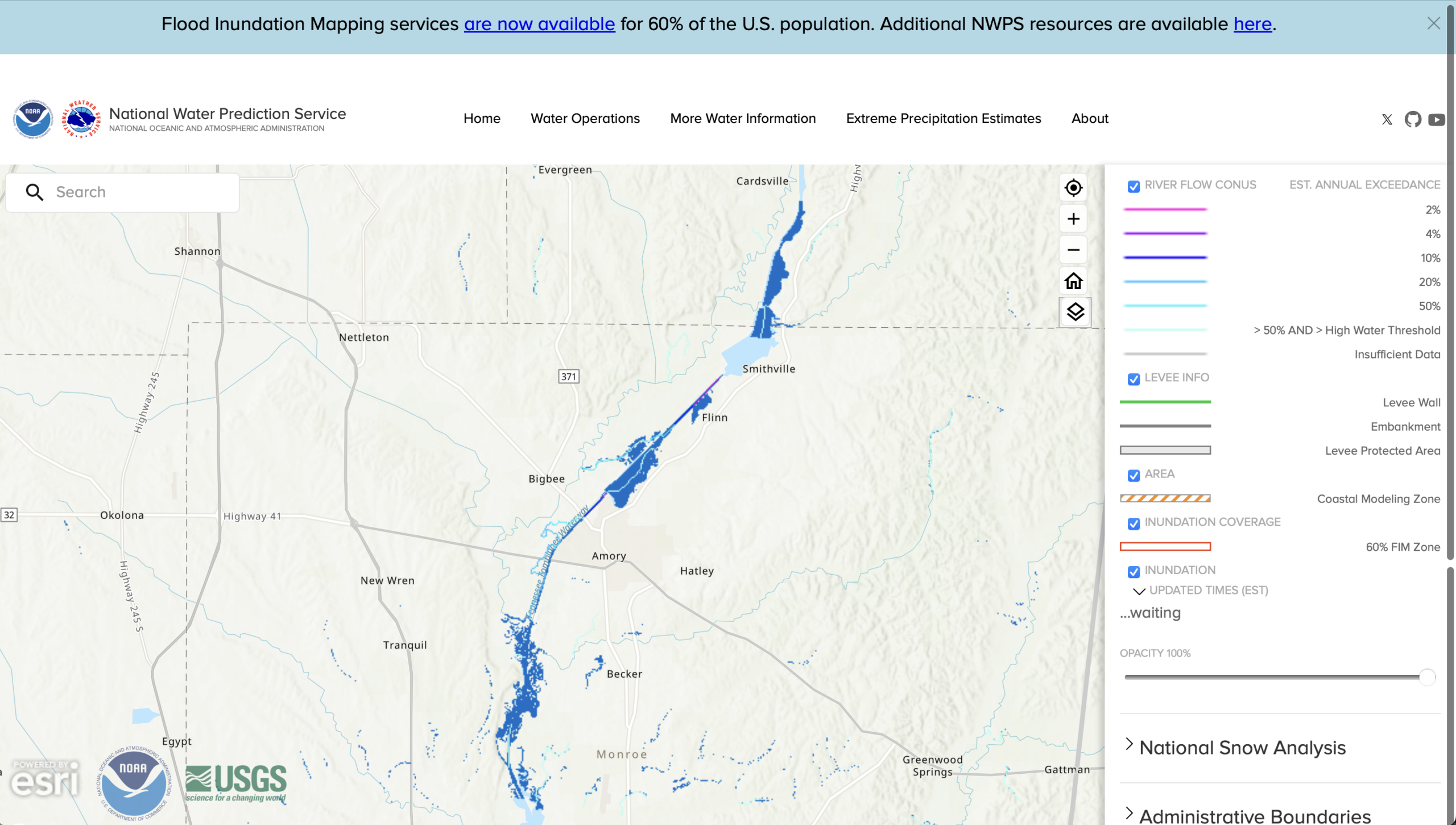
Finally, this paper is really exciting for the Watershed Lab because it has a clear research-to-implementation pathway. We did this work with NOAA funding and in close collaboration with NOAA’s Office of Water Prediction. NOAA is currently rolling out a FIM service for the US (see screenshot above). Our collaboration with NOAA means that there is potential that the agency will implement some of the changes that we’ve suggested in the paper on water.noaa.gov. To make our case stronger, we’ve followed up this diagnosis work with alternate visualization testing of the NOAA FIM visualizations and have a paper in prep on the outcomes of that. Stay tuned for more in this space!