A year ago today, the summit eruption of Eyjafjallajökull began, producing a large ash cloud that wreaked havoc with aviation. Last week, at the European Geosciences Union conference, scientists presented the results of their studies into how it all happened. This post summarises the results of a number of these presentations. In particular, it highlights the difficulties in trying to measure or to predict the location of such an ash cloud.
Anatomy of an eruption
The range of observations, made by hundred of scientists from tens of countries, the were presented at the conference was extremely impressive. Through their talks and posters, we heard how each had worked away investigating their own tiny aspect of the eruption, allowing us a much greater understanding of the whole.
Seismologists tracked the magma rising beneath the volcano by locating the thousands of small earthquakes that it produced as it broke through the rock. Radar satellites and GPS networks measured how the volcano swelled up before, and then deflated during the eruption. The patterns were best explained by magma collecting at specific locations within the crust, especially at 4-6 km depth. Studies of mineral chemistry revealed that these depths corresponded to the pressures at which many crystals grew, and analysis of little packets of melt that were trapped within the crystals tells us how much gas (e.g. carbon dioxide, sulphur dioxide) the magma contained down there.
This image, prepared by Páll Einarsson and posted during the eruption on the University of Iceland website, shows an early interpretation of what happened beneath the volcano. Over the last year, the picture has been refined with more samples and better data. The general picture is that the Fimmvörðuháls eruption was magma that rose relatively directly to the surface, whilst the summit magmas had mingled with older magma beneath the volcano, making them sticky and producing a more explosive eruption.
On the surface, a team armed with ultraviolet cameras and various spectrometers measured how much gas was escaping from the vent (CO2; levels were equivalent to 0.5% of mankind’s daily output). Other teams were busy mapping the thickness of deposits, and measuring how quickly the ash was falling, using radar or high-speed cameras. Samples were sieved to find the size-distribution of erupted ash, and examined by electron microscope to see how the magma had fragmented. The content of fluoride, which can poison livestock, and cristobalite, which has been associated with lung disease, were measured and both were relatively low.
Investigating the plume
A number of presentations were devoted to measurements of the ash cloud. They showed the different methods that could be used to study it, and showed that each have advantages and disadvantages.
Plume size at source
The height of the plume at the source was measured by weather radar in Keflavik and by webcams closer to the volcano, and during explosive phases of the eruption, it was found to range from 6-9 km in height. Keflavik is 150 km away from the volcano, so it is hard to pin down changes of less than ~1 km. The sensitivity is reduced if the plume is dry, or is blowing away from from the station (i.e. towards Europe). Webcams closer to the volcano are more precise, but are obviously useless if it is cloudy or dark. Furthermore, it can sometimes be hard to distinguish between plumes of ash and plumes of steam. Generally, webcam data and radar data agreed within +/-500 m, which is reasonable but, as we will see, any error in the plume height has a strong effect on predictions of ash cloud concentration.
Long distance tracking
Satellite data was used to track the plume across the Atlantic. Visible light images (e.g. photographs) could show areas of high ash concentration, but only during daylight hours and if the ash was above the clouds. Ultraviolet images are able to pick out sulphur dioxide, but it is unclear whether it can travel separately from the ash. Thermal infrared (TIR) images are useful, because they contain information about both the extent and the altitude of the ash cloud. If you assume that the ash has the same temperature as the surrounding air (which is reasonable given the small size of the grains), and we know how the temperature of air changes with altitude, then you can work out its altitude from its temperature. This method falls down, however, if there are clouds at similar altitudes in the area, as they will also emit thermal infrared.
Using lasers in space (LiDAR), the altitude of the cloud could be checked, and the thickness could be measured. It was found that the TIR methods underestimated the altitude of the ash by up to 1.5 km. The thickness was usually <1 km. Using a combination of TIR and lasers in space, the mass of ash in the cloud was estimated, but the uncertainties were around 40-50%. Ground based lasers were also able to measure the height and thickness of the cloud, and gave confirmation of ash above a number of locations across continental Europe. The disadvantage of LiDAR is that it can’t see through cloud, and only gives information at a specific point (or along a narrow track in the case of a satellite-based system).
Samples of ash from continental Europe
Ash grains found in UK rainwater. The mean diameter of the grains is 20 microns. This is much larger than the grains that are assumed to make up the majority of the material in the ash cloud.
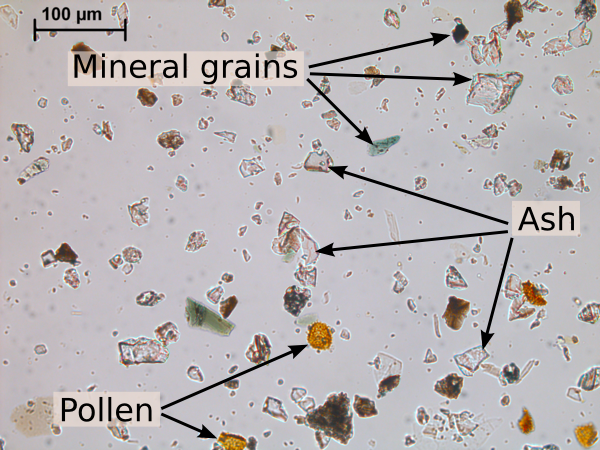
Finally, the ash in the plume was sampled. Specially-equipped aeroplanes flew scientific missions through the cloud, filtering the air to collect ash. By spiralling up and down through it, they were able to identify discrete layers. Some of the planes were subsequently grounded for repair. One study found that visible ash in the satellite images corresponded to about 3 milligrams per cubic metre (mg m-3). Concentrations were >2 mg m-3 just south of Iceland, dropping to <0.2 mg m-3 over Germany, where the cloud was patchy and ash was mostly between 2.5 and 10 microns in diameter. There are 1000 microns in a millimetre; these grains are seriously tiny. Interestingly, ash grains collected on the ground were much bigger, with diameters of 40 microns in the Faroe islands and 20 microns in the UK. Much further south, scientists measuring air quality at the Jungfraujoch weather station, high in the Swiss Alps, identified ash grains in their filters. All of the grains had diameters of less than 10 microns.
The difficulties with dispersion modelling
During last year’s crisis, NAME, the UK Met Office’s atmospheric dispersion model was used to predict locations where ash was likely to be found. There were a few presentations on the results. Dispersion models have the advantage that they can predict the location of ash at much lower concentrations than can be seen by satellites, and at any time of the day or night. The disadvantage is that their results, like those of any other computer program, are only as good as the data that is put in.
In this case, the inputs are the plume characteristics, and the weather data. In terms of the plume, the most important factor is the mass discharge rate (i.e. how much ash comes out of the volcano per second). Good predictions depend on being able to estimate this and feed it into the model as the eruption progresses. Unfortunately, this isn’t that easy.
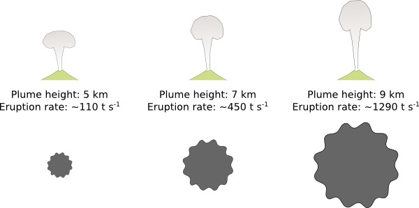
A comparison of mass discharge rates estimated from different plume heights. The estimated mass discharge rate (given in tonnes per second) is very sensitive to the height of the plume. The area of each cloud in the diagram is proportional to the mass discharge rate.
The mass discharge rate is commonly estimated using an equation based on the height of the plume. The equation has been derived from observations of previous, sustained, explosive eruptions. It is not even clear how well it can be applied to Eyjafjallajökull, whose plume was relatively weak and pulsating. Using the formula, a small error in the plume height causes a huge change in the estimated mass discharge rate. For example, using 5 km instead of 6 km produces a discharge of 110 tonnes per second instead of 240 tons per second. You will remember from before that +/-1 km is about as close as we can get with the radar estimates of the plume height.
This makes it very hard to put a figure on what the ash concentration might be at any one point. One presentation at EGU compared NAME’s predictions with much of the ash cloud data described above. It found that about two thirds of the measured values were within +/-3 times the value predicted by the model. The errors showed no bias, so the model was not systematically under- or over-estimating the ash concentrations.
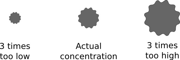
Graphic illustration of a +/- 3 times variation in concentration. The area of the cloud is proportional to the concentration.
How much ash is too much ash?
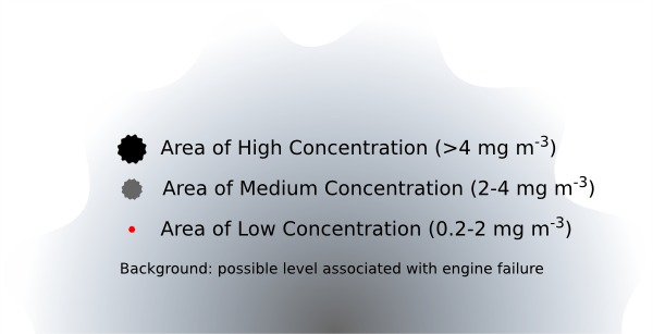
Prior to Eyjafjallajökull, the rules for aircraft were to “Avoid All Ash”. These were rethought in a hurry as the costs of grounding thousands of aircraft rapidly escalated. New rules were introduced for Europe, which set a threshold concentration of 2 mg m-3, below which it was permitted to fly. This immediately opened up large areas of airspace, allowing flights to resume. These rules have since evolved, resulting in the designation of Areas of Low (0.2-2 mg m-3), Medium (2-4 mg m-3) and High (greater than 4 mg m-3) Contamination. Areas of High Contamination are considered a Temporary Danger Area and special procedures must be followed if a flight is to enter them. This is much more flexible than the previous system, but currently, with such large uncertainties in our measurements and predictions, I’m not convinced that we can distinguish regions of 2 mg m-3 from those of 4 mg m-3 with any certainty.
At the time, there were very few figures on what concentration of ash represented a danger to an aircraft. It seems like this situation is improving now. Experiments are ongoing, and we heard one presentation describing experiments on melting ash at jet engine temperatures. Another talk described using NAME to estimate what the ash concentration had been during previous documented ash-aircraft encounters. There are huge uncertainties in the results (weather recording and volcano monitoring have come along way in the past 30 years), but it seems that concentrations of a few grams per cubic metre (i.e. hundreds of times the current limit) were involved in incidents where engines were stopped.
A comparison of the threshold levels of ash concentration in the new flight safety rules. The area of the cloud is proportional to the concentration.
Shoulders of Giants or Mountains of Midgets?
This post has highlighted a lot of the uncertainties and problems in the results that were presented. This is not a criticism of the scientists. The large uncertainties exist because they are trying to do new things, and because the things that they are trying to do are hard.
I was very impressed at how much of the data I had seen already, as lots of the results were made public very quickly during the eruption. One year later, they are up for discussion at a conference. Over the next months they will be submitted to journals and go through the peer-review process. Perhaps you will be able to read the articles before Eyjafjallajökull’s second birthday.
It was also really cool to see so many different studies presented together in one place. Newton said “If I have seen further, it was because I was standing on the shoulders of giants”. It was such a cool line that Oasis named their worst album after it. An alternative view, which gives a more incremental and dispersed view of scientific progress is that we stand on a mountain of midgets. Seeing all the pieces fitting together last week suggests that this is a much more fitting description.
Sources
Most of the numbers in this post came from presentations at the 2011 EGU conference in Vienna. Their accuracy is as good as my note-taking on the day.
EDIT: 15/04/11 15:48hrs. Fixed can/cannot typo.


How do you tell the ash grains from normal minerals under the microscope? They don’t look noticeably differnet to me
A
With difficulty. Some have shapes that were clearly bubbles, or have bubbles or crystals of other minerals inside them. You can often separate volcanic glass from whole crystal mineral grains by their appearance in cross-polarised light. Finally, you can use an x-ray technique under the scanning electron microscope (SEM) to get the approximate composition of the grain, but SEM time is expensive and the method is slow, so can only be used on a few samples. In the end, this is another measurement that will have significant uncertainties.
Pingback: Stuff we linked to on Twitter last week | Highly Allochthonous
Pingback: Are ash cloud aircraft rules really safe?