![]() It’s a miracle! In an amazing (and probably entirely serendipitous) feat of organisation, I find myself printing my poster for the AGU 2012 Fall Meeting a whole 3 days before I fly to San Francisco. Since I am generally more of a “expand task to precisely fit the time available” type, it’s rather unusual for me not to experience some degree of last minute panic: I’m so used to it, it’s almost…too calm.
It’s a miracle! In an amazing (and probably entirely serendipitous) feat of organisation, I find myself printing my poster for the AGU 2012 Fall Meeting a whole 3 days before I fly to San Francisco. Since I am generally more of a “expand task to precisely fit the time available” type, it’s rather unusual for me not to experience some degree of last minute panic: I’m so used to it, it’s almost…too calm.
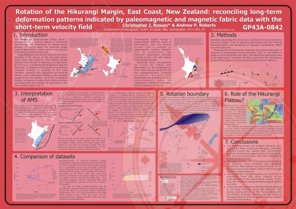
I was doing the final proofing before sending my latest opus to the plotter, and a thought occurred to me that requires me to go back to my very first AGU, and my very first AGU poster, in 2004. The creation story for this one is much more Chris-like: AGU that year was the final leg of a “conference world tour” that saw me fly from the UK to New Zealand to give a conference talk in Taupo, before flying to San Francisco for AGU, and then back to the UK just in time for Christmas. A large amount of the final interpretation for this thing were thrashed out in a jetlag-induced haze over the Pacific ocean; much of the actual creation was done in the lounge of a youth hostel in the Southern Alps; and it was printed in a New Zealand copy shop the morning before I flew out.
This poster is…pink. This is partly because the screen on the laptop I had at the time apparently had a bit of trouble accurately reproducing reds, but even then you have to admit it’s a brave visual choice. Perhaps the reason I spent most of my poster session in a very forthright argument with a New Zealand geologist was because the garishness unduly provoked him. Even if the colour scheme was not embarrassing, in hindsight, it’s also clear that this effort suffers from the all-too-common problems of too much text in too small a font: the figures are also too small and often clash with the background.
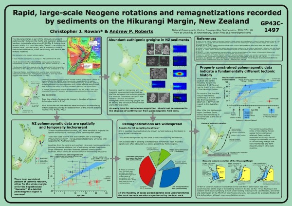
It was 3 years before I got the chance to do better, although this next poster holds the distinction of making it to AGU 2007 even though I personally didn’t. The prohibitive cost of getting from South Africa to San Francisco meant that although I got an abstract accepted, my co-author and PhD supervisor ended up presenting our work. As such, I’ve never actually seen a full-size version of this poster printed out, but I feel it’s a better effort: less text, clearer figures and layout, and most importantly, a somewhat more muted background that the figures actually stand out from.
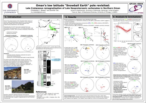
It was three more years before I actually got the chance to attend AGU in person again – since I’d just moved to Chicago, the commute was somewhat more reasonable, even if I was presenting some of the work I’d done in Edinburgh. A further 3 years (and an admonishment from my new IT department to not run through the plotter’s colour ink just for the sake of pretty background) had apparently moderated my more outlandish visual sensibilities, and I quite liked the end result: a simple layout, with the data as the visual focus. Although I’m suspicious of anecdata, I had some very constructive conversations in front of this poster that suggested that I might have been doing something right.
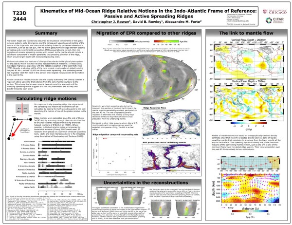
Last year, I was presenting some of my Chicago work; but although I was now talking about global plate kinematics rather than remagnetisations, it seems I decided to stick with the same visual style. I think it mostly works, thanks to the fact that the sort of work we’re doing lends itself to pretty figures. However, looking at it again I think that having so much text on the left, and that little squashed box in the centre bottom, makes it feel a little unbalanced. Unfortunately, when you’re printing on the Saturday afternoon before a Sunday morning flight, tweaking layout elements is not exactly a priority.
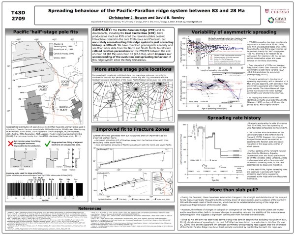
And now we come to this year, and guess what? It all looks a bit familiar:
Which is what I was thinking when I was giving this years’ effort one last once-over: that just like this blog has a ‘theme’ which gives all the posts and pages a consistent visual look, I seem to also have established a ‘theme’ for my posters. It’s partly convenience, I think: simply copy and pasting layout elements when creating a new poster certainly saves faffing around with line thicknesses, box corners and font sizes. But I believe that there’s also an element of me evolving towards a style that ensures the form of my poster brings out the substance – my science – rather than distracting from it. I’d be interested to know if anyone else has ended up doing this; or do you start anew every time you have to make a new presentation?



Comments (3)
Links (1)-
Pingback: AGU Dispatches: Convergence, the Caribbean and Cosmic Impacts (not) | Highly Allochthonous