
Blockbuster headlines about the thawing of the North-West Passage are all very well, but you can’t really assess the significance of the record low in Arctic summer sea-ice cover (as reported by both the European Space Agency and the National Snow and Ice Data Center (NSIDC)) without taking a slightly longer view. Fortunately, the NSIDC provides almost 30 years’ worth of monthly satellite measurements for us to play with. The image below compares this years March maximum and September minimum ice cover with the ice observed 10 and 20 years ago. The purple line on the figures represents the average position of the edge of the ice sheet between 1979 and 2000.
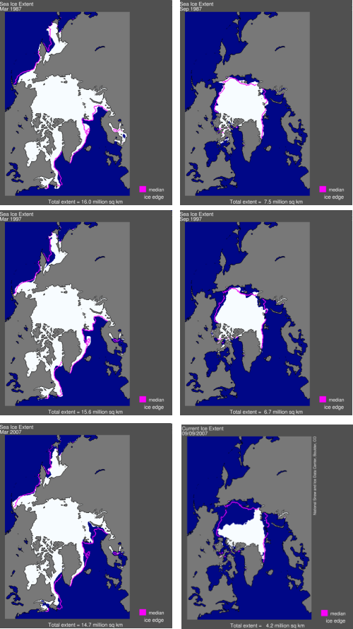
The two things that stand out in this sequence are that firstly, there is a large intra-annual variation in the amount of sea-ice: the measured extent during the September minima is less than 50% of the area measured during the March maxima. The second is that whilst this years summer ice coverage is clearly much smaller than those of ten and twenty years ago, the change in winter ice extent appears to be much less dramatic: the only obvious decrease in the March 2007 picture compared to 1997 and 1987 is between Greenland and Scandinavia.
Of course, only looking at a picture every ten years might be misleading. However, if you look at the year-on-year variations, the only additional thing you see is that whilst the current ice coverage (which rather annoyingly doesn’t appear in that plot yet) does seem particularly low even compared to last September, there does seem to be a fair amount of variation in the amount of summer sea-ice over the last twenty years, particularly in the region of the the Siberian coast (look at September 1996 compared to September 1997, for example).
After squinting at these plots for a while, I concluded that the only way to reliably look at trends was with a graph, so below I’ve plotted both the March (blue line) and September (red line) ice coverage; note that I’ve used a double y-axis so that you can directly compare the winter and summer trends.
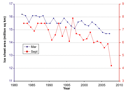
This makes it much clearer that there has indeed been a fairly steady downward trend in the amount of summer and winter ice coverage in the past 25 years or so, to the tune of about 1.5 million square km in both cases. However, we also see the summer ice has a lot more variability around this trend, with fairly sizeable year-on-year increases and decreases, particularly in the 1990s. For example, the 1996 ice coverage was 2 million square km greater than that measured in 1995; this is of the same order as the decrease observed between 2006 and this year. At this stage, then, it is difficult to know if this year’s record low represents an acceleration of the long-term shrinkage of Arctic sea-ice, or is merely part of the variability in a fairly dynamic system (as witnessed by the large changes in coverage over the annual cycle). Only time will tell: the figures for this winter could be very interesting.
Update: March 2008 data are now available.


Comments (7)